You know the folder I mean. The one with fifteen blue icons sitting in a row, each one named something like final_v2, final_FINAL, or new_new_real. You keep opening the wrong one because your eyes have to read every label, and by the time you find the right folder, you've already broken your train of thought.
That friction is exactly what a visual file manager tries to remove. Instead of making you read everything, it gives your brain something faster to work with, like color, icon shape, or a small overlay that tells you what belongs where. On macOS, that matters because Finder often falls back to a generic folder icon unless you add a custom overlay, which is why even small visual differences create strong grouping in dense folder trees Apple's file-system guide.
Table of Contents
- Why Your Folders All Look the Same
- What a Visual File Manager Is
- A Short History of Visual File Browsing
- The Visual Signals That Make Files Scannable
- Real Benefits for Real Work
- Folder Icons Versus Thumbnails and Preview Panes
- Building a Visual Folder System on macOS
- Your Next Steps to a Scannable File System
Why Your Folders All Look the Same
A messy Projects folder usually starts innocently. One client gets a folder. Then a second client. Then a few deliverables, some reference assets, a couple of “maybe later” folders, and suddenly the whole thing turns into a wall of identical blue folders.
The problem is recognition, not storage
Finder can store your files perfectly well, but storage and scan speed are two different things. When folders all look alike, you're forced into name-reading mode, and name-reading is slow when the folder list gets long or the names get too similar.
That's why visual systems help. They give your brain a shortcut, so you can spot the right folder before you've read the whole path. If you've ever used a whiteboard tool to organize ideas on walls, you already know the feeling, the structure becomes easier to understand once the visual grouping does some of the work.
Practical rule: if your folders are numerous and similar, your first job is not prettier names, it's better visual separation.
The rest of this guide follows that idea. First, it defines what a visual file manager is. Then it looks at which visual signals help most, how Finder supports them, where thumbnails and preview panes fit in, and how to build a setup that doesn't collapse after a week.
What a Visual File Manager Is
A visual file manager is any file-browsing setup where appearance carries meaning. Alongside folder names, it uses color, icon style, overlays, or layout to make categories visible, so the right folder can stand out before you finish reading.
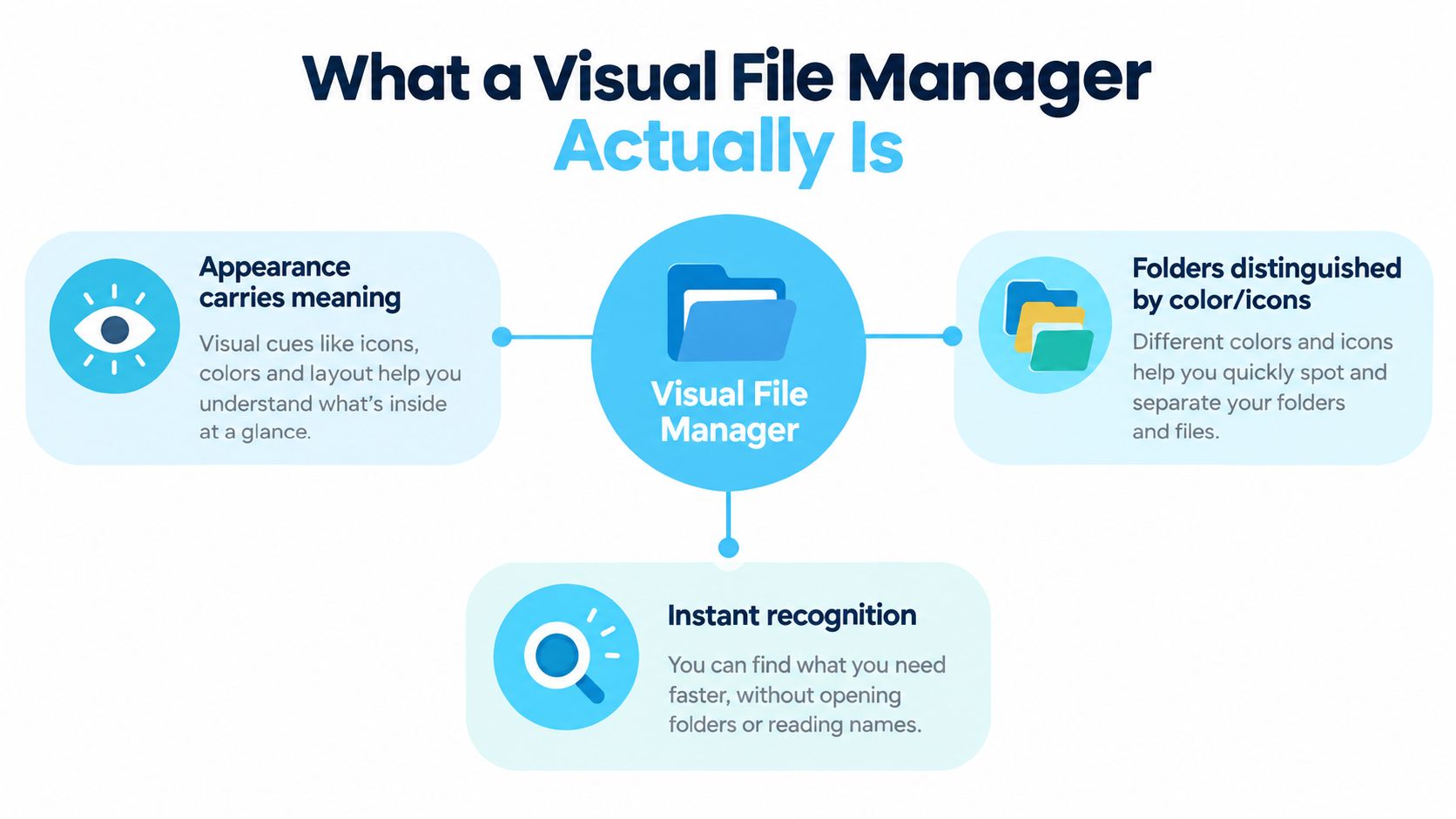
A parking garage with differently painted levels works the same way. You notice the blue level before recalling P3. A red client folder can be recognized before its name is read, just as a painted garage level is found before the level number.
Path navigation versus recognition navigation
Plain folder browsing is path-based. You remember where something lives, then read through each folder name until you reach it. That approach works with a small directory, but long project lists make similar names blur together.
Recognition-based browsing gives each folder another signal. A color can mark a client group, an icon can identify photo shoots, and an overlay can show archived work. In a dense folder tree, these signals divide the visual load. Color works well for broad grouping, icons for content type, and overlays for status or exceptions.
Folder-level visuals answer, “Which branch should I open?” Thumbnails and preview panes answer, “What is inside this branch?” A thumbnail helps with photos and other visual files, while a preview pane helps after you select an item. Neither replaces a clear folder cue when you are scanning the tree itself.
Apple's Finder supports folder icon changes, colors, symbols, emojis, custom images, and layout adjustments in Icon view, so you can build this system without replacing Finder Apple's Finder help. The same visual grouping idea appears in tools built to organize ideas on walls, where position and appearance help separate related items.
Takeaway: a visual file manager helps you recognize the right folder before you have to read the entire path.
A Short History of Visual File Browsing
Visual file browsing did not start with modern productivity apps. Its roots go back to the GUI work of the 1970s, when Xerox Alto introduced windows, icons, and desktop-style interaction history of file explorers.
Apple made the desktop metaphor feel familiar with the Macintosh in 1984. Microsoft followed with the first GUI-based Windows File Manager in Windows 3.0 in November 1990, then replaced it with Windows Explorer in Windows 95. That history matters because it shows visual file management was not a side feature, it became the standard way people expected to work with files.
Why that history still matters on your Mac
The folder-and-icon model is already in your head. You do not need to learn it from scratch, which is why visual cues can be so fast to read in Finder. A folder with a strong color overlay or a clear symbol stands out quickly because it matches the way desktop computing trained your eye.
That also explains why small changes can do so much. When the base folder icon is plain, a color change on a Mac folder is often recognized faster than any naming system you could invent. It works the way a labeled tab does in a crowded paper cabinet, except here you can adjust it in seconds.
The practical takeaway is direct. Use the visual language people already know, then make it consistent in your own folders so Finder gives you faster recognition inside larger trees.
The Visual Signals That Make Files Scannable
A folder system starts to feel fast when each visual cue has one job. Color can mark broad groups, icons can identify meaning, and layout can decide how much you can read at a glance. If you pile all of those cues onto the same folder without a rule, the screen turns into noise.
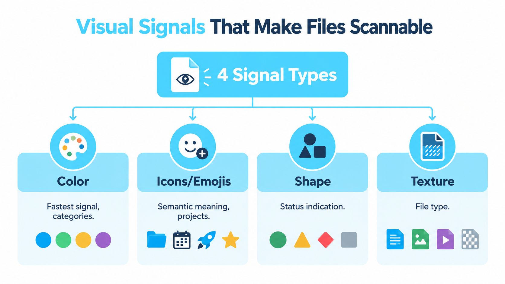
Apple's Finder help explains that you can change folder icons with colors, symbols, emojis, or a custom image, and you can also adjust icon size and grid spacing in Icon view Apple's Finder help. That matters because scannability usually comes from two layers working together, the symbol on the folder and the way the folder is spaced among its neighbors.
What each signal is good at
Color is the quickest signal to read. It works best for broad buckets like client work, personal files, active jobs, or archived material. Your eye catches a solid color before it reads the label, the same way a tab in a paper cabinet stands out before you open the drawer.
Icons and emojis add meaning. A camera icon points to photo work, a gear can mark system files, and a subject-specific symbol tells you more than color alone. That makes icons useful when several folders share the same top-level category but need to split into smaller groups.
Overlays combine signals in one folder. A colored folder with a symbol often reads better than either cue by itself, because it gives you both category and content at once. The point is not decoration, it is faster recognition when the folder tree gets dense.
Layout tuning keeps the system readable. Larger icons can help in a short list, while tighter spacing can make sense when you need more folders on screen. If the layout is too loose, you waste space. If it is too tight, the visual cues blur together.
Practical rule: use color for categories, icons for meaning, and layout for readability.
| Signal | Best for | Watch out for |
|---|---|---|
| Color | Broad grouping | Too many colors become noise |
| Icons and emojis | Project types and subfolders | Small icons can be hard to parse |
| Overlays | Combined meaning | Too much detail on one folder |
| Layout | Scan speed and spacing | Overcrowding or oversized icons |
The productivity guide by MyImageUpscaler makes a similar point about layout, since the way things are arranged changes how quickly you can process them even when the content stays the same.
Color-code folders on Mac shows how folder-level signals can be applied without rebuilding your whole system from scratch.
The common mistake is treating color as the whole system. A rainbow of forty folders is harder to scan than a small set of plain folders with consistent cues. Visual clarity comes from a limited set of signals that stay stable enough for your eye to trust them.
Real Benefits for Real Work
The payoff shows up in the small moments. You spot the red client folder immediately, open the right shoot folder without checking the name, and stop wasting attention on decisions that should've been automatic. That's not decoration, it's reduced friction.

Independent guidance on color-coded filing emphasizes that the true value is reducing decision fatigue and speeding recognition, and one source claims a well-designed system can save an average office worker 2.5 hours per week, or over 130 hours annually, as long as labels stay readable and the system is structured color-coded filing guidance. The useful part of that claim isn't the number itself. It's the reminder that visual systems help only when they're disciplined.
Where this matters most
A photographer with dozens of shoot folders benefits because client jobs, selects, and exports stop looking interchangeable. A developer can separate client repos from experiments without reading the same three-letter prefixes over and over. A student can split semesters, courses, and drafts into groups that stay visible even when the folder list grows.
That's where the clarity-versus-noise tradeoff shows up. If every folder gets a different color, the system becomes decorative and harder to trust. If the visual language is narrow and consistent, it becomes a memory aid.
Good visual systems make the right folder obvious. Bad ones make every folder look important.
The best setups stay readable under pressure. That means labels remain legible, and the folder styling supports the label instead of replacing it. The goal isn't to stop reading forever, it's to read less often.
Folder Icons Versus Thumbnails and Preview Panes
Folder-level visuals solve one problem, thumbnails and preview panes solve another. Folder icons answer which group is this? Thumbnails answer which file is this? Those are related questions, but they aren't the same.
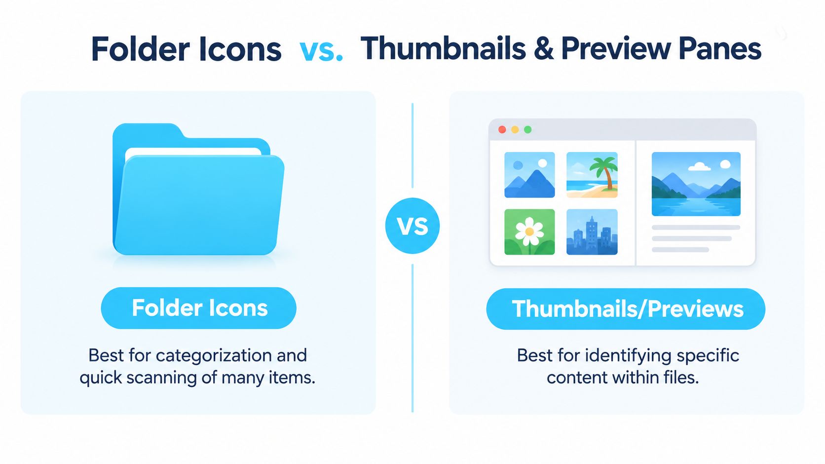
Recent independent coverage highlights that preview panes and thumbnail browsing let users identify content without opening each item, while multi-pane browsing reduces task-switching costs and cognitive load recent workflow coverage. That matters because a lot of visual-file-manager advice never compares folder cues against the browsing aids you already have.
Use the right visual layer for the right job
Folder icons are best when you need to move through a tree. If you've got ten client folders, the right color or overlay helps you choose the right branch fast. Thumbnails help when you're inside a folder and need to distinguish content items one by one.
Preview panes are even more direct for inspection. If you're looking at documents, images, or mixed media, the preview tells you what's inside without opening each file. Multi-pane browsing then lowers the amount of back-and-forth between locations, which helps when you're comparing groups side by side.
The practical rule is simple. If your folders are numerous and similarly named, folder-level visuals usually help more than thumbnails alone. If you're choosing between individual files inside one folder, thumbnails and preview panes do more of the work.
How to customize folder icons is a good companion if you want to compare folder styling with the browsing tools Finder already gives you.
Rule of thumb: folder visuals organize the tree, thumbnails and previews identify the contents.
Building a Visual Folder System on macOS
A good visual system starts with the folders you already open all day. In Finder, you can change folder icons through Get Info, paste in a custom image, and tune icon size and grid spacing in Icon view. That is fine for a few folders. Once the tree gets larger, the question becomes whether your eyes can still tell one branch from another at a glance.
Manual styling breaks down because every change has to be maintained by hand. For a small desktop, that feels manageable. For a working folder system, it turns into one more chore, and the visual clues stop helping because half of them drift out of date.
A workable setup starts small
Start with a small meaning set. Three to five categories is usually enough to make a folder tree readable without turning the desktop into a color chart. You might use one color for active client work, another for personal items, and another for archived folders. Save icons for the places where color alone still leaves you guessing.
Then batch-apply the styles instead of editing folders one by one. Consistency matters more than decoration. If the same cue means the same thing everywhere, your eyes can skip the decision-making and move straight to the right folder.
One option for scale is Tintd, which batch-applies icons and colors across whole folder trees, styles new folders automatically as they appear, and keeps everything local on your Mac Tintd. If you want to set the naming and grouping rules before you style anything, the step-by-step file organization system is a useful companion. For more practical setup ideas, Mac file organizer tips can help you decide how far to push Finder-based organization.
Best practice: style your top-level folders first, then automate the new ones so the system stays clean.
Local processing matters for a simple reason. Your folder names, styles, and habits stay on your Mac instead of being sent elsewhere. For many people, that privacy and speed tradeoff is part of the appeal.
Your Next Steps to a Scannable File System
Start by auditing the folders you open most often. If they all look the same, that's where the visual system pays off first. Don't try to redesign every folder in one sitting.
Choose a small set of meanings, then stick to them. Add color for broad groups, icons only where color isn't enough, and overlays when you need a second layer of meaning. If a folder style doesn't help you find something faster, remove it.
Then batch-apply the styles so the system feels coherent from the start. After that, set up automation for new folders, because the main win is a system that keeps itself tidy while you work. Prune old categories occasionally, and resist the urge to keep adding more colors just because they're available.
What you want is boring in the best possible way. You want folders you can see at a glance, months from now, without remembering a single path.
If you want a cleaner way to keep that system alive on your Mac, Tintd can apply folder colors and icons, batch-edit whole folder trees, and automatically style new folders as they appear. It's built for the exact problem this guide covers, fast visual recognition without hand-editing everything. Visit Tintd if you're ready to turn your folder list into something you can scan instead of search.