You know that half-second of hesitation before you click into a folder? You read the name, your brain processes it, then you go. Now multiply that by every folder, every day. It adds up. Color-coding kills that pause. Green means work, blue means clients, red means urgent, and your hand moves before you've even finished reading. That's the whole point. Not decoration. Speed.
Here's how to actually set up a color system on your Mac, the kind that makes Finder feel less like a filing cabinet and more like a dashboard.
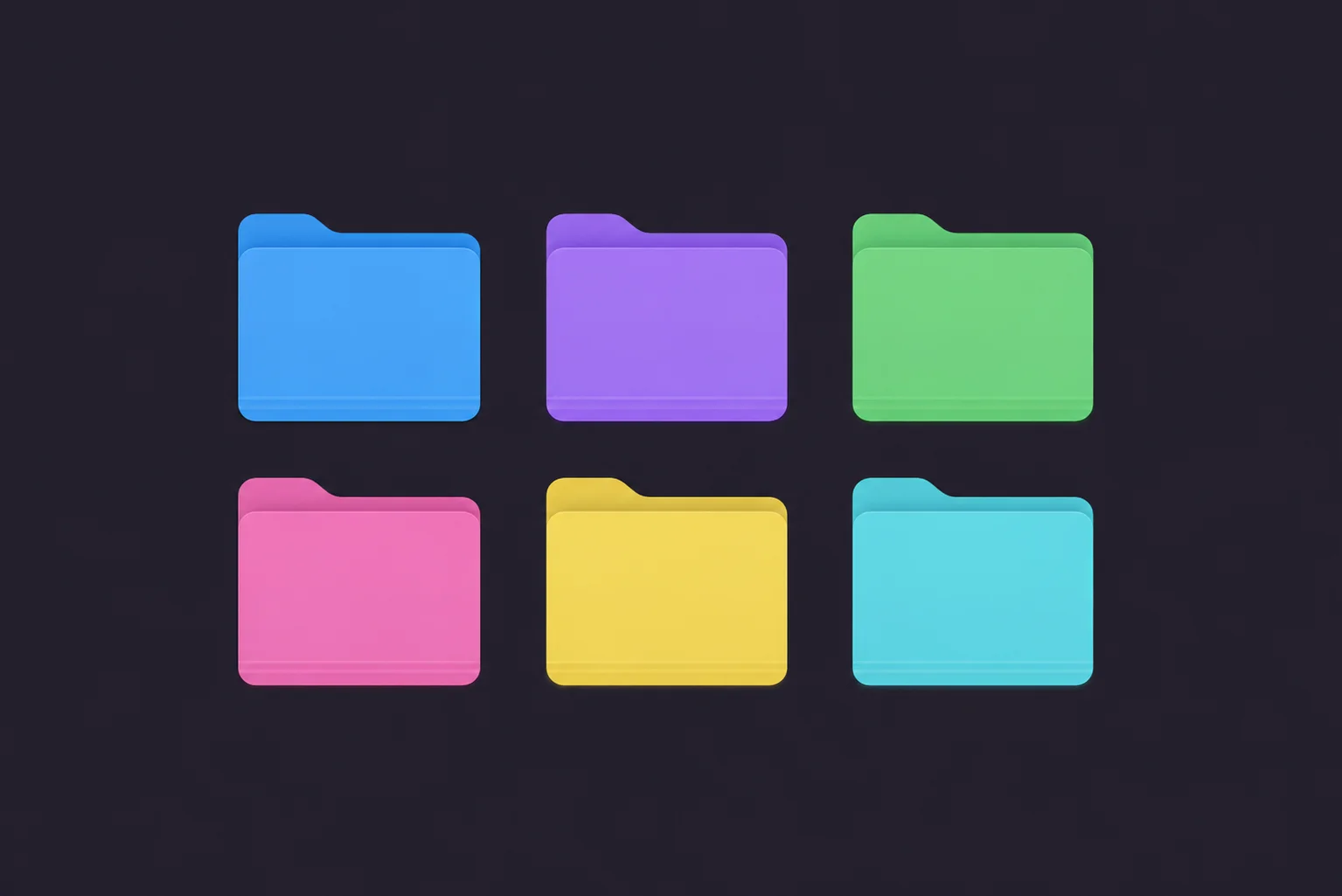
The Fast Way to Color-Code Folders: Tintd
First, a heads-up. macOS gives you colored tags, those little dots you can attach to files. But they don't change the folder itself, you have to be looking at the right column to even see them. Color-coding the actual folder icon is a different thing, and macOS has no real way to do it in bulk. That's where Tintd comes in.
Setting up a color system takes a couple of minutes:
Download Tintd and open it.
Drag in the folders you want to color, or right-click them in Finder and pick Tintd. You can grab a whole bunch at once.
Pick a color and dial in the intensity. Subtle pastel or bold and saturated, your call.
Apply. The folder icon itself changes color, right there in Finder. Repeat for each group in your system.
Why this method?
- Real folder colors: The icon changes, not a tiny tag dot off in some column.
- Batch it: Select a dozen folders and color them in one move.
- Intensity control: Tune how loud each color is, so your scheme isn't shouting.
- Add icons too: Pair each color with a matching icon for an even faster read.
Build a Color System That Actually Sticks
A color system only works if it's consistent. Random colors are just noise. So before you start clicking, spend two minutes deciding what each color means. Here's a simple starting point you can steal:
- Blue for work or active projects
- Green for finished or archived stuff
- Red or orange for urgent, needs-attention, deadlines
- Purple for personal
- Yellow for reference and resources
The exact colors don't matter. What matters is that you pick a meaning and stick to it everywhere. Once your brain learns "red equals deal with this now," it stops reading and starts reacting. That's the productivity win.
Pro Tip: Don't use more than five or six colors. I know it's tempting to give every category its own shade, but past six your eye can't tell them apart fast, and you've recreated the exact problem you were solving. Fewer colors, clearer meaning.
Color-Coding by Project vs. by Type
There are two ways people usually do this, and the right one depends on how you work.
By status
Color reflects where something is in your workflow. Active is blue, on-hold is gray, done is green. Great if your work moves through stages, since a glance at your folders shows you what's in flight and what's parked.
By category
Color reflects what kind of thing it is. Clients are blue, finances are green, design assets are purple. Better if you're juggling different types of work and want to jump to the right area instantly.
You can mix them, but honestly, pick one as your primary. A system that tries to do both at once usually ends up doing neither.
Make It Even Faster With Icons
Color gets you 80% of the way. Adding a small icon on top gets you the rest. A blue folder is "work," sure, but a blue folder with a little chart icon is "work, financial reports," no reading required. Tintd lets you drop an icon from a library of over 11,000 right onto the colored folder, so each one carries two layers of meaning at a glance. Color for the category, icon for the specifics.
Keeping the System Consistent Over Time
Here's the thing nobody tells you about color systems: the hard part isn't setting them up, it's keeping them up. You make a beautiful scheme, then three weeks later half your new folders are plain blue again because you forgot. If that sounds familiar, Tintd's Folder Watcher can auto-apply colors to new folders in the spots you care about, so your system maintains itself instead of slowly falling apart. Set the rules once, and new folders just join the scheme.
Wrapping Up
Color-coding folders isn't about making your Mac pretty, though it does that too. It's about cutting out the tiny moments of friction that pile up all day. When red means urgent and green means done, you navigate by reflex instead of by reading. Start small: pick four or five colors, give each a clear meaning, and color your most-used folders. Live with it for a week. I'd bet you won't go back to a wall of identical blue.
Frequently Asked Questions (FAQs)
How do I color-code folders on Mac?
macOS can't recolor the folder icon itself in bulk, only attach small color tags to files. To change the actual folder color, use an app like Tintd: drag in the folders, pick a color and intensity, and apply. You can color a whole batch of folders at once and build a consistent system in minutes.
What's the difference between Finder color tags and colored folders?
Finder tags are small colored dots attached to a file or folder, visible mainly in the sidebar or a Finder column. A colored folder changes the actual folder icon, so it's obvious at a glance no matter how you're viewing things. Tags label; colored icons transform. For an at-a-glance system, colored icons win.
How many colors should I use for a folder system?
Stick to five or six at most. Beyond that, colors start blending together and you lose the instant recognition that makes the system useful in the first place. Pick a small set, give each color a clear meaning, and use them consistently everywhere.
Should I color-code by project or by category?
Both work, so match it to how you think. Color by status (active, on-hold, done) if your work moves through stages and you want to see what's in flight. Color by category (clients, finances, personal) if you juggle different types of work and want to jump to the right area. Pick one as your primary rather than mixing.
Can I color multiple folders at once?
Yes. The slow part of any color system is doing it one folder at a time. Tintd lets you select a whole group of folders and apply the same color and icon together, so setting up or updating your scheme takes one pass instead of dozens.
Will new folders get colored automatically?
They can. Tintd's Folder Watcher can monitor the locations you choose and auto-apply colors and icons to new folders as they appear, so your system maintains itself. Without something like that, new folders show up as plain default blue and you have to remember to color them by hand.
Do colored folders stay if I move or back up the folder?
Yes. The color lives in the folder's own metadata, so it travels with the folder when you move it or back up your Mac. One heads-up: syncing through some cloud services doesn't always carry custom folder icons across to other devices.
Does color-coding folders work on the latest macOS?
Yes. Tintd supports macOS 14 and later, including the current release, and works the same way on Apple Silicon and Intel Macs. The colored icons show up everywhere Finder does: the desktop, sidebar, and folder windows.
Can I undo color-coding and get the default folder back?
Anytime. Drop the folder back into Tintd to change its color or strip the customization completely, which restores the plain macOS folder. Nothing is permanent, so you can experiment with a scheme and adjust it freely as your workflow changes.