You open Finder to grab one project file and get the familiar sinking feeling. Your Desktop is crowded with identical blue folders from a client handoff, Downloads contains months of overlapping installers and attachments, and the file you need is probably somewhere obvious, if only “obvious” still meant anything. You search, open several folders, lose the thread of what you were doing, and spend another few minutes reconstructing a filing decision you made earlier.
That's why a Mac file organizer shouldn't be judged only by how well it stores files. The more useful question is whether it helps you recognize the right folder before you have to search for it. Colors, icons, emoji, position, and consistent folder patterns turn a directory from a wall of names into something your eyes can scan.
Table of Contents
- What a Messy Finder Actually Costs You
- What a Mac File Organizer Actually Does
- The Features Worth Caring About
- Three Ways Mac Users Organize Files
- Setting Up a Visual System for Project Folders
- Why On-Device Tools Are Worth the Switch
- A Five-Minute Weekly Folder Routine
- Mac File Organizer Questions Worth Answering
What a Messy Finder Actually Costs You
A messy Finder window rarely looks dramatic at first. One folder lands on the Desktop, then another. A client sends a revised logo, a designer exports a new version, and someone downloads an archive with a nearly identical name. Nothing is technically lost, but every folder now asks you to read, remember, and compare before you can act.
That creates a recognition problem. A row of identical blue folder icons gives your eyes almost no useful difference to work with, so you fall back to slow name-by-name checking. “Final,” “Final 2,” and “Final revised” may all be readable, but they don't tell you what matters until you open them.
The cost appears in small interruptions:
- Finding context: You remember the project, but not the exact folder branch where its assets live.
- Resuming work: A workspace that made sense yesterday feels unfamiliar after a break.
- Handling handoffs: Incoming folders look like every other folder, even when they need immediate review.
- Starting cleanup: The mess feels too ambiguous to sort, so you postpone it.
Practical rule: If you keep using search to answer “which folder is this?”, your system has a recognition gap, not merely a storage gap.
macOS has supported visual folder customization for a long time. The classic Finder allowed extensive personalization, including custom folder icons, while the browser-like Finder introduced with Mac OS X 10.0 in 2001 standardized navigation around icons and views inside one window. That history helps explain why visual organization remains relevant across macOS generations. You can read more about the Finder's evolution in this history of Finder).
The system also preserves folder presentation through hidden .DS_Store metadata. It can retain details such as icon positions, view mode, column widths, sorting, and folder backgrounds, which shows that Finder treats presentation as part of the folder experience, not as decoration added afterward. A practical explanation of this metadata is available in this guide to .DS_Store files.
Once a folder has a meaningful color or symbol, your eye can land on it without decoding the entire filename. You click the project folder, keep your attention on the work, and leave the search box closed. The same principle applies outside Finder too. If a collaboration workspace has become irrelevant, knowing how to archive a Slack channel can remove another source of visual and mental clutter.
What a Mac File Organizer Actually Does
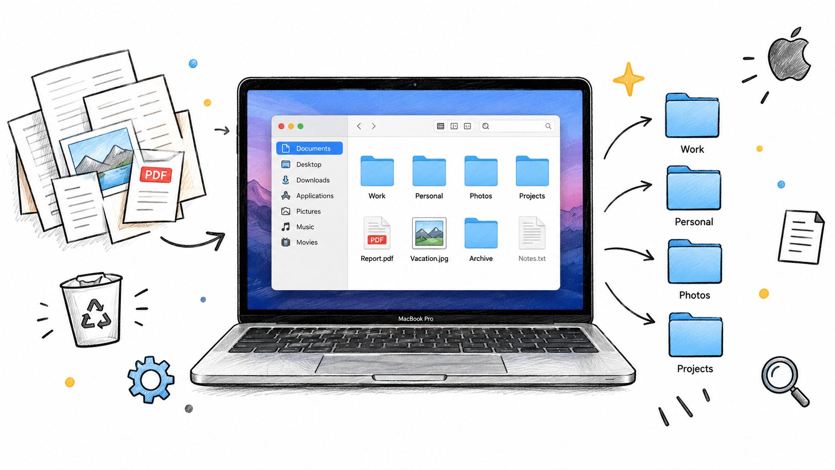
A Mac file organizer occupies a specific lane. It helps you identify, style, group, or maintain folders, but it isn't automatically a replacement for Finder and it shouldn't rearrange important files without your permission.
Start with what macOS already provides:
- Finder tags attach labels such as work, urgent, or personal to files and folders.
- Smart Folders save searches that update as matching items appear.
- Recent items provide a quick route back to files you've opened lately.
- Custom folder icons let you copy an image and paste it into a folder's Get Info window.
These features are useful, but they depend on habits. You need to remember to apply a tag, maintain a useful search, or repeat the icon process for each folder. Apple's own documentation confirms that Finder supports folder customization with colors, symbols, emoji, and custom icons, all through its built-in interface. You can review those controls in Apple's folder customization instructions.
The third-party layer
Dedicated tools add convenience around those native capabilities. They commonly sit in the menu bar, connect to Finder, or expose actions through a contextual menu. Their useful jobs usually fall into three groups:
- Apply visual styles in batches. Select several project folders and assign a shared color, icon, or emoji without repeating the same manual workflow.
- Create recognizable folder designs. Use templates, custom images, or icon libraries to distinguish invoices, drafts, client work, source assets, and completed projects.
- Support project-based grouping. Keep a project's working materials together instead of relying only on file extensions or a global search.
A Finder Sync extension can register monitored folders and add contextual menus, badges, toolbar buttons, and sidebar icons. Apple documents this Finder Sync extension model, which is the technical reason some utilities can work inside Finder rather than forcing you to switch to a separate file manager.
A visual organizer generally doesn't move, rename, or delete files unless you explicitly tell it to. That distinction matters. If your real need is a central library for images, video, and other media, a digital asset management system may be more appropriate. NanoPIM's explanation of centralizing media with DAM covers that broader category.
The Features Worth Caring About
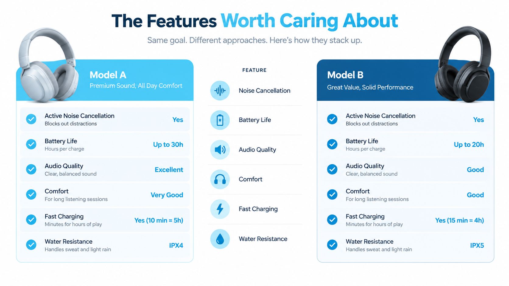
Not every organization feature pays off equally. The best choice depends on whether you usually remember where something is, what it means, or what it looks like.
Folder visuals have the highest everyday payoff
Color, icon, and emoji work before conscious reading. A red folder can mean needs attention, a green folder can mean approved, and a camera symbol can identify photography assets. The exact vocabulary is yours, which is the point. You're building recognition around the distinctions you already make.
Apple supports these visual changes natively, but manual customization becomes repetitive across a large project library. A dedicated tool is most useful when it can apply a consistent style to multiple folders and preserve that system as the workspace grows. For a native walkthrough, see this guide to adding an icon to a Mac folder.
Automation is valuable when it reinforces a rule
Automation earns its place when the action is predictable. For example, moving a completed project into an Archive folder should also make its status visually obvious. A watched location can apply a style when new folders appear, while a Finder-integrated action can keep the change close to the right-click menu.
The best automation doesn't create a complicated filing philosophy. It quietly reinforces one you already understand.
Search and Smart Folders are powerful, but interruptive
Search is excellent when recall matters more than recognition. If you remember a file contains a particular phrase but have no idea where you saved it, Spotlight or a Smart Folder can be faster than browsing. The trade-off is that search pulls you into a keyboard-and-results workflow, which can break the visual flow of navigating a project tree.
Use it for questions such as “show me PDFs modified recently,” not as the only way to distinguish active projects from archived ones.
Tags are useful metadata, not a complete visual language
Tags work well when an item belongs to more than one category. A contract might be both “Client” and “To review,” while a folder icon can communicate only the primary visual identity you chose. Tags also require ongoing maintenance and are easy to forget during busy handoffs.
| Feature | Best use | Where it falls short |
|---|---|---|
| Folder visuals | Immediate recognition during browsing | Needs a consistent visual vocabulary |
| Automation | Repeating predictable folder actions | Poor rules can create noise |
| Search and Smart Folders | Finding items by properties or text | Interrupts visual scanning |
| Tags | Cross-cutting status and categories | Depends on remembering to apply them |
The practical answer isn't to choose one feature forever. Use visuals for recognition, tags for status, and search for recall. Each solves a different kind of uncertainty.
Three Ways Mac Users Organize Files
Mac users usually settle into one of three approaches. The right choice depends less on technical ability than on how many folders you can comfortably maintain by hand.
Manual customization
The manual route uses Finder's Get Info panel, color labels, copied images, and custom icons. It's clear and costs nothing beyond your time. If you have a small set of important folders, this method can be perfectly adequate.
Its weakness appears when every new project needs the same treatment. The system has no natural inheritance for a new folder, so consistency depends on you remembering every step.
Tag-first organization
A tag-based system treats Finder metadata as the main navigation layer. You might tag items by client, workflow stage, or document type, then use Finder searches and Smart Folders to surface them.
This scales well when you remember attributes rather than locations. It's less satisfying when you want to glance across a directory and immediately see which folders are active, waiting, or complete. Tags answer “what label did I assign?” more readily than “which folder should my eye choose?”
Visual bulk tools
A dedicated visual tool applies folder styles across a hierarchy, often through batch controls, Finder menus, or watched locations. This approach carries a small setup cost, but it reduces the repeated effort that causes manual systems to decay.
Choose it when your folders outnumber your patience, especially if you work across client projects, creative assets, code repositories, or research materials. A visual system is only useful if you can keep it current without treating organization as a separate job.
| Approach | Best For | Scales To | Main Weakness |
|---|---|---|---|
| Manual icons and colors | A small set of important folders | Small libraries | Repetitive and hard to maintain |
| Finder tags and searches | Recall by status or attribute | Broad collections | Requires search and regular tagging |
| Visual bulk tools | Many project folders | Large, evolving workspaces | Needs an initial visual system |
For broader desktop cleanup, these Mac desktop organization ideas can help you decide what belongs on the Desktop before you style it. The decision criterion is simple: use manual customization for a compact library, tags when metadata matters most, and bulk visual tools when browsing has become exhausting.
Setting Up a Visual System for Project Folders
A visual system works best when it uses a small vocabulary. Start with three to five folder archetypes, not a different color and emoji for every possible meaning. Too much variation turns visual organization into another code you have to decode.
A practical set might look like this:
- Active: blue with a lightning or working symbol.
- Archived: gray with a box or storage symbol.
- Client: purple with a people or briefcase symbol.
- Personal: warm yellow with a home or heart symbol.
- Reference: green with a book or bookmark symbol.
The exact choices don't matter as much as consistency. Pick one color and one glyph for each category, then use those choices everywhere.

Style the highest-traffic folders first
Don't begin by redesigning your entire Mac. That's how a useful system becomes an abandoned afternoon project.
- Start with the Desktop. Give visible clutter an immediate status.
- Style the active project root. Make the folder you open most often easy to spot.
- Style one level inside it. Apply the same logic to Drafts, Final, Assets, and Notes.
Folder-level styling is more durable than styling every file inside. A folder can change names, contents, or location while still carrying its visual cue. That cue remains useful even when filenames evolve.
Use a shared project skeleton
Inside each project, keep a modest structure such as /Drafts, /Final, /Assets, and /Notes. The purpose isn't to create a perfect hierarchy. It's to give your hands a familiar route when you open a new project.
A folder organizer can help apply colors and icons across several locations, but the underlying structure still needs to make sense to you. This guide to color-coding folders on Mac offers another practical route for building that visual layer.
Write the rules in a short note and pin it near the top of the project folder. Include what each color means, which emoji belongs to each archetype, and where completed work goes. If you can't remember the system, Finder can't rescue it.
Why On-Device Tools Are Worth the Switch
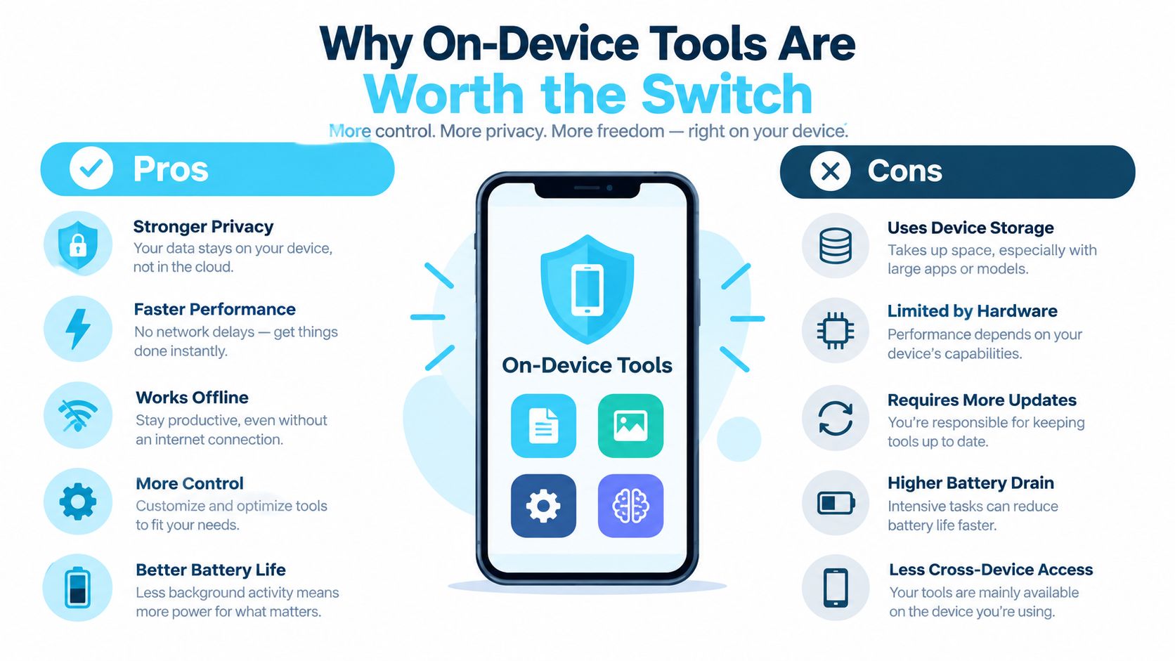
A folder organizer handles sensitive context even when it doesn't open file contents. Folder names may reveal clients, products, legal matters, health information, or unreleased work. An on-device utility can apply styles while keeping that metadata on your Mac.
Privacy is therefore more than a settings-page preference. A local workflow means you don't have to send folder names to a remote service just to choose a color or icon. That matters particularly when the organization itself tells a story.
Local processing removes needless dependencies
On-device tools read local filesystem metadata directly. They don't need to wait for a server response before showing a suggestion or applying a folder style. They also continue working when you're traveling, offline, or connected to an unreliable network.
Cloud software can be useful for shared libraries and cross-device coordination, but folder styling usually isn't a collaboration problem. It's a local interface problem. Adding an account, network dependency, or recurring sync process can make a tiny action feel heavier than it should.
What to check before installing
Look for clear answers to four questions:
- Does it process locally? The app should explain whether folder names and metadata leave the Mac.
- Does it integrate with Finder? Contextual actions reduce the friction of switching windows.
- Can it undo changes? Restoring the default macOS folder icon should be straightforward.
- Does it fit your payment preference? A one-time purchase may suit a utility you expect to use for years.
Tintd is one example of this category. It runs on-device, offers folder icons and emoji, supports batch editing and Finder context-menu actions, and can watch selected locations for new folders. It also includes a library of 11,000+ icons and emojis, as described by the publisher's product information, and provides a one-click route back to standard macOS folder icons.
The point isn't to outsource your filing decisions. It's to make the decisions you've already made visible and repeatable.
A Five-Minute Weekly Folder Routine
A visual system stays useful when maintenance is almost boring. Set aside a short weekly check and follow the same order every time.
- Scan Downloads first. Remove obvious installers and temporary items, then move anything worth keeping into an existing project or reference folder.
- Check the Desktop. Give each remaining folder a destination and apply the correct visual style to any new project root.
- Review active folders. If a project is finished, move it into the archive structure and update its appearance to match its new status.
- Refresh exceptions. Fix one or two folders that no longer follow your color and icon rules instead of attempting a total redesign.
- Empty the Trash when appropriate. Confirm that nothing important is waiting there before you clear it.
The routine works because it separates triage from deep cleanup. You don't need to resolve every ambiguous file during the weekly pass. Put uncertain items into a temporary review folder, style that folder clearly, and return to it when you have context.
Consistency also prevents the backlog that makes organization feel like a major project. A small recurring reset keeps recognition cues aligned with the actual state of your work.
Mac File Organizer Questions Worth Answering
How do I restore a folder's default icon?
Select the folder, press Command-I to open Get Info, and click the custom icon preview near the top of the window. Press Delete. Finder should return the folder to its standard macOS appearance.
Do custom folder styles sync through iCloud Drive?
Treat custom styling as potentially device-specific. File contents may sync through iCloud Drive, but Finder presentation metadata and third-party app state may not reproduce identically on another Mac. Check the organizer's sync documentation, and keep your visual rules in a note so you can reapply them if needed.
Do nested folders inherit a parent's style?
Usually, no. A parent folder's icon doesn't automatically turn every child folder into the same visual category. That's useful because you can style a project root as Active while using different cues for its Drafts, Final, Assets, and Notes folders. Apply child styles deliberately, and avoid adding so many variations that the hierarchy becomes harder to scan.
Tintd gives you on-device folder colors, icons, emoji, batch editing, Finder right-click actions, and automatic styling for new folders. If your Mac's problem is recognition rather than storage, visit Tintd and build a visual system you'll keep using.