You open a project folder on your Mac and find a wall of identical blue folders. Client work sits beside exports, research, invoices, drafts, and archived assets, but Finder gives you almost no visual help. You can read every name, of course, but reading is slower than recognizing a color or symbol at a glance.
That's why learning how to customize folder icons on Mac is more than a cosmetic exercise. A useful icon system turns a crowded directory into a visual index. macOS handles the basics well, but anyone managing a deep project tree quickly runs into the same limitation: native customization is designed for individual folders, not for consistent styling across a living file system.
Table of Contents
- The Problem With Default Blue Folders
- Changing Icons Using Native macOS Tools
- Styling Folders in Bulk With Tintd
- Importing Custom Images and Adjusting Overlays
- Automating New Folder Styling With Folder Watcher
- Restoring Defaults and Managing Your History
The Problem With Default Blue Folders
The default blue folder works when you have a small, simple file structure. It becomes a liability when every project contains the same categories. A folder named “Assets” may sit beside another “Assets” folder for a different client, and Finder's identical icons force you to pause and read the surrounding text each time.
Color and symbols give those folders a second layer of meaning. A red folder can signal urgent work, a camera symbol can identify raw photography, and a document symbol can distinguish contracts from production files. These cues don't replace clear naming, but they reduce the amount of visual parsing required before you choose the right folder.
Practical rule: Use folder names for precise information and icons for quick classification. Don't ask one system to do both jobs.
Apple has supported custom folder icons since the classic Mac OS era. Commentary on macOS history traces custom icon data to hidden folder resources stored since 1984, while current Finder documentation describes a native Customize Folder command for changing a folder's color, symbol, or emoji. Apple's current folder customization guide presents the feature as a way to make items stand out in Finder, not as a separate design application.
The feature's long history also reveals the central trade-off. Mac folder customization has always been available, but the operating system treats each folder as an individual object. If you're styling a small set of folders, that's manageable. If you're building a consistent visual language across several project directories, repeating the same interaction becomes tedious and the system starts to drift.
Start with a file system you can maintain
Icons work best when they support a broader organization method. Clear parent folders, consistent naming, and sensible project categories still matter. For practical guidance on reducing clutter before styling, Bulk Image Generation's file system tips offers useful advice about arranging digital files before adding visual labels.
A related workflow is covered in this guide to organizing files on a Mac. The important principle is simple: don't decorate chaos and expect decoration to solve it. First decide what each folder means, then use color and overlays to make those meanings easier to recognize.
Changing Icons Using Native macOS Tools
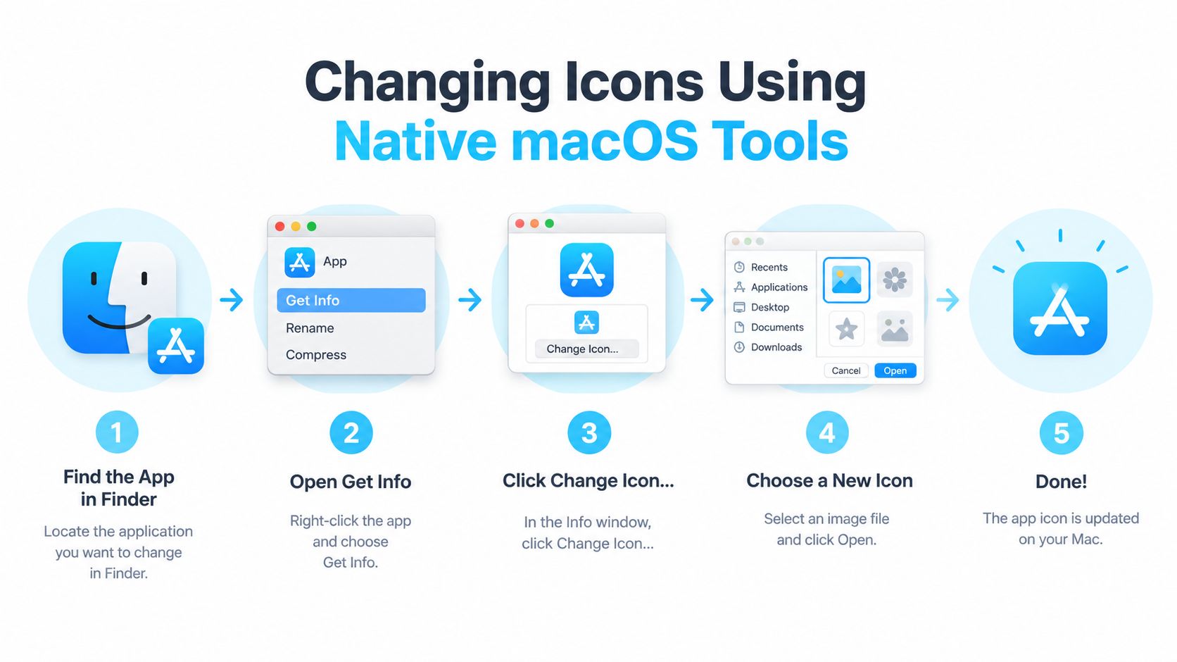
macOS gives you two useful native workflows. The first uses Finder's built-in customization controls. The second replaces the folder's icon with an image through the Get Info window.
Use Finder's Customize Folder command
Select a folder in Finder, then open its context menu and choose Customize Folder. Depending on your macOS version, you can change the folder color, add a symbol, or add an emoji. Choose a visual label that reflects the folder's role, then close the customization controls and return to Finder.
The native options are deliberately lightweight. A color is useful for broad grouping, while an emoji or symbol adds a more specific cue. For example, you might use one color for active client work and different symbols for design, delivery, or administration.
Finder also separates the folder's icon from the way Finder displays the folder. Open the folder, choose View > Show View Options, or press Command-J, then adjust the icon size and grid spacing in Icon view. Apple documents these controls in its guide to customizing Finder views. Larger icons can make symbols easier to identify, while tighter spacing can help you see more items at once.
Replace the icon with a custom image
For a fully custom folder icon, prepare an image and open it in Finder. Select the image, copy it, select the destination folder, and press Command-I to open its Get Info window. Click the small folder icon at the top of that window, then paste the image. You can also drag an image onto that small icon area, a workflow described in this guide to adding a custom icon to a Mac folder.
To remove the custom image later, open Get Info again, select the small icon at the top, and press Delete. The folder returns to its standard appearance.
Native tools work well for a handful of deliberate changes. They don't automatically style newly created folders, and each folder generally requires its own action. View settings also don't replace the underlying icon, so changing icon size or grid spacing won't create a visual classification system by itself.
Styling Folders in Bulk With Tintd
Manual Finder customization breaks down when the same visual system needs to cover multiple folders and subfolders. A bulk workflow lets you make the classification decision once, apply it to a selected group, and review the result as a coherent set.
Tintd is a macOS application that assigns customized icons and colors to Finder folders through manual controls and automated rules. It offers batch editing, a library of icons and emojis, Smart Icon and Smart Color suggestions, custom image support, Finder context-menu integration, and local processing without cloud or AI calls.
Build a consistent set
Start by selecting the parent directory or the folders you want to style. You can add multiple directories, then use the batch controls to apply a shared color palette or icon set across a group. This is useful for project trees where sibling folders have related roles, such as source files, references, exports, and delivery materials.
Smart Icon and Smart Color use folder names and nearby folders to suggest styles. The value isn't just speed. Suggestions based on neighboring folders can help prevent a common problem with manual styling, where every folder receives a visually unrelated color and the directory becomes harder to interpret.
A practical workflow looks like this:
- Choose the scope. Start with one project tree or one stable parent folder rather than styling your entire drive at once.
- Set the visual grammar. Decide whether colors represent status, department, file type, or project ownership.
- Review smart suggestions. Accept useful matches, but override ambiguous names and folders with special meaning.
- Apply in batches. Style related folders together so the result feels intentional in Finder.
- Check the folder at normal viewing size. An icon that looks clear in a picker may be too detailed when viewed among neighboring folders.
What bulk editing does and doesn't solve
Bulk editing removes repetitive selection and replacement work, but it doesn't decide what your organization should mean. If a folder name is vague, the suggested icon may be equally vague. If your colors have no defined purpose, applying them consistently won't make the system useful.
The strongest setup combines broad rules with selective review. Apply a shared treatment to predictable categories, then manually adjust exceptions such as confidential work, final deliveries, or folders that must remain visually neutral for handoff. Since processing remains on the Mac, folder names and usage don't need to be sent to an external service for suggestions.
The result is a system that's easier to scan because the same visual cue keeps the same meaning across a project tree. That consistency matters more than adding decoration to every available folder.
Importing Custom Images and Adjusting Overlays
A built-in icon library can cover common categories, but creative teams often need something more specific. A studio may want a client-approved mark, a photographer may want a recognizable project badge, and a design team may need an internal asset that doesn't map cleanly to a standard emoji.
Use a high-resolution PNG with a transparent background whenever possible. Transparency prevents a white rectangle from appearing around the artwork, while sufficient resolution keeps the overlay clean when Finder displays the folder at a larger size. Keep the design simple, because fine detail disappears quickly at typical Finder sizes.

Import and position the artwork
In Tintd, choose the option to import a custom image, then select the prepared asset from Finder. Use the preview to decide whether the overlay communicates clearly against the folder base. If the artwork feels cramped, reduce its size. If it disappears into the folder, increase it or choose a stronger base color.
The useful controls are granular:
- Overlay size: Scale the imported image so it remains recognizable without covering the folder shape.
- Base color: Choose a folder color that supports contrast and fits the surrounding visual system.
- Placement: Adjust the position so the image sits naturally within the folder design rather than appearing stuck to one edge.
- Transparency: Preserve transparent edges to avoid visible boxes around logos, illustrations, or symbols.
- Consistency: Reuse the same treatment for related folders instead of creating a different composition for every directory.
The technical choice affects practical recognition. A logo with several small elements may look impressive in the source file but become indistinct in Finder. A simplified mark, strong silhouette, or single letter often survives the reduction better.
Match the icon to its context
Custom images are most useful when they carry information that a generic symbol can't. They're less useful when they're purely decorative or visually similar to nearby folders. Before applying a design broadly, view it beside the folders that will surround it and check whether you can identify it without reading the name.
Don't use brand assets without considering sharing and handoff. A personal visual system may be helpful on your Mac but confusing for a client who expects standard Finder conventions. Keep custom images tied to a clear purpose, and reserve the most distinctive treatments for folders that benefit most from fast recognition.
Automating New Folder Styling With Folder Watcher
A carefully styled directory can lose its visual logic the moment someone creates a new folder inside it. Native macOS customization doesn't automatically carry your icon choices into newly created directories, so the system becomes reactive. You notice the plain blue folder, decide it needs attention, and repeat the manual process.
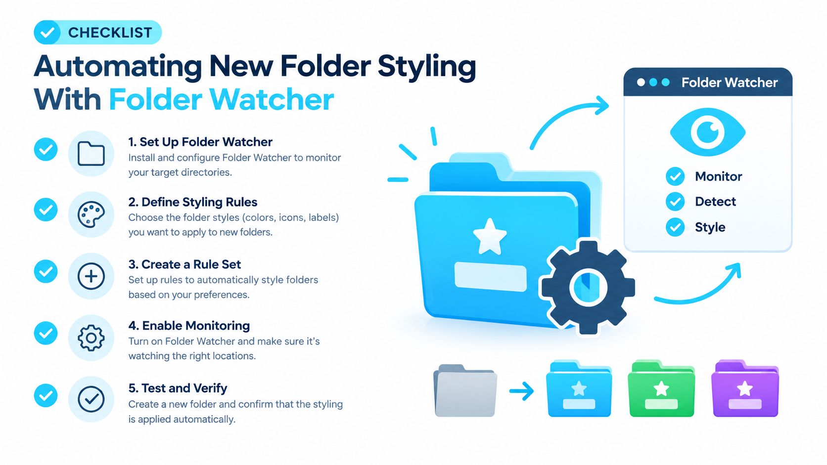
Folder Watcher changes the workflow from styling after creation to defining rules before creation. In Tintd, you select a parent location, create matching rules, and allow the watcher to detect new folders in that location. When a new directory matches a rule, the application applies the associated style in the background.
Set rules around stable parent folders
Begin with a parent directory whose purpose is clear, such as a Clients or Projects folder. Grant the application the required Full Disk Access permission in macOS when prompted. Without that permission, a watcher may not be able to observe or update folders in protected locations.
Create rules that reflect how your directory is used:
- Select the parent location. Choose the folder where new directories regularly appear.
- Define the match. Use folder names, categories, or the structure available in the application's rule controls.
- Assign the treatment. Choose a color, icon, emoji overlay, or custom style for matching folders.
- Test an exception. Create or add a folder with an ambiguous name and confirm that the rule behaves as expected.
- Leave the watcher active. The purpose is to keep the visual system current without another manual pass.
The guide to automatically changing folder icons on Mac covers the same watcher-oriented workflow in more detail.
Use automation with restraint
Rules are powerful when folder names are predictable. They're risky when a parent directory contains unrelated content or when names are inconsistent. A rule that applies one style to every child can flatten meaningful distinctions, while an overly specific rule may miss folders created with a slightly different name.
Automation works best when it follows a naming convention. The clearer the folder names and parent structure, the less often you'll need to correct the result.
Keep watched locations narrow at first. Review the first few results, refine the matching logic, and expand only when the outcome is predictable. Local, offline processing is also useful for sensitive project structures because folder names remain on the device rather than being sent to an online service.
Restoring Defaults and Managing Your History
Folder styling should be reversible. A project may move to an archive, a client may prefer standard macOS icons, or a visual convention may stop making sense after your directory changes. A good system lets you undo a treatment without hunting through folders one by one.
Tintd includes a one-click restore action that returns selected folders to the default macOS folder icons. Use it selectively when only part of a project needs to be reset, or apply it to a completed group before handing the files to someone else.
History provides the opposite operation. Instead of rebuilding a successful combination of color and overlay, reuse a previous style from the saved list. This is especially useful when a recurring project follows the same folder structure and you want the next version to resemble the previous one.
Keep the visual system maintainable by reviewing it when your file structure changes. Remove rules that no longer match, reserve distinctive colors for categories that matter, and restore folders that no longer need special treatment. The best icon system stays legible because it remains selective.
Tintd gives Mac users manual controls, batch editing, smart folder styling, custom image imports, and Folder Watcher rules for keeping new directories consistent. Visit Tintd to move from repetitive icon swapping to a folder system that stays organized as your projects grow.