
Two blue folders sit side by side in your project directory. Then four. Then a dozen, all the same shade of Finder blue, all identical down to the tab, and the only thing separating the one holding client invoices from the one holding design assets is a line of grey text underneath. After the sixth folder you stop reading the names and start hovering over them.
The usual fix is a custom icon, and the sharpest-looking ones are transparent: a symbol, a logo or an emoji with nothing behind it. That's where the confusion starts. Transparent artwork behaves differently from artwork with a solid background, and once you understand what Finder does with the image, you can predict when your icon will look crisp, when it will vanish into the wallpaper, and when it will disappear entirely on another Mac.
What a Transparent Folder Icon Is
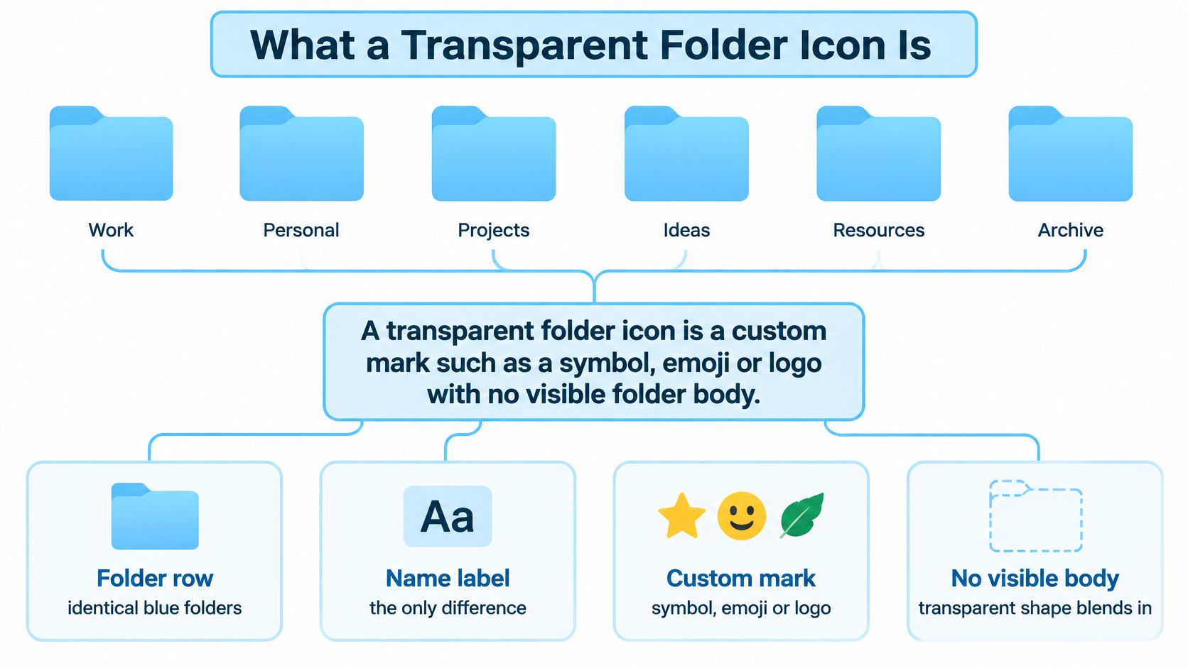
A transparent folder icon is a custom mark such as a symbol, emoji or logo with no visible folder body behind it. The transparent pixels let whatever sits behind the folder show through, so a folder with a transparent icon can read as a floating glyph rather than a folder at all. That's a feature when you're organizing a project tree and a problem when you scan a window at speed.
Think of the default folder as a wooden door with its paint already on. It has a color, a frame, a handle. A transparent icon is a decal you stick onto that door, and a decal with no backing of its own lets the grain show through. Beautiful on a plain wall, invisible on busy brickwork. Hold onto that image, because most of the surprises later come from the wall behind the decal, not the decal itself.
Where the icon actually lives
The image never becomes a file inside the folder. macOS stores it as Finder metadata tied to the folder, which is why a folder can look completely different while every file and subfolder inside it stays exactly where it was. Custom folder icons are a foundational Mac feature rather than a recent add-on, and a history of custom Finder icons traces the underlying icns resource to resource ID -16455, with a format lineage reaching back to 1984, the year the first Macintosh shipped.
The workflow you'd use today is the same one people used then. Copy an image, select the small icon at the top of the folder's Get Info panel, paste. Apple's current documentation confirms you can assign a custom icon to any file or folder using your own pictures, a downloaded icon, or another file or folder's icon. Because the artwork lives in metadata rather than in the folder, changing an icon or a color is purely cosmetic. Nothing inside gets renamed, moved or altered, and no subfolder is affected.
A ten-second check on any folder
Right-click the folder and choose Get Info. Look at the small icon at the top left of the panel. A plain blue folder means it's still default. A symbol, emoji, color or image means someone has customized it, and selecting that icon and pressing Delete puts the stock folder back.
Reading names instead of seeing icons costs real time. In 2025, U.S. employees surveyed by Smallpdf's digital declutter report spent an average of 4.5 hours per week searching for files, emails or links they had already seen, which adds up to 29 workdays a year. A mark you can recognize at a glance is cheaper than a name you have to read.
Choose the Right Method and Next Step
Three routes get a custom look onto a folder in Finder. They differ in how much control you get over the artwork and in how much of macOS you can reach.
| Method | Available on | Own transparent artwork | Best for |
|---|---|---|---|
| Customize Folder (color, symbol or emoji) | Recent macOS versions | No, it uses Apple's color, symbol and emoji options | Quick, consistent color coding |
| Get Info paste of a PNG | Any macOS version | Yes, full control over transparency | One-off custom icons on single folders |
| Batch tool such as Tintd | macOS with the app installed | Yes, imported images as well as built-in icons | Large project trees and bulk styling |
Customize Folder, for color and quick marks
This is the fastest route on a current Mac. You pick a swatch to tint the standard folder shape, then add a symbol or emoji on top, all from a menu inside Finder. The styling is applied through Apple's own system, so it looks native and stays consistent across your desktop. The trade-off is that you're choosing from Apple's set of colors and marks, not supplying your own artwork.
Get Info paste, for your own transparent PNG
The old method still wins on control. Copy any image with a real transparent background, open the folder's Get Info panel, click the small icon at the top left and paste. This works on every macOS version you're likely to meet and gives you total say over the artwork, including transparency. It's slower per folder, which only matters once you're doing this at scale.
A batch tool, for scale
When you're styling dozens of folders a week, doing them one at a time stops being a workflow. Tintd handles this by letting you select several folders and apply a color and icon in one action, or by letting its Folder Watcher style new folders automatically as you create them, and any customized folder can be reverted to the original macOS Finder icon with one click. That combination matters more than it sounds, because icon schemes change and reverting by hand is tedious.
The rule matters more than the tool. Consistency is what makes color coding readable, and a scheme invented folder by folder has no consistency to offer.
Start with one action: pick a single folder, apply one method, then run the wallpaper and sync checks further down before you scale the scheme to the rest of your structure. If you'd rather start from ready-made artwork, browsing a Mac icon pack gives you a feel for what reads well at Finder sizes.
Customize Folder Steps on Recent macOS
On recent macOS versions, Customize Folder lives in the folder's context menu and covers three styling dimensions at once. Apple's Mac user guide for customizing folders and files describes choosing a folder color, adding a symbol, or adding an emoji, while the option to use a fully custom image remains available for any file or folder.
- Select the folder in Finder and open its context menu, then choose Customize Folder. The command sits alongside the usual Get Info and Rename items, so there's no app to install.
- Pick a color swatch first. The color tints the standard folder shape and becomes the base layer of the whole style, which means your choice here sets the contrast for everything stacked on top.
- Add a symbol or emoji. This places a mark on the folder without any custom background, so the artwork stays inside Apple's system and scales cleanly.
- Check the result in both List and Icon view. A mark that's legible at Icon size can turn into a smudge in List view, and the fix is usually a simpler symbol rather than a bigger one.
- Reverse it the same way. Open Customize Folder again and return the folder to its default style if the scheme doesn't survive contact with your real workflow.
The symbols offered here come from SF Symbols, which Apple's design guidance describes as a library of thousands of configurable symbols drawn to align with the San Francisco system font across weights and sizes. That's why they look native. It's also why the picker feels endless if you don't arrive with a category in mind.
When the command isn't there
If Customize Folder is missing, you're either on an older macOS release or looking at a protected system location. Neither is a dead end: fall back to the Get Info paste method covered next. What this method can't do is accept your own transparent artwork, so use it for color coding and reach for the paste method when you want your own image on the folder.
How to Make and Apply a Transparent PNG Icon
The paste method gets you a transparent icon in about a minute once you have the image ready. The image is where many people go wrong, so the steps below flag the reason for each move and the slip that usually follows.
Start with a square source image at least 512 x 512 px, ideally 1024 x 1024 px. Finder generates several sizes from your artwork, so a large square source keeps edges crisp at every one. The common slip is using a screenshot or a logo pulled from a website, which looks soft the moment Finder scales it down.
Remove the background so the image has genuine transparency, then save as PNG. A PNG stores transparency; a JPEG doesn't, and it will paste as a visible white box around your mark. If you're cutting the background out with an automated tool rather than by hand, comparing background removal models first is worth ten minutes, because edge quality on thin strokes is what decides whether the icon survives at small sizes.
Keep the main shape inside a margin of roughly 10 percent on every side. Finder doesn't crop your image, but a mark that runs to the edge reads as cramped and loses the breathing room native icons have. The slip here is a design that fills the canvas in your editor and looks squeezed in Finder.
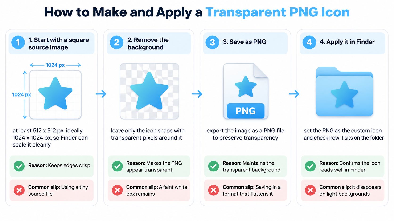
Open the PNG in Preview and copy it with Command-C. Preview preserves the transparency information on copy, which a quick drag from some other apps doesn't.
Select the folder and press Command-I. Get Info opens a panel where the folder's current icon sits at the top left, just below the name.
Click that small icon so it gets a blue outline, then press Command-V. The paste only works when the icon itself is selected rather than the panel. If nothing happens, you clicked the wrong spot, so click the icon again.
Close Get Info and check the folder in List and Icon views. This is your first real test of whether the transparency works in context. An icon that reads clearly in a big Icon view can turn faint in the narrow List column.
To undo, open Get Info, click the custom icon and press Delete. The stock macOS folder returns immediately. Nothing inside the folder is affected either way.
The developer version of the same operation
macOS exposes this through the AppKit API documented by Apple's NSWorkspace reference), which accepts an arbitrary image, transparent artwork included, and generates the icon representations Finder needs automatically. Two constraints matter if you're scripting it. The target must already exist, and it must be writable, so a script should check both the path and the permissions before it reports success.
If you're building a repeatable setup, this is also how batch tools stamp one icon across many directories without touching their names or contents. Rendering size, color and placement into the source image before assignment gives you consistent results across the whole set. For a deeper walkthrough of the manual route, this guide to custom folder icons on Mac covers the Finder side in more detail.
Why Transparent Icons Can Disappear in Finder
Here's the part most tutorials skip. Transparency isn't automatically the more native or more usable choice, because an icon has to survive four different display contexts and you're usually judging it in only one of them. Guides commonly recommend a square PNG with a transparent background because it resembles a native Mac icon, but guidance on Mac folder color and icons notes that transparency can reduce recognition at small Finder sizes, over varied wallpapers, and in newer translucent interface styles.
- Transparent PNG, upside: it blends with the desktop, looks light and native, and works beautifully for a simple silhouette on a plain wallpaper.
- Transparent PNG, downside: fine detail fades at List and Column sizes, and the mark loses contrast against a photographic wallpaper.
- Opaque colored tile, upside: edge contrast holds, so a folder reads instantly in a long list and stays visible on any background.
- Opaque colored tile, downside: it looks less delicate, and a heavy tile repeated a hundred times can feel loud on a light desktop.
The Tahoe variable
macOS Tahoe introduced Clear and Tinted icon styles, which let background color show through interface elements and change how contrast reads on screen. An icon you tuned on an earlier release can look washed out under those styles, and accessibility settings matter too: a reader with Reduce Transparency enabled sees a different visual hierarchy from one who keeps translucent effects on. Neither view is wrong. They're just different, and your icon has to work in both.
| Icon type | List and Column sizes | Busy wallpaper | Tahoe Clear or Tinted styles | Best use |
|---|---|---|---|---|
| Transparent PNG | Weaker, fine detail fades | Weaker, background shows through | Weaker, Clear and Tinted styles show color | Simple silhouettes on plain desktops |
| Opaque colored tile | Stronger edge contrast | Stronger, tile holds its shape | Stronger, background stays visible | Large project trees and fast scanning |
| Folder-shaped PNG | Good when the shape is kept | Good | Good | Recognition at a glance |
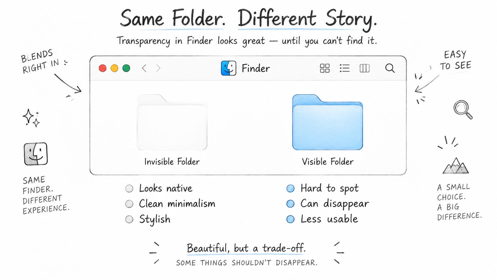
Test each icon at the four sizes Finder uses: List, Column, Icon and sidebar. For project folders, a slightly opaque, consistent background usually beats a minimal transparent mark, because the job is recognition at speed, not decoration. If you want a faster way to apply and swap those treatments while you're testing, a Mac icon changer workflow cuts the back-and-forth considerably.
The test that settles it
Switch Finder to List mode and look at the folder there. Then change your wallpaper to the busiest image you own and check again. If the mark still reads in both conditions, the icon is doing its job. If it dissolves, you've found the wall behind the decal.
Where Custom Icons Survive and Where They Vanish
The files are all there. Every subfolder, every document, byte for byte. And the icon is gone, replaced by a plain blue folder on a Mac that's never seen your color scheme.
That's the wrong thing to be surprised by. Custom icon data is stored locally on each Mac, so any customization has to be set up separately on every machine, and Finder metadata, resource forks and extended attributes don't travel the same way across devices, archives and sync services. Apple's own documentation on customizing folders and files covers how to set an icon, while portability depends entirely on where the folder goes next. Visual consistency can be lost even when nothing inside the folder is at risk.
| Location or workflow | Icon usually survives? | Main risk | Safer approach |
|---|---|---|---|
| Local internal drive | Yes | Low risk while the folder stays put | Apply icons here and keep the folder in place |
| iCloud Drive | Sometimes, not guaranteed | Sync may not preserve Finder metadata | Check the icon on a second Mac before relying on it |
| External or removable disk | Often, until the disk is reformatted | Copying or formatting may drop metadata | Copy, check the icon, then remove the original |
| ZIP archive | Often not | Icon metadata is usually stripped | Add a labeled folder name or a README |
| Shared project folder on another Mac | Often not | The icon must be set on each Mac | Document the icon scheme in a shared note |
The test routine that saves you
Apply the icon, move or sync a copy, then check the destination before you delete anything. You're verifying the outcome rather than trusting the mechanism, and it takes two minutes per workflow.
For compressed delivery packages, assume the icon won't survive and plan around it. A labeled folder name and a short README describing the color scheme do more for the recipient than a mark that never arrives. And if Customize Folder is unavailable in a protected system location, a pasted custom image may be your only option there, so it's worth knowing both methods.
If you're preparing a handoff for a team, write the scheme down: which color belongs to which category, and which symbols map to which subfolder types. A one-page note in the project root rebuilds the whole visual system on a new Mac in minutes.
That's the shift worth making. The question isn't how to make an icon. It's how to keep the visual system working when the folder leaves this Mac.
Tintd applies colors and icons across whole folder trees in a few clicks, imports your own transparent PNGs when you want custom artwork, and reverts any folder to the stock macOS icon when a scheme changes. Everything runs locally on your Mac, so folder names stay private, and the Folder Watcher styles new folders as you create them. Visit Tintd to try it on your own project structure.