
You've got a Finder window open with forty identical blue folders, and you're reading names one by one to find the right client, tax year, or photo shoot. That's the moment custom folder icons start to make sense. A color, symbol, or image lets you spot a folder before you finish reading its name. It won't fix a messy naming scheme, and it won't help Spotlight find anything faster. Used on top of clear names and tags, though, it's one of the fastest ways to make a crowded directory scannable.
Pick the Right Way to Set a Folder Icon
Start with how many folders you're changing, not which tool looks nicest. One folder, a handful, and a directory that grows every week are three different jobs.
| Method | Best for | How you apply it |
|---|---|---|
| Finder Get Info paste | One folder with any image | Copy an image, open Get Info, click the small icon, paste |
| Finder tag color | Quick status cues without changing the icon | Right-click the folder and assign a tag |
| Tintd drag-and-drop | Emoji or library icons on several folders | Choose the icon from the app's library, then drag it onto one or more folders |
| Tintd Folder Watcher | New folders created in chosen locations | Point it at the folders you want watched |
Get Info is the native route, and the slowest at scale. Tintd speeds up the repeat work: pick an icon from the library, drop it on a selection, and move on. Manual color changes in Tintd don't require Full Disk Access. The Folder Watcher handles new folders after they appear in the locations you choose.
What Icons Can't Do
Icons speed up recognition in icon view. They do nothing for search. In icon view, a red receipt or a green camera lets you skip reading. In list view, that cue shrinks to a thumbnail and the name still does the work. Finder search, Spotlight, keyboard navigation, and list view lean on names and tags. Tags stay searchable from the Finder sidebar and travel with items across local and iCloud storage, while custom appearance mainly helps items stand out.
Build two layers. Keep stable names like 2026 ClientName Invoices and add Finder tags for status or client. Then add color or an icon for the glance. I'd treat the icon as a second layer because it changes how fast you spot a folder, not how fast you find it. If you want a broader naming structure first, our guide to Mac folder organization pairs well with this approach.
Colors alone also have limits. Some people can't tell similar colors apart, emoji can render differently across macOS versions, and too many different symbols turn into noise. Pair color with shape or a clear name, and keep your system small enough to remember without a legend.
Prepare an Image That Reads at Small Sizes
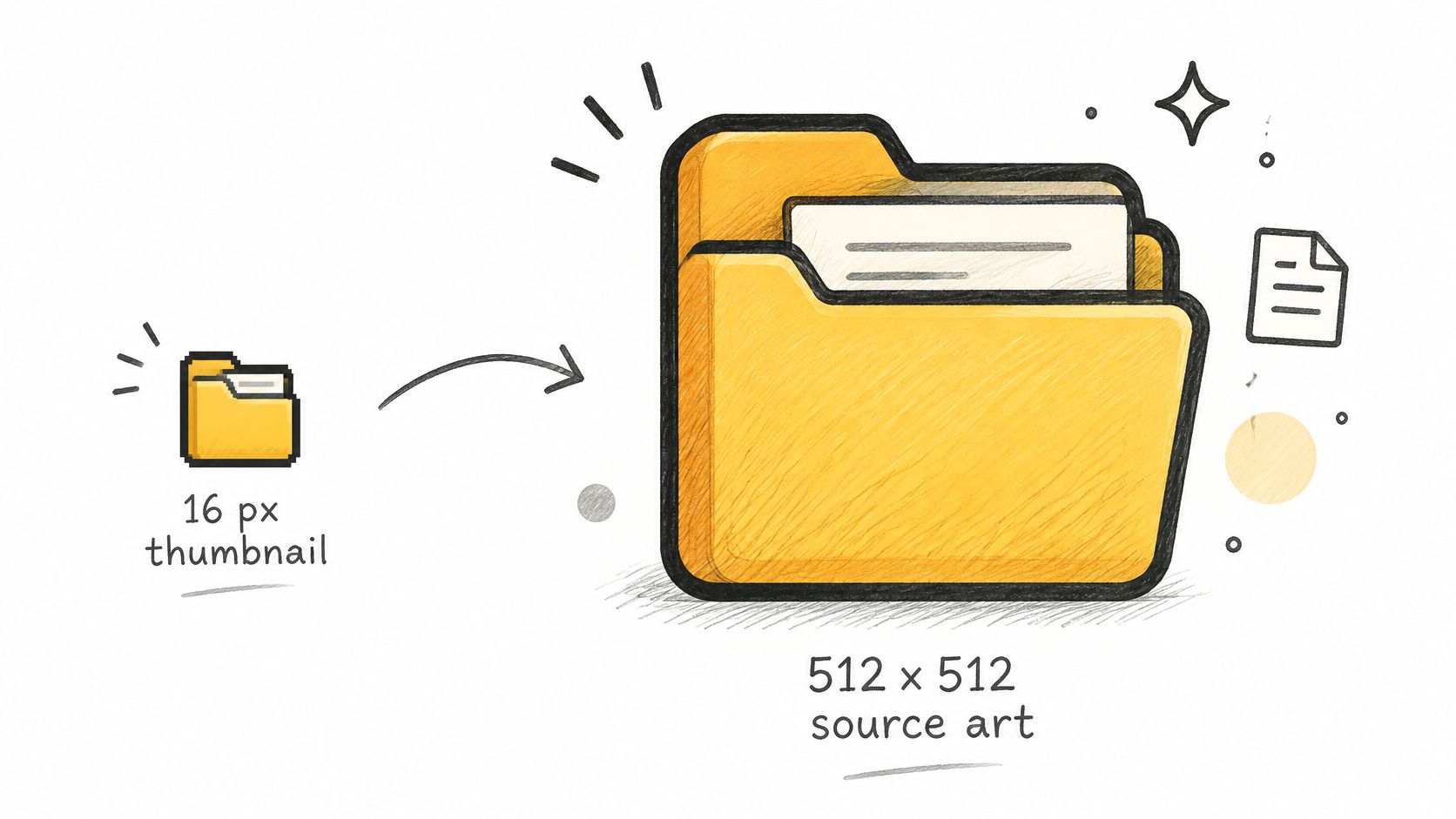
Your icon has to survive two extremes. It may fill a large icon view, or shrink to a thumbnail in a list. Apple's Human Interface Guidelines for app icons specify a 1024 × 1024 pixel layout size for macOS app icons and warn that a document icon may appear as small as 16 × 16 pixels and must remain recognizable at that size. Earlier Finder guidance recommended 512 × 512 pixel source artwork plus 32 × 32 and 16 × 16 pixel hint sizes for consistent rendering.
That range is the whole design problem. Fine lines, small text, and busy photos vanish first. One bold shape with strong contrast survives.
The illustration below shows the scale gap you're designing for, from a tiny list thumbnail to a full source image.
A Simple Preparation Workflow
- Start square: Use a 512 × 512 pixel PNG or larger, ideally with a transparent background.
- Pick one cue: Center a single receipt, camera, house, or other bold shape. Don't stack three symbols.
- Strip detail: Remove fine text, thin outlines, and small decorations. If it needs explanation, it's too complex.
- Export and keep the source: Save the PNG where you can find it again for reuse or edits.
- Test at real sizes: Check it in icon view, then switch to list view and look at a glance.
Say you're styling a Taxes folder. One large receipt symbol reads instantly. A paragraph from a tax form, shrunk to list size, becomes gray smudge. That same test applies if you're picking from a Mac icon pack instead of drawing your own.
If the central shape disappears at list-view size, simplify it until it reads at a glance. Don't enlarge detail. Remove it.
I would rather see a plain, high-contrast shape that looks slightly dull at full size than a clever image nobody can identify in the view they use.
How to Set an Icon with Get Info
For a single folder, you don't need another app. Apple's guide to customizing folders and files on Mac confirms you can replace an icon with an image, an icon downloaded from the web, or the icon copied from another file or folder, and separately customize folders with colors, symbols, or emoji.
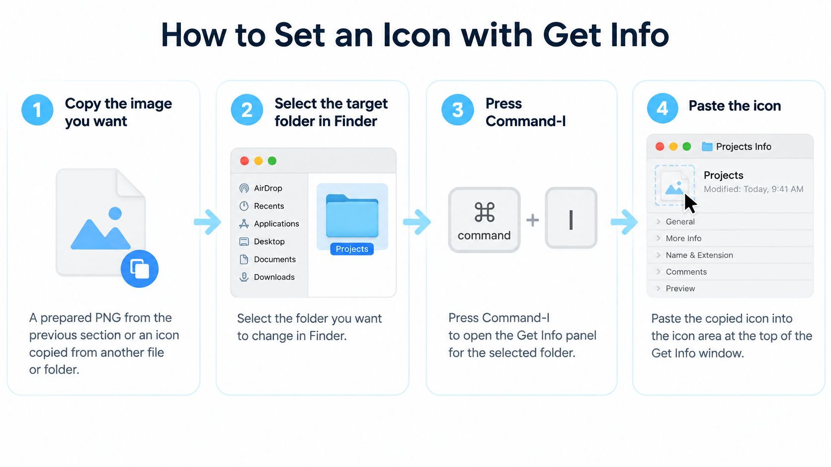
The graphic below condenses the paste workflow before the detailed steps.
The Six Steps
- Copy the image you want. Use your prepared PNG, or copy an icon from another file or folder. Copy the image contents, not just the file, or Finder may paste a generic file icon.
- Select the target folder in Finder. Check the name carefully. It's easy to style the neighboring folder if several Get Info windows are open.
- Press Command-I. This opens Get Info for that folder. You can also use File, then Get Info.
- Click the small icon at the top left. This is the step people miss. The small icon is editable. The larger preview below it isn't your paste target, so pasting there does nothing.
- Press Command-V to paste. The thumbnail should change immediately. If Paste is unavailable, you probably didn't select the small icon or didn't copy image contents.
- Close the window and check icon view. Confirm the new icon appears on the folder itself, not only in Get Info.
Limits and Common Slips
Apple's native color, symbol, and emoji options are a quicker path when you only want a tint. The paste route is better for your own image, a web icon, or an icon lifted from elsewhere.
There's also a hard scope limit. Applications, Library, System, and Users cannot be customized, while your Home folder can. Don't try to force protected folders by modifying system resources for a cosmetic change.
Success is specific. The new icon shows in icon view, it appears on the Get Info thumbnail, and the folder's contents haven't changed. If list view still shows the old icon briefly, give Finder a moment to refresh before you assume the paste failed.
How to Colorize and Icon Folders in Tintd
Get Info is fine for one folder. It gets tedious at twenty. That's where a batch workflow earns its place, especially when you want the same visual language across a whole project tree.
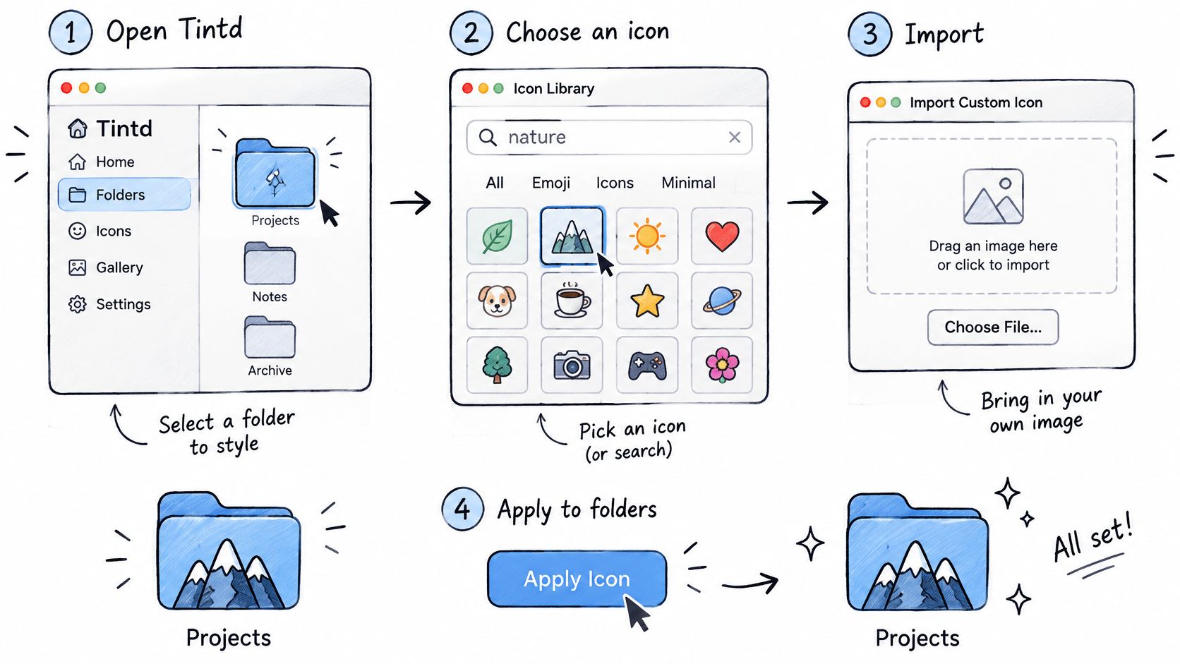
This overview shows the basic Tintd flow before you work through it step by step.
Apply an Icon to Existing Folders
- Open Tintd and bring in your folders. Select the folders you want to style, or drag them into the app. Starting with a visible set makes it easier to judge balance across neighbors.
- Choose an icon. Search the library of more than 11,000 icons and emojis by keyword, or pick any emoji. Use a word from the folder's job, such as invoice, travel, code, or music, rather than browsing aimlessly.
- Or import your own image. If you prepared a PNG earlier, bring it in here. It follows the same small-size rules, so don't import dense artwork just because the app preview looks large.
- Set the color. Pick from the palette, or create a custom color and fine-tune it. Keep meanings consistent. If green means done in one project, don't make it mean urgent in another.
- Adjust size, color, and placement. Tune the overlay so it reads against the folder color. A pale symbol on a pale folder fails no matter how good the icon is.
- Apply it. Drag the icon onto a folder, or select several folders and apply one icon and color in one action. This is the main time saver over repeated Get Info pasting.
- For one folder, right-click in Finder. Use the Finder right-click option to open Tintd directly when you're already looking at the folder. You don't have to go hunting for it inside the app.
The short video below walks through that apply step in the app, which is useful if you're deciding whether drag-and-drop fits how you already work in Finder.
Smart Suggestions and Batch Tools
Smart Icon reads the folder name and matches it against the library. A folder named Photography gets a fitting suggestion without a manual search. Smart Color looks at colors already used on neighboring folders and picks one that fills a gap on the color wheel, so you don't end up with five nearly identical blues in a row.
Treat both as starting points. If the suggestion doesn't match how you think about the folder, change it. A system you recognize instinctively beats a technically balanced one you have to decode.
For larger sets, you can randomize colors across folders or apply the same icon to many folders at once. Random colors help when the goal is simple separation, not meaning. One repeated icon helps when folders belong to one category, such as every client deliverable folder carrying the same mark with different colors. Your history keeps icons you've made before, so you can reuse a proven design across projects instead of rebuilding it.
One reassurance that's worth stating plainly. These changes are purely cosmetic. Styling a folder doesn't move, rename, or alter the files inside it.
Automate New Folders with the Folder Watcher
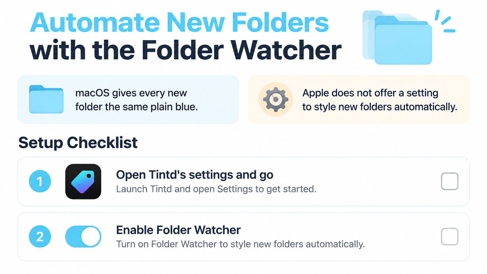
Say you're a freelancer with a Clients folder. Every new client gets a folder, and every new folder arrives in the same plain blue. You style the first ten by hand, forget the eleventh, and within a month the system has holes. macOS gives every new folder that same default look, and Apple doesn't offer a setting to style new folders automatically.
The setup checklist below shows what the Folder Watcher needs before it can close that gap.
Set It Up Once
- Open Tintd's Settings and go to Folder Watcher. This is separate from manual styling.
- Add the locations to watch. Projects and Downloads are common choices. In the freelancer example, you'd add Clients. If you automate other parts of your Mac too, our roundup of Mac automation apps puts this in context.
- Grant Full Disk Access when macOS asks. This lets Tintd notice a folder the moment it's created in a watched location. Without it, the watcher can't do its job.
- Create a test folder. Put it in a watched location and confirm it receives a color and icon matched to its name.
Once it's running, each new client folder gets styled from its name, with colors chosen to avoid clashing with its neighbors. You stop spending attention on setup and just name the folder well, which you should be doing anyway for search.
What to Check Before You Rely on It
Icon customizations are stored locally on each Mac, so you'll need to set the watcher up separately on each machine you use. Suggestions also run locally. Your folder names never leave the device, and Tintd doesn't call any AI service. You can turn the Folder Watcher off at any time in System Settings if you change your mind.
Run three checks. The test folder shows its color and icon in icon view. A folder created in an unwatched location stays plain. And after you relaunch Tintd, the watcher still styles a new folder. If all three pass, you can trust it and stop checking.
Fix Common Icon Problems and Restore Defaults
A folder that refuses to change is rarely broken. It is a folder macOS protects, a watcher that never got permission, or Finder showing you a stale cache. Match the symptom to the cause and fix that one thing instead of reinstalling icons at random.
| Symptom | Likely cause | Fix |
|---|---|---|
| Icon looks blurry or disappears in list view | Source image too detailed or too small | Use a 512 by 512 source with one bold shape |
| New folder stays plain blue | Folder Watcher lacks Full Disk Access or the location was not added | Grant Full Disk Access and add the location in settings |
| Protected folder will not change | Applications, Library, System or Users cannot be customized | Customize a subfolder or your Home folder instead |
| Neighboring folders look too similar | Colors chosen without checking the set | Use Smart Color or pick a color that fills a gap |
| Icon not showing after a change | Finder has not refreshed | Close and reopen the window, or relaunch Finder from the Dock |
| Colors hard to tell apart for some users | Color-vision deficiency or color-only cues | Pair the color with a bold symbol or the folder name |
| Emoji look different on another Mac | macOS version renders emoji differently | Check the icon on each target Mac before relying on it |
Restore the Default Icon
Open Get Info on the folder, click the custom thumbnail in the top-left corner so it picks up a blue outline, and press Command-X. That cuts the custom icon out of the folder's metadata and the standard macOS icon comes back. You are not editing protected system resources, and you do not need to download a replacement default icon.
Cutting removes the icon and nothing else. The folder stays where it is, the files and subfolders inside it are untouched, and the whole operation is cosmetic. In Tintd, any customized folder reverts to the original macOS icon with one click, which beats walking through Get Info when you have a dozen folders to clean up.
Restoring an icon is not the same as making a folder easier to find. Icons speed up recognition in icon view and do nothing for search. If a folder keeps getting lost, the fix is a clearer name or a Finder tag, not a new thumbnail.
Batch and View Pitfalls
Don't treat every visible folder as equally writable. A batch that includes protected folders should report skipped items instead of claiming success. If a run says everything worked but a system folder still looks unchanged, that folder was probably never eligible in the first place.
Separate the icon from the view. Icon size and grid spacing are per-view settings, not properties of the folder icon itself. Test your result in Icon, List, Column, and Gallery views separately. A design that falls apart in list view is a design problem, not a Finder setting.
Never let color carry the meaning alone. Pair it with a bold symbol and a clear folder name, so the system still works for someone who can't distinguish your red from your green. With emoji, check rendering on each Mac where the folder will be used, since the same emoji can draw differently across macOS versions.
Keep those checks apart. A batch can write metadata correctly while Finder still displays the old icon, and a folder can look fine while restore has never been tested. Knowing which step failed tells you exactly what to fix.
Choose Your Folder Icon Setup Today
Don't restyle your whole drive this afternoon. Pick the method per folder group, prove it on a small set, then roll it out.
- Match the method to the group. One folder with Get Info, a batch of existing folders with Tintd, a growing set with the Folder Watcher.
- Prepare one icon for your most-used folder. Square source, one bold shape, strong contrast, no fine text.
- Apply it to a test set of five folders. Check the result in both icon view and list view before you touch anything else.
- Confirm search still works. Search for a folder by name. Then add a Finder tag through the Tags field in Get Info or the right-click Tags option, and search for that tag.
That fourth step is the one people skip, and it's the one that protects you. Your icons handle recognition. Your names and tags handle retrieval. Both layers should pass their own test.
If you want the batch and automatic route, Tintd's Lifetime plan is a one-time purchase that grants access to all features, unlimited generations, automatic folder icons, smart icons based on folder name, and more than 11,000 icons and emojis. Every icon you've made stays one click away in your history, so a design that works for one project is reusable on the next.
I recommend starting this week with exactly one action. Apply one icon to five folders, check it in both views, and only then decide how far to take it.
Ready to make your busiest Finder windows readable at a glance? Tintd lets you apply custom folder icons and colors in a few clicks, batch-style existing folders, and automatically style new ones with the Folder Watcher. Start with your five most-used folders today and see how much faster you find what you need.