
You open Finder to find one folder, and the whole window looks like a wall of identical blue squares. The names are fine, maybe even disciplined, but the eye still has to read each one because nothing else gives you a fast cue. That's where mac folder organization usually breaks down, not because the files are messy, but because the navigation layer is too flat.
The Honest State of Your Folders Right Now
A lot of Mac users blame the file count. The problem is a folder tree that has grown too deep, too broad, and too visually repetitive to scan quickly. In a comparative study of personal file collections, Mac users managed roughly twice as many files and three to four times as many folders as Windows and Linux users, and the Mac collections were described as both deeper and much broader than the others (arXiv study on personal file collections).
Why the default view starts failing
Once a folder tree gets past a handful of branches, recognition matters more than recall. If every folder looks the same, your brain has to read names one by one, then read them again when similar names sit next to each other. That slows everything down, especially when the top of the hierarchy fills up with project names, client names, export folders, and archives.
A shallow hierarchy by itself does not solve that. A tidy top-level list can still turn into a mess if every branch holds another stack of nearly identical subfolders. The fix is a structure that is easier to recognize at a glance and less tempting to duplicate.
What a durable system has to do
Good organization on a Mac has to do three things at once. It has to make the right folder easy to spot, make the right file easy to retrieve, and reduce the need to save the same item in two places just because the structure is awkward. Apple's Finder already supports that layered approach with folders, sorting, grouping, tags, and Smart Folders (Finder organization in Apple Support).
For me, the shift was dropping the idea that tidy means minimal. Tidy means fast to find things in, hard to confuse, and easy to maintain. That is the standard this approach uses.
Building a Folder Structure That Survives Growth
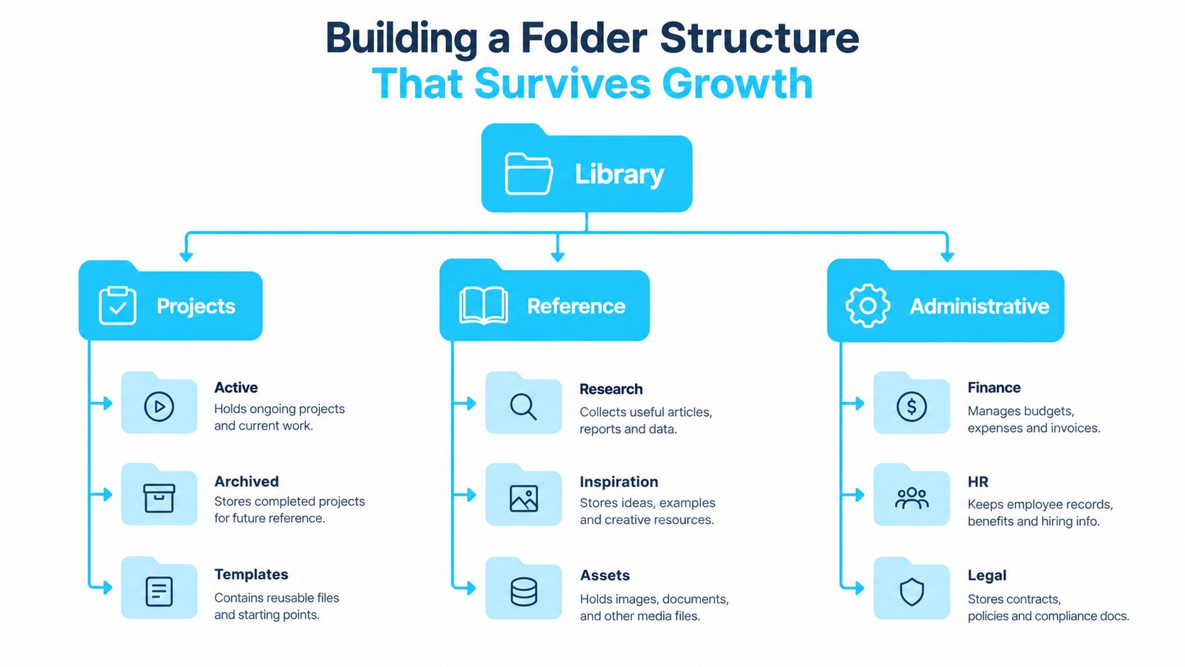
A folder system that survives growth starts with a simple rule, keep the top level obvious. If you have to remember too much before the first click, the structure will crack as soon as a new client, semester, or project lands on your desk. Apple's Finder guidance points in the same direction, using a shallow hierarchy around stable entities and letting tags and Smart Folders do the rest.
Start with stable entities, not task types
A freelance designer does not need a top level built around verbs like “editing,” “exporting,” and “sharing.” That becomes a process map, and process maps age badly. A structure built around clients, projects, or years lasts longer because those entities keep their identity even as the work changes.
A practical project template might look like this:
- 01_Admin for contracts, invoices, and logistics.
- 02_Source for raw assets and inbound materials.
- 03_Working for active edits, drafts, and in-progress versions.
- 04_Review for items waiting on feedback.
- 05_Deliverables for final exports and handoff copies.
The order matters as much as the labels. Put the folders you open most often near each other, and keep the names consistent so your future self does not have to reinterpret them.
Name for sorting, not just for meaning
A naming convention only works if it helps both people and Finder. Put the most discriminating element early, so similar files split fast. Fixed-width dates like 2026-03-08 sort cleanly, and stable prefixes keep related folders grouped without manual dragging later.
That is where a clear template pays off. If every new project inherits the same folder names and naming pattern, you do not have to rethink structure every time you start fresh. Repetition is useful when it removes decisions.
A simple way to test the system is to try three retrieval tasks. Find one known file, find one project subset, and find one status subset. If each one works without creating a duplicate copy, the structure is doing its job.
For a practical companion to that mindset, reduce digital chaos with organization is useful if your folders sit inside a wider document workflow. For another angle on the same problem, this guide to digital file organization is a solid reference point.
Why Folder Icons and Colors Are a Navigation Layer
Uniform blue folders are the visual equivalent of identical drawers with no labels on the front. You can still get to the right place, but only after reading, comparing, and second-guessing. That gets expensive fast when a hierarchy is deeper and much broader, because scanning cost rises every time Finder shows more siblings that look alike.
The eye reads color before text
Two folders named 2026 Q2 and 2026 Q3 are easy to confuse in a crowded window. Give them distinct visual cues, and the folder you want stops being a reading exercise. Color, icon shape, and consistent overlays create a second path to recognition, which matters when you are moving through dozens of nearly identical project branches.
File management is still a messy, understaffed task in practice, which is exactly why visual differentiation helps at scale. The tools exist, but the human side still has to do the recognition work. A folder color is not decoration when it helps you avoid a wrong turn.
Use visual cues to encode category, not file type
Many people stumble here. A PDF icon, a screenshot icon, or a thumbnail preview tells you what kind of file it is, not what it is for. That is useful, but it is not a navigation system. A project color, on the other hand, can mean “client work,” “internal,” or “archived,” and your muscle memory starts to learn that pattern after a while.
For folder icons, consistency matters more than style. If one project uses a warm tone and another uses a cool tone, you are building contrast you can trust. If every folder gets a random look, the brain stops noticing.
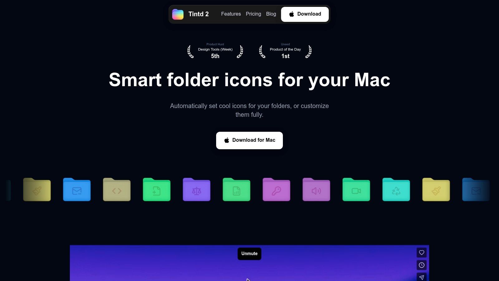
That is also where Tintd fits. It gives you a way to apply folder icons and colors at scale on-device, so the visual layer stays consistent across large sets without turning every folder into a manual art project. If you want the shortest path from same-looking folders to recognizable branches, that kind of bulk visual control earns its place.
Used well, icons and colors do not sit beside hierarchy. They make hierarchy faster to read. Tags and Smart Folders can then sit on top of that structure without replacing it, so you are not relying on three separate systems that all try to do the same job.
Using Tags and Smart Folders Without Creating Duplicates
Folders answer where something lives. Tags answer what else it belongs to. Smart Folders answer what should appear together without moving the originals. That split keeps the system usable. If you try to make folders do all three jobs, the structure turns into a duplicated mess that drifts out of sync.
Treat tags as attributes, not locations
Finder tags work best when the vocabulary stays small and stable. A file can be active, waiting, or archived without leaving its folder, and the same file can still surface in different views through the sidebar and Spotlight. That makes tags useful for status, priority, review state, and other labels that cut across projects.
Apple's guidance combines this metadata layer with hierarchy directly, recommending a shallow structure, consistent naming, tags for cross-cutting attributes, and Smart Folders for recurring queries. That combination works because it avoids the common mistake of encoding every detail into the folder path itself.
Let Smart Folders handle recurring views
A Smart Folder is a saved search, not a container. It updates dynamically and shows files that match your rules without moving them. That makes it a clean fit for recent work, review queues, or a project subset that keeps changing while the underlying hierarchy stays fixed.
The best setup is simple. Use folders for stable entities, tags for cross-project states, and Smart Folders for recurring queries. A project folder might hold 01_Admin, 02_Source, 03_Working, 04_Review, and 05_Deliverables, while a Smart Folder shows every file tagged waiting or every document last opened recently. The original files stay put, so you avoid maintaining copies in two places.
| Tool | Best for | Drawbacks | Example |
|---|---|---|---|
| Folders | Stable ownership and physical storage | Too rigid for cross-project views | Clients/Acme/2026/Assets |
| Tags | Status, priority, and other shared attributes | Depends on consistent use | active, waiting, archived |
| Smart Folders | Recurring searches and live views | Rules can go stale if naming changes | Files tagged waiting |
For a practical walkthrough of how these pieces fit together, this guide to organizing folders on Mac is worth a look.
Batch Icon and Color Workflows That Scale
Manual folder styling works for a couple of project roots. It gets old fast when you're dealing with an entire archive or a fresh client tree with dozens of subfolders. The trick is to pick the right workflow for the size of the job, then stop pretending every folder deserves a separate hand-tuned pass.
Three ways to style a folder tree
The old-school route is still there. In Finder, you can open a folder's Get Info panel, paste a custom icon, and adjust one-off folder styling when the case is simple. That's fine for a single root or a temporary change.
The middle ground is batch selection plus shared styling decisions. That works when you want several sibling folders to match without turning the setup into a project of its own. It's useful, but only up to the point where the tree starts expanding faster than you can keep up.
For larger libraries, Tintd is the straightforward automated option. It applies Smart Icon and Smart Color suggestions based on folder names and nearby folders, watches selected locations for new folders, and offers batch editing across multiple folders and subfolders. It also works on-device, so the styling logic stays local instead of depending on a cloud round trip.
A few things make that useful in practice:
- Large icon and emoji library: helpful when folders need distinct overlays instead of generic labels.
- Folder Watcher: styles newly created folders as they appear, which keeps fresh project trees consistent.
- History and reuse: useful when you want to repeat a visual pattern across client sets.
- One-click restore: handy when a folder needs to go back to the default macOS look.
For a deeper look at the color side of that workflow, this internal guide on changing folder color shows how to manage the visual layer without rebuilding the whole hierarchy.
The payoff is not aesthetics for their own sake. It's fewer wrong clicks, faster scanning, and less time spent hunting through nearly identical branches. If you've ever opened the wrong quarterly folder three times in a row, you already know why that matters.
A Maintenance Routine That Keeps It Tidy
Any system that relies on memory will drift. The fix is a routine small enough that you'll do it and strict enough that the tree doesn't slowly rot from the edges inward. A little upkeep beats a heroic cleanup every time.
Keep the cadence short and predictable
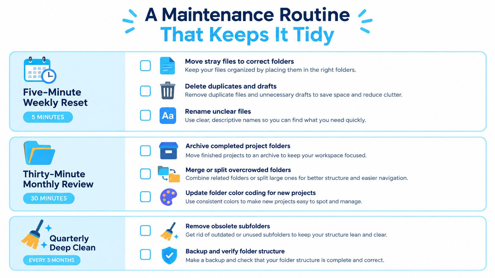
A weekly reset should be quick. Clear the desktop, dump the Inbox folder, and apply tags to anything new that still needs a decision. If a file stays unlabeled for too long, it usually stays unlabeled forever.
A monthly review is where the system stays honest. Check whether Folder Watcher rules still produce sensible icons, retire stale tags, and trim Smart Folder rules that no longer match the way you work. If a tag hasn't been used in ages, it's probably just adding noise.
The quarterly audit is slower and more structural. Ask whether a client or project belongs in archive, look for overcrowded branches that need a split, and confirm that recent folders still follow the naming convention. The top level should change rarely, but it shouldn't become sacred.
Fix the failure modes before they spread
A renamed folder can lose its custom icon, so check the visual layer after big reorganizations. If your tag vocabulary has drifted, merge labels back into a smaller set instead of inventing a new color every time. And if a Smart Folder stops matching, assume the file metadata or filename changed before you assume Finder is broken.
Those are small annoyances individually. Together, they're how organized systems start feeling fragile. The cure is the same every time, reduce the number of exceptions and keep the cleanup loop short.
Common Questions and When to Break Your Own Rules
Icons and colors don't sync as a universal truth across every setup, and that's fine. Shared drives especially benefit from simpler conventions, because multiple users don't need multiple visual languages fighting over the same tree. Keep the shared structure plain, then let each person add local visual preferences where they make sense.
If you need to return a folder to the default blue look, use the one-click restore path rather than manually stripping styles piece by piece. That's one of the few moments where simplicity beats cleverness. If you're moving image-heavy files around before styling them, a service like convert HEIC files online can help with format cleanup before those files land in your organized folders.
AI naming suggestions are only useful when they support your own conventions. If they introduce vague labels or noisy variations, they're making the tree harder to scan. A folder system should be deliberate and local, not a template imported from someone else's work pattern.
The rule is simple. Use hierarchy for ownership, tags for attributes, and visual cues for recognition. Break the rule only when a specific workflow proves it slower or more confusing than the alternative.
Tintd gives you a way to style Finder folders with custom icons and colors, batch changes, and on-device folder watching, which makes the visual layer part of the system instead of an afterthought. If your Mac folders are organized but still hard to scan, visit Tintd and see whether a stronger visual navigation layer fits the way you work.