
You've got a Downloads folder full of files you meant to sort, a Desktop covered in screenshots, and a Projects folder buried under layers of folders you no longer remember creating. The usual response is to build another elaborate hierarchy, move everything into it, and watch the same mess return a few weeks later.
That approach fails because Finder organization isn't only a storage problem. It's a decision problem. A file can belong to a physical project, carry a status such as “waiting,” and need a visual cue that helps you recognize it instantly. Folders, tags, Smart Folders, colors, and icons each solve a different part of that problem. Use one tool for every job and Finder becomes rigid. Use all of them without rules and they start contradicting one another.
The reliable model is simple: location tells you where an item belongs, metadata tells you how it relates to other items, and visual cues help you scan the screen. Build those layers in that order and you'll have a system that's quick to use instead of impressive only on cleanup day.
Why Your Finder Still Feels Chaotic
Most folder systems collapse for the same reason: they force one hierarchy to answer questions it wasn't designed to answer. A client proposal might belong inside a project folder, be relevant to several campaigns, need an “awaiting approval” status, and deserve a visible cue because you open it every day. Copying it into several folders creates duplicates. Hiding everything behind tags makes browsing unpleasant. Adding colors without rules creates visual noise.
Finder has supported more than strict folder nesting for years. When Apple introduced Finder Tags with OS X Mavericks, it described them as a way to organize and find files across a Mac and iCloud. Tags could appear in the Finder sidebar, letting users group files by project or category independently of their physical folder location. Apple also introduced Finder Tabs to reduce the clutter caused by multiple open Finder windows in the same release. Apple's Mavericks announcement documents that shift toward combining hierarchy with searchable metadata.
Choose the tool by the question
Ask what you're trying to solve before you create anything:
- Where should this item live permanently? Use a folder.
- What else is this item related to? Use a Finder Tag.
- Which files match a changing condition? Use a Smart Folder.
- What should I notice immediately while browsing? Use a color or icon.
- How should the item sort and display? Use a naming convention and Finder view settings.
That distinction prevents the most common mistake, which is creating a folder called "Urgent," then moving files into it, then making a tag called "Urgent," then coloring the folder red, and finally forgetting which signal carries the primary meaning. Pick one primary mechanism for each kind of information.
Your physical folders should answer the question, “Where is the source of truth?” They shouldn't try to represent every project status, client relationship, file type, or temporary task. Once that foundation is readable, metadata can give you alternate views without scattering copies across your Mac.
Building a Shallow Folder Foundation
Start with the folders you'll still understand next year. In your Home folder, create a small set of stable top-level domains such as Work, Personal, Projects, Media, Archive, and Temp. You don't need to use all six, and you shouldn't create a bucket merely because the example has one. If you can't explain what belongs in a top-level folder in one sentence, its name is probably too vague.
Use Shift-Command-N to create a folder in Finder, or choose File > New Folder. Give folders names that sort predictably and describe their contents, not your current mood. “Client Projects” and “Invoices” are useful. “Stuff,” “Important,” and “Sort Later” become junk drawers.
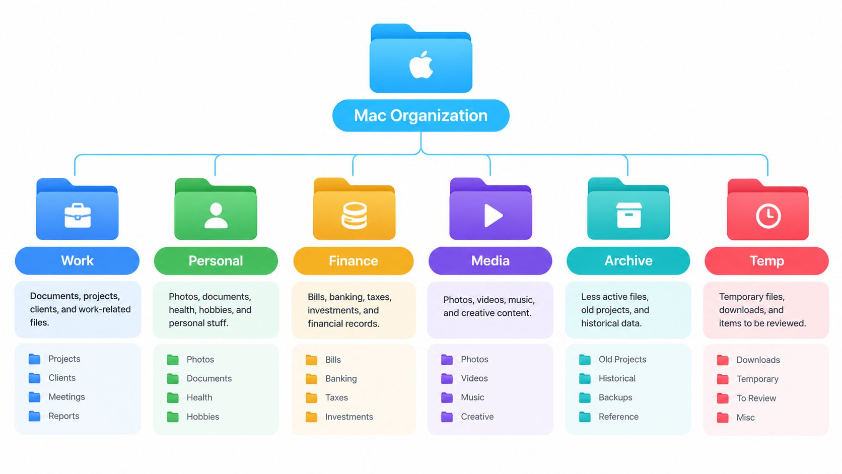
Keep the hierarchy shallow. A dependable pattern is:
- Top level: stable life or work domains.
- Second level: project, client, course, or subject.
- Third level: predictable working categories such as Assets, Sources, Exports, or Archive.
Stop adding levels when the folder's name already tells you what you're looking at. A freelancer might use Work > Clients > Acme > Website, while a developer could use Work > Software > ProductName > Assets. A student might choose Education > Courses > History > Research and keep personal records elsewhere. The exact labels matter less than the repeatable shape.
Make Finder display the structure properly
Open a folder in Finder and choose View > Show View Options. Enable Keep folders on top, then choose a consistent sort method such as Name. This keeps folders from disappearing among PDFs, images, and other loose files. Apple's guidance on organizing files in Finder also covers grouping and sorting options that help preserve a readable layout.
Use one naming style inside sibling folders. If one project uses Assets, Exports, and Sources, use those same names everywhere that structure applies. You'll find things by recognition rather than stopping to interpret a new taxonomy every time.
For a visual planning reference before you build, this guide to folder structure with Font Checker is useful for sketching the hierarchy first. You can also compare the approach with this digital file organization guide if you're cleaning up several areas at once.
Use the structure for a week before refining it. Don't move every historical file immediately. Create the new foundation, file active work into it, and let obsolete material remain in an Archive area until you know which categories survive real use.
Adding Finder Tags and Smart Folders
Tags belong to files that have more than one meaningful relationship. A proposal can live in one client folder while carrying tags for a campaign, status, or confidentiality level. Apple explains that tagged items remain findable from the Finder sidebar or Spotlight regardless of their physical location, which means you don't need duplicate copies just to make them visible in another context. Apple's Finder tag documentation also explains how tags work across files, folders, and iCloud items.
Keep the tag vocabulary small. I'd start with status tags such as Active, Waiting, and Done, then add project or client tags only where they provide a genuinely different view. Don't create a tag for every noun in a file's name. If the folder already says “Acme,” tagging every Acme file adds clutter without adding information.
Build a Smart Folder around a question
A Smart Folder is a saved search, not a storage location. It displays matching files without moving them, so the results change as files gain tags, change dates, or meet other criteria. That makes Smart Folders ideal for questions you ask repeatedly.
To create one, choose File > New Smart Folder in Finder. Click the plus button near the upper-right corner and add criteria. For a useful document view, set the kind to PDF, then add a date condition for items modified within the recent period you care about. Save it with a name such as Recent PDFs.
For a work queue, add a tag criterion for Active, then restrict the search to your Work folder if you don't want personal items included. You can combine criteria instead of creating separate folders for every state. When the work is finished, change or remove the tag and the item disappears from the active view without being moved.
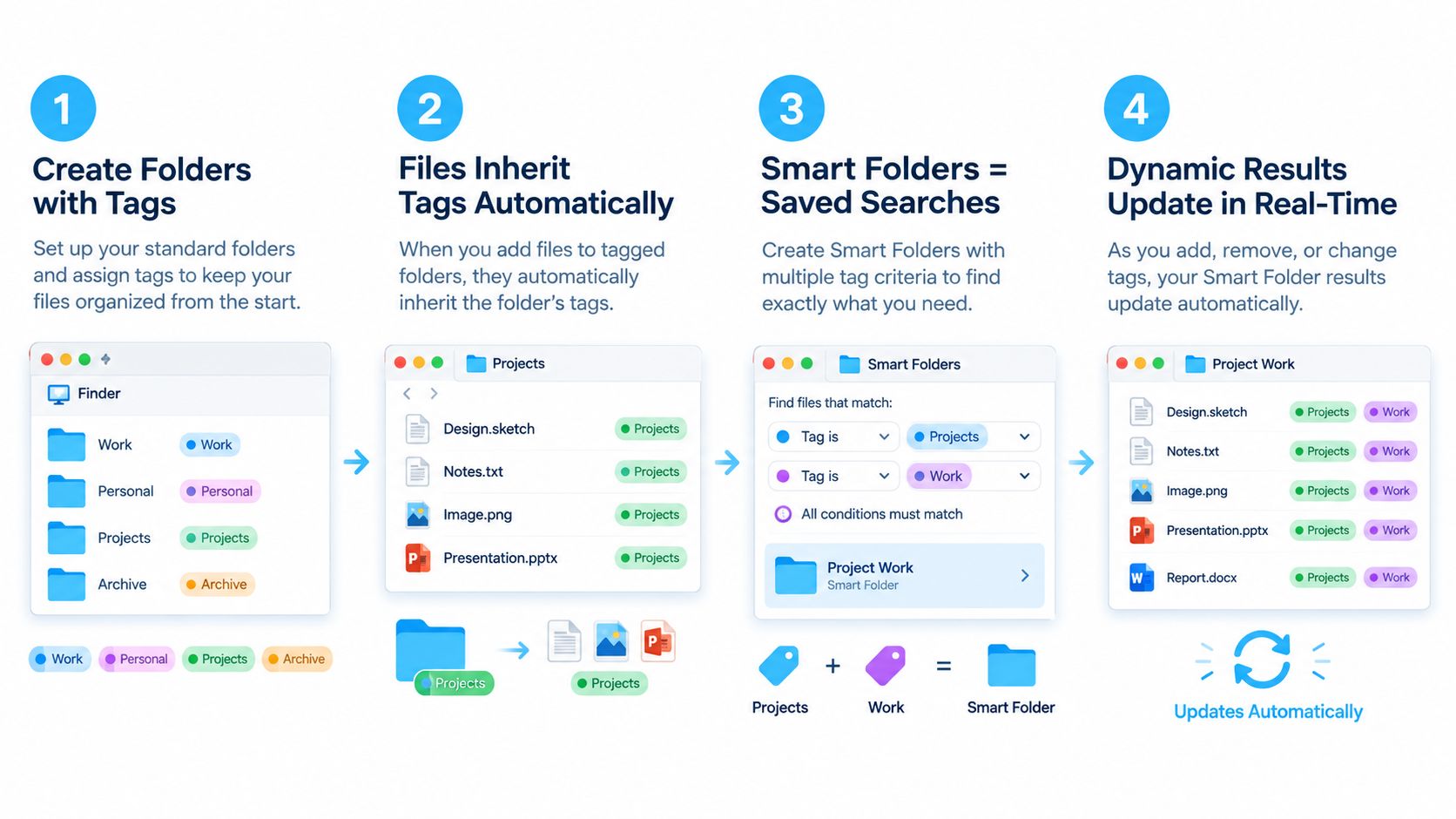
Treat a Smart Folder like a saved lens. Deleting the lens doesn't delete the files it shows, and deleting a result from inside Finder can still delete the underlying file. Pay attention to which action you're taking. A Smart Folder should help you retrieve and review items, not become a second place where you pretend files live.
Use colors consistently inside the tag system. For example, reserve red for urgent work and green for completed work, but don't assign those colors casually. If a color changes meaning from project to project, it stops helping you scan.
Visual Cues with Built-In Tools Versus Dedicated Apps
Visual styling is useful when it carries information. A red folder can signal attention. A camera symbol can identify media. A gray folder can mark material you rarely touch. A folder covered in random emojis is decoration, and decoration becomes distracting when every folder competes for attention.
macOS already handles basic customization. Select a folder, open its context menu, choose Customize Folder, and change its color or add a symbol or emoji. Apple's folder and file customization instructions also describe using pictures, downloaded icons, or icons copied from other files and folders.
When native controls are enough
Use Finder's built-in tools when you're styling a small, stable set of folders. They cost nothing, integrate directly with macOS, and are appropriate for a handful of high-priority locations such as your current project, Archive, or shared work area.
The limitations become obvious when the collection grows. Native customization is manual, folder by folder. You need to choose the icon, adjust the appearance, and reverse the change yourself. Imported artwork can also look muddy or meaningless at Finder thumbnail size, so test it before treating it as part of your system.
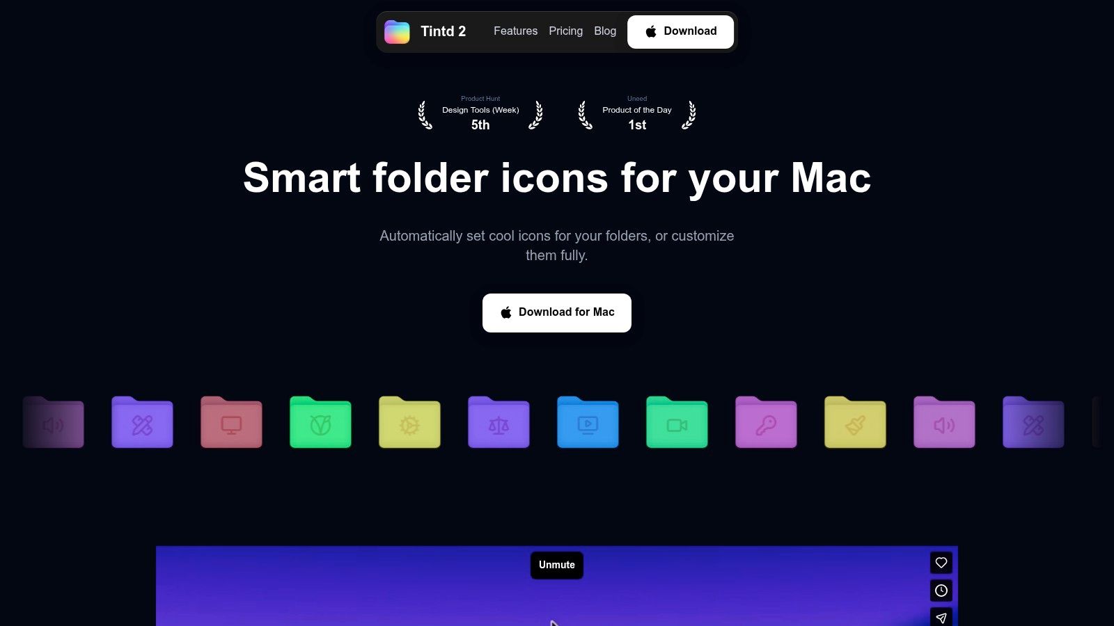
A dedicated utility becomes practical when you manage many repeated project folders and want the visual scheme to continue without constant manual work. Tintd can suggest icons and colors from folder names, apply styles in batches, watch selected locations for new folders, and restore the standard macOS folder icon. It operates locally, which suits people who don't want folder names or usage patterns sent to an external service. Its library includes icons and emojis, but you should still use a restrained visual vocabulary rather than styling every folder differently.
Make the choice without overthinking it
Choose native customization if you have a few folders and enjoy controlling them manually. Choose a dedicated app if you need batch edits, consistent styling across repeated structures, or automatic treatment for folders created later. The app doesn't replace a hierarchy, tags, or Smart Folders. It only improves the visual layer.
For a broader perspective on using appearance as part of navigation, this visual file manager discussion provides useful context. Don't mistake visual recognition for searchability. An icon helps you spot a folder. It doesn't tell Spotlight that a file belongs to another project.
Naming Schemes, Color Coding, and Batch Operations
A good visual system starts with names, not colors. Name folders so Finder can sort them and scripts can work with them later. Use dates in a consistent format such as YYYY-MM-DD when chronology matters, and use project identifiers that remain stable instead of labels such as “new” or “latest.”
For example, a designer might use:
2026-Q3-ClientName-Website
Inside it:
Assets, Sources, Exports, and Archive
Keep spaces when they make names easier to read, unless you regularly automate through the shell or other tools. The important rule is consistency. If one project uses Final Exports and another uses Deliverables, you'll waste time deciding where a finished file belongs.
Assign meaning to each visual layer
Use colors for workflow or lifecycle, and icons for content type. Don't make one color mean “client work” in one folder and “urgent” in another. A small vocabulary is easier to remember and easier to maintain.
| Visual Cue | Meaning | When to Use |
|---|---|---|
| Blue | Active work | Current client or project folders |
| Yellow | Personal attention | Personal tasks or records requiring review |
| Gray | Inactive or archived | Material you keep but rarely open |
| Red | Urgent status | Time-sensitive work that needs action |
| Image or symbol | Content type | Assets, research, exports, or media |
A designer's project might use a blue project folder, a camera symbol for Assets, a document symbol for Sources, an upload symbol for Exports, and gray for Archive. The colors communicate state. The symbols communicate content. The names remain the authoritative description.
Apple's native workflow lets you customize a folder through its context menu and return to the standard appearance through Finder's information controls. For repeated work, select sibling folders together where Finder supports the operation, or use a dedicated batch tool that previews changes before applying them. Don't apply a visual rule blindly across unrelated folders.
Make batches safe
Before a bulk change, test the convention on one project. Check the folder in list view, icon view, and a Finder sidebar if you use one. An imported image that looks excellent at a large size may become an indistinct blob when reduced to a thumbnail.
Batch operations are most useful when the structure is already standardized. Apply the same treatment to every Assets folder, for example, rather than choosing a different icon for each client. If your work includes many PDFs and repeated document handling, a workflow designed to streamline PDF document processes can complement Finder organization, especially when the files already follow consistent naming and storage rules.
You can also connect these conventions to Mac automation apps, but don't automate a weak taxonomy. Automation makes a bad rule faster, not better. Preview the result, verify that your files still open normally, and preserve a straightforward route back to the default folder appearance.
Common Mistakes That Quietly Break the System
The most damaging mistake is building a hierarchy that requires too much navigation. Deep paths make people abandon the structure and save files to the Desktop instead. Keep stable domains near the top, put active project categories underneath them, and stop adding layers when a clear name already provides the needed context.
The second mistake is treating visual cues as decoration. If every folder has a different color and emoji, none of them communicates anything. A visual system works only when you can predict what a color or icon means before opening the folder.
Watch for these warning signs:
- You duplicate files to make them visible: Keep one source file in its physical home and use tags or a Smart Folder for alternate access.
- Your tag list keeps expanding: Delete tags that don't answer a recurring retrieval question.
- Your colors have conflicting meanings: Choose one meaning per color and apply it across sibling folders.
- You rely on icons instead of names: Keep descriptive names even when the icon seems obvious.
- You mistake Smart Folder results for storage: A Smart Folder is a dynamic view. Its contents remain in their original locations.
- You treat tags as protection: Metadata isn't a backup. Maintain a separate backup system.
- You clean the Desktop without fixing the cause: Moving everything into a temporary folder only hides the missing destination rule.
A daily Desktop-clearing ritual can be useful, but it shouldn't be your entire strategy. If files repeatedly land in “Sort Later,” create a real destination or simplify the hierarchy. Your system should make the correct action obvious while you're busy, not require a separate productivity ceremony.
Review the setup when you notice friction. Two folders with the same color but different meanings, repeated searches for the same file type, or several abandoned Smart Folders are signs that the information architecture needs tightening.
Maintenance, Restore Plans, and What to Do This Week
Set aside a short weekly review to file Downloads, remove obsolete status tags, and delete Smart Folders you no longer ask questions through. Keep a restore path: Finder customization can be reversed through Get Info, and dedicated tools can restore default icons without changing the underlying files. This week, apply only two ideas to one project folder set, then use it for seven days before expanding the system.
Tintd gives you on-device folder color and icon customization, batch editing, name-based suggestions, and folder watching for new folders. If you want Finder to become easier to scan without replacing your physical structure, visit Tintd and test it on one project set first.