
You open Finder to grab a project folder, but the window is full of identical blue icons. Several client folders sit beside exports, reference material, invoices, and old drafts. The names are technically clear, yet you still read each label before clicking. Changing folder color on Mac can turn that slow visual search into a quicker recognition task, provided you build a system instead of decorating folders at random.
macOS now offers native folder styling in Finder, including colors, symbols, emoji, and custom pictures. That gives you a straightforward manual path, while local automation tools can take over when the same visual rules need to apply across a large project tree. The useful choice isn't manual versus app in the abstract. It's deciding how much repetition, consistency, and privacy your workflow requires.
Why Changing Folder Color Actually Matters on Mac
A designer opening a crowded asset library usually doesn't need every folder to look unique. They need to spot working files, approved exports, source material, and archived work without inspecting every name. A developer may use one visual treatment for active repositories and another for documentation or generated assets. A consultant managing client work can make adjacent project folders easier to distinguish at a glance.

The benefit is visual indexing. A color gives your eyes a second signal alongside the folder name, so you can recognize a category before reading the full label. That matters most in Icon view, on a busy Desktop, or inside Documents folders where many names share the same structure.
Color should describe a role
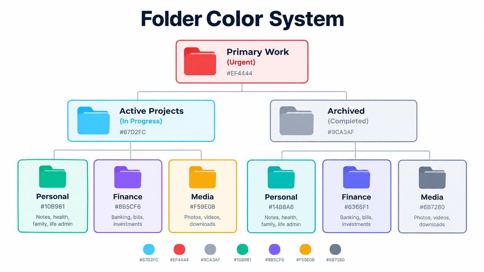
The strongest systems assign meaning before assigning appearance. For example, blue might represent active work, gray might represent completed material, and orange might identify folders that need attention. The exact choices don't matter as much as keeping the meaning stable.
Apple's native controls also support symbols and emoji, so color doesn't have to carry every distinction by itself. You might use a blue folder for active projects and reserve a camera symbol for photography work inside that category. This combination is more useful than giving every neighboring folder a different shade.
macOS has changed this workflow by making folder appearance a first-class Finder option rather than forcing users to rely on tags or manual image replacement. An independent guide describes the native feature as a major shift from older workarounds and identifies seven preset colors, red, orange, yellow, green, blue, purple, and gray, in its guide to changing folder color on Mac. For a broader visual filing approach, visual file manager principles can help you decide where color adds clarity and where it merely adds noise.
How to Change Folder Color in Finder on macOS
Apple's native route is quick for an individual folder. Start in Finder and select the folder whose appearance you want to change. Open the contextual menu with a right-click, then choose Customize Folder.
A customization panel appears with controls for the folder's color and additional visual elements. Choose a color, add a symbol, or select an emoji if that gives the folder a clearer role in your file structure. Apple's current Finder folder customization instructions document this native process and the available appearance options.
Check the appearance setting if the color control is missing
The folder-color control isn't displayed under every Finder appearance combination. In macOS Appearance settings, Apple ties that control to the Icon & Widget style selection. The color option appears when the style is set to Default, Dark, or Clear, so check that setting if Customize Folder doesn't show the expected control.
The practical sequence is:
- Select the folder: Open the relevant Finder location and click the folder once.
- Open customization: Right-click the folder and choose Customize Folder.
- Choose the visual treatment: Pick a folder color, then add a symbol or emoji only if it communicates something useful.
- Review it in context: Look at the folder beside its neighbors, not in isolation.
- Repeat selectively: Apply the same meaning consistently to folders that serve the same role.
The native method works well for a personal folder, a new client directory, or a small cleanup session. It becomes less appealing when you repeatedly apply the same style to many folders. Finder gives you the controls, but it doesn't define your taxonomy, remember every decision for you, or automatically style folders created later.
This walkthrough shows the visual flow in motion:
Don't treat the built-in picker as a bulk organization strategy. Use it when the number of folders is small enough that choosing each style remains deliberate. Once you find yourself repeating the same clicks across projects, the limitation is no longer the color tool. It's the lack of a reusable workflow around it.
Manual Folder Styling vs Local Automation Tools
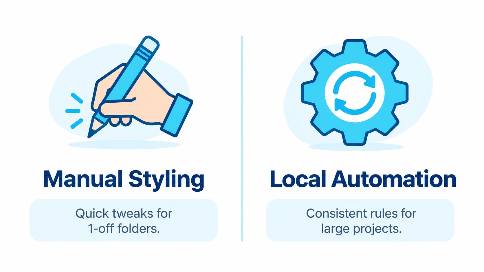
Manual styling has an obvious advantage: there's almost no setup. You can select a folder, open Finder's customization panel, choose a color, and move on. That makes it the right choice for a one-off folder, a temporary project, or a small personal filing adjustment where consistency across future folders isn't important.
The cost appears through repetition. If several project folders need the same treatment, you must remember the rule, open each folder's menu, and make the same decision repeatedly. That process also creates opportunities for small inconsistencies. One folder gets a symbol, another gets an emoji, and a third receives a color that no longer means what you intended.
Choose based on repetition, not folder count
A local automation tool is more useful when folder creation is ongoing or when the same visual language must cover multiple project trees. It can apply styles in bulk, use folder names as signals, and watch selected locations for new folders. That shifts the work from repeating individual edits to defining rules once and reviewing the result.
The trade-off is setup and trust. You need to understand what the tool can change, where it operates, and how it handles existing custom icons. A local workflow is particularly attractive if folder names and project metadata shouldn't leave the Mac. On-device processing avoids sending that information to an external service, which matters for client work, research, private archives, and source code.
Manual editing minimizes setup. Local automation minimizes repeated decisions.
There's also a control difference. Manual Finder styling gives you an immediate, visible choice for each folder. Automation gives you consistency, but you should test its rules on a small folder set before applying them broadly. A tool that operates entirely offline can also reduce privacy concerns, but offline operation doesn't remove the need to review permissions and backups.
For a practical look at recurring Finder workflows, automatic folder icon changes on Mac is a useful reference. The same decision applies to folder color: keep the native method for occasional edits, and consider local automation when styling has become part of how you create and maintain projects.
Building a Simple Folder Color Palette for Finder
A palette works when each color has one job. Start with categories that already exist in your workflow, such as active work, reference material, completed projects, personal files, or items waiting for review. Don't begin by trying to use every available color. Begin with the distinctions you need to recognize during a normal Finder session.
Give each color a stable meaning
Write the rule down, even if it's only in a note beside your project structure. A useful system might look like this:
- Active work: Use one strong color for folders that are currently being edited or delivered.
- Reference material: Choose a calmer color for source files, research, templates, and supporting documents.
- Completed work: Use gray or another subdued treatment for material you need to keep but rarely change.
- Needs attention: Reserve a contrasting color for folders containing unresolved tasks or pending decisions.
The specific palette is less important than the restriction. If every folder has a different color, color stops being a category signal and becomes another detail to decode. Apple supports folder symbols and emoji as well as colors, so use those for subcategories rather than creating a new color for every project type.
Keep nearby folders visually calm
Visual balance matters most when folders sit beside one another in Icon view. Avoid placing several highly distinctive treatments next to each other unless those folders require immediate separation. A shared color for a shared status creates a block your eyes can recognize quickly.
Use symbols for meaning that color can't express. A blue active folder with a document symbol can identify writing work, while the same blue with a camera symbol can identify media work. This keeps the project status consistent while allowing the subject matter to vary.
Mixed-language folder names can also make visual cues useful. A predictable color and symbol system can support recognition when folder names use different languages, abbreviations, or naming conventions. For more ideas on combining naming rules with visual organization, AI file organization techniques offer useful context without replacing the need for a simple local convention.
Test the palette on one project tree first. Browse it in the Finder view you use most, check dark and light appearances, and remove any treatment that slows recognition rather than improving it.
Practical Workflows for Single and Multiple Folders
For one folder, use the smallest useful intervention. If a client project is active, apply the active-work color and stop there. Add a symbol only when it distinguishes the folder from nearby projects. The purpose is to make the next visit easier, not to create a miniature design system for one directory.
Multiple folders need a repeatable order of operations. First, clean up names so similar folders follow a recognizable pattern. Next, decide whether the color represents status, content type, or ownership. Don't mix those meanings within the same level of the hierarchy. A blue folder should not mean “active” in one project and “design” in another unless the two folders live in separate systems with separate rules.
A reliable batch routine
- Choose a small sample: Select a few representative folders, including nested folders and folders with long or mixed-language names.
- Apply the palette: Use the contextual menu for manual changes, or a batch workflow when the same treatment belongs across a set.
- Inspect neighboring items: Check whether the folders remain easy to distinguish in the Finder view you use.
- Correct exceptions: Give an individual folder a symbol or different color only when its role differs.
- Extend the rule: Apply the tested convention to the wider project tree.
Finder's contextual menu is useful because it keeps the action close to the folder. For larger structures, batch editing can reduce repetitive navigation across subfolders. A folder watcher takes a different approach by detecting new folders in selected locations and applying a matching style as those folders appear. That can suit project templates, download areas, or working directories that grow continuously.
Automation still needs boundaries. Watchers should target deliberate locations rather than the entire file system, and rules should be simple enough to predict. Review a small subset before a broad rollout, then keep a history of the visual convention so future changes don't create a mixture of old and new meanings.
For more options around consistent Finder appearance, customizing folder icons on Mac covers related workflows. Color, naming, and optional icons work best when they reinforce one another instead of competing for attention.
How to Restore Default Folder Colors on Mac
A visual system should be reversible. If a color no longer represents the folder's role, or a trial palette made the Finder view harder to scan, open the folder's customization controls again and remove the custom styling. Apple's Finder guidance explains that you can return to the standard appearance by removing the custom icon or switching away from the applied styling in the folder customization workflow: Apple's instructions for customizing folders and files.
Start with the folders that create the most confusion. Restore their default appearance, then review the surrounding group before deciding whether the rest should change. This is usually safer than clearing an entire project tree immediately, because you can identify which visual choices caused the problem.
Use a short reset checklist
- Confirm the role: Decide whether the folder still belongs to the category represented by its old color.
- Remove unnecessary extras: Clear symbols or emoji that no longer add information.
- Restore the standard icon: Use the customization controls to remove the custom appearance.
- Check Finder views: Review the result in the layout you use for daily work.
- Keep the revised rule: Record the new meaning so future folders don't drift back into inconsistency.
If a folder looks different after a macOS update, compare it with an untouched folder before making broad changes. Reapply only the style that still serves a clear purpose. A small test set remains the safest way to validate a palette, especially when folders contain important project material or shared conventions.
Tintd applies customized colors and icons to Finder folders, with bulk editing, contextual-menu access, folder watching, and local offline processing for workflows where folder names should remain on the Mac. Visit Tintd to see whether its local automation approach fits the way you create and maintain project folders.