
Your Mac desktop is probably doing too much right now. Screenshots sit next to half-named folders, Downloads keeps collecting junk, and the one file you need is hidden under a pile of things you meant to sort last week. That isn't a cleanliness problem, it's a navigation problem, and the fix is a system that makes every new file obvious at a glance.
A tidy Mac desktop looks calm because it gives each file a clear job. Old clutter gets pushed into a clean structure, new files get a predictable home, and visual cues do some of the work before you even read a name. If you want the practical version of that mindset, start with a simple digital filing approach like digital file organization, then make the desktop match the same logic.
For a desk surface that doesn't fight your eyes, it also helps to reduce the visual noise around the computer itself. If you want a physical setup that supports the same low-clutter mindset, explore felt desk mat range from CITYSHEEP and pick one that calms the space instead of competing with it.
What a Tidy Mac Desktop Actually Looks Like
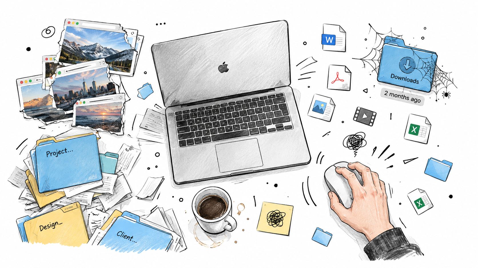
The messy version is familiar. A screenshot lands on the desktop, a project folder gets duplicated and renamed three different ways, and Downloads turns into a parking lot for things you “haven't dealt with yet.” The cost isn't aesthetic, it's friction. You lose seconds every time you hunt for a file, and you lose context when your eyes have to re-learn the same clutter every time you switch tasks.
A good mac desktop organization system does the opposite. It gives you one place for current work, one place for reference, and one visual language for figuring out what matters fast. Apple's own Finder treats folders, tags, color cues, grouped views, and Smart Folders as normal navigation tools, not decoration, so this isn't some third-party gimmick. It's the way macOS already expects you to work with files. Apple's Finder guidance makes that clear.
The target is simple. New files should land somewhere obvious, old files should move somewhere final, and the desktop should stay readable even when you're in the middle of real work. That's why I care about both structure and appearance. Folder hierarchy handles where things live, and visual cues handle how fast you can recognize them.
Build the Folder Skeleton Before You Add Anything Else
Start by clearing the surface, not by rearranging the clutter on top of it. Drag everything off the desktop into a temporary Cleanup folder, then stop pretending each loose file deserves a custom decision right now. You're sorting one pile, not sixty separate interruptions. That single move makes the rest of the work bearable.
Keep the top level shallow
Build a small hierarchy first, then leave it alone. The University of Pennsylvania's file-organization guidance recommends consistency, descriptive names, ISO 8601 dates, avoiding special characters, and keeping directory trees around 3 to 4 levels deep as a usability rule rather than a hard limit. That's the right mindset for a Mac too. Penn's file-organization guidance is blunt about what works and what doesn't.
Use a structure like this:
- Work for active professional files
- Personal for household and private material
- Projects for short-term efforts with a clear end
- Archive for closed items you still want to keep
- Inbox for anything unprocessed
Name for sorting, not sentiment
Use dates in YYYY-MM-DD form when timing matters, and keep project names predictable, like 2026-03_Client_Project. Don't use Misc, New Folder, or clever labels you'll forget in a month. Also don't lean on color to do the whole job. Finder search, Spotlight, scripts, backups, and cross-platform tools all care about filenames and metadata first, not your sense of taste.
When you create folders, use Finder's Shift-Command-N shortcut. It's faster than hunting through menus, and it trains your hands to build structure the same way every time. If you want a practical companion guide for this kind of setup, organize folders on Mac fits right alongside the same workflow. For file-heavy work like delivery pipelines, even a process such as digital asset delivery in photography depends on the same principle, clear hierarchy beats improvisation every time.
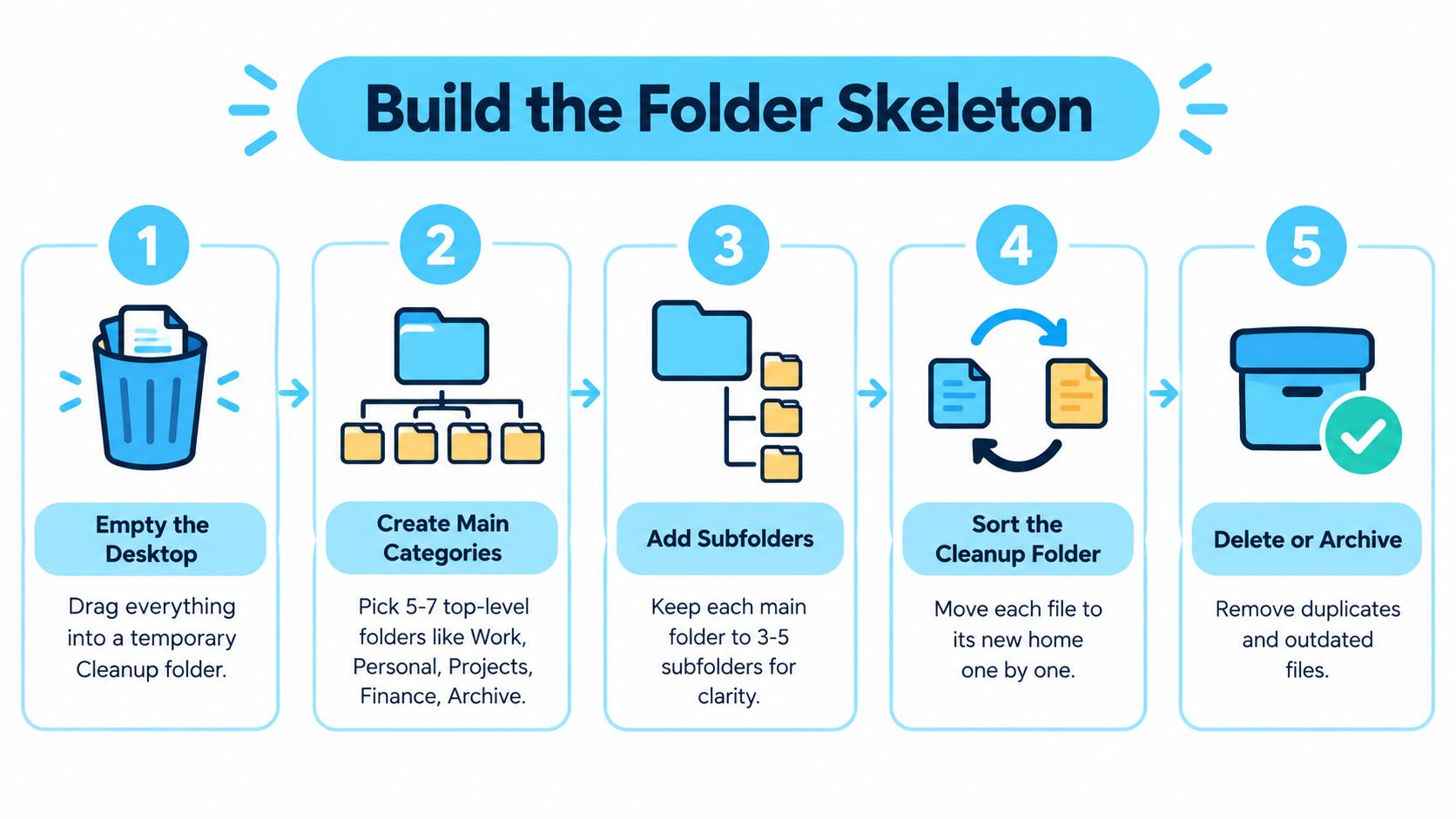
Move the Cleanup folder one file at a time into the right home. Delete duplicates, archive dead projects, and leave the desktop empty when you're done. That part is not glamorous, but it's the foundation everything else depends on.
Use Finder Stacks, Tags, and Smart Folders Together
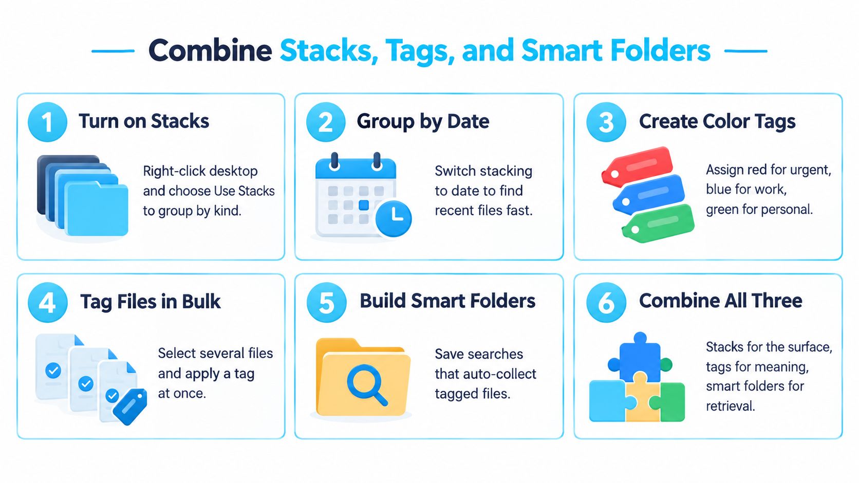
macOS already gives you three useful layers, and people ignore all three. Stacks clean up the surface. Tags mark meaning across folders. Smart Folders give you live views without moving anything. Used together, they turn the desktop from a dumping ground into a working surface.
Treat the desktop like a view, not a storage bin
Turn on Use Stacks so loose files group by kind or date instead of spreading across the screen. Keep Folders on Top when you sort by name, because folders should stay easy to reach. That way the desktop acts like a surface you can scan quickly, not a landfill where everything competes for attention.
Tags are where the best control comes in. Use a small vocabulary such as Active, Review, Final, and Archive. Apple documents that tags can be applied from Finder's contextual menu and then found in the Finder sidebar or Spotlight, which is exactly why they work so well for cross-cutting states. A file can belong to a project folder and still carry a tag that says what stage it's in. Apple's Finder organization guide covers the mechanics.
Smart Folders are not a move command. They're a lens.
That distinction matters. A Smart Folder surfaces matching files, such as PDFs edited in the last month or everything tagged Work, but it doesn't relocate anything. Use them for the views you reopen constantly, not for pretending the file system is cleaner than it is.
For people who want a tool-assisted version of the same visual logic, Tintd styles folders with icons and colors locally on the Mac, including automatic styling for new folders. I'd still start with native Finder tools first, because the structure has to exist before the styling has anything useful to reinforce.
Design a Color and Icon System That Reinforces Memory
Icons and colors only help when they mean the same thing every time. If a green folder means “urgent” in one place and “finance” in another, you've built confusion with prettier shapes. The trick is to make color and icon work as a second memory layer, not as the whole system.
Assign one meaning per visual dimension
I'd use color for workflow state and icons for content type. That gives you a clean split. For example, one color can say whether something is active, in review, or archived, while the icon can tell you whether the folder holds project files, paperwork, or media.
The reason this works is simple. Finder gives you a sidebar, folders, search, and tags, but the human eye still reads shape and color before it reads text. Apple's docs also show that folder customization and visual cues are now part of the native macOS experience, not some strange add-on. With macOS Tahoe introducing more folder customization options, the need for a stable legend gets even stronger. Apple's folder customization overview reflects that direction.
Keep the legend small and boring
Don't build a rainbow. Keep the palette tight, and use the same symbol language across every top-level folder.
- Blue or green: active work
- Amber: review or waiting
- Grey: archive
- Rocket icon: projects
- Camera icon: media
- Document icon: paperwork
If the legend needs explaining every time, it isn't a legend.
That also means folder icons should reinforce semantic names, not replace them. A folder called 2026-03_Client_Project with a matching icon is useful. A folder called misc stuff with a cute emoji is not. Visuals should make the right folder faster to spot across the room, but the name still has to carry meaning when Spotlight or another tool reads the structure.
If you want a practical way to build and maintain this kind of folder styling, how to customize folder icons is the right place to pair with this approach. Just keep the rule simple. One folder family, one visual language, no exceptions unless the purpose changes.
Manual Icon Workflows Versus a Folder Watcher
If you only have a handful of custom folders, manual icon work is fine. Open Get Info, paste the icon, move on. It's native, free, and perfectly acceptable when the number of folders is small. Once the count climbs or folders keep getting created, that method turns into repetitive admin.
| Dimension | Manual via Finder | Folder Watcher |
|---|---|---|
| Setup effort | Low for a few folders | Higher upfront, then mostly hands-off |
| Speed | Fine for one-offs | Faster when folders appear often |
| Consistency | Depends on you remembering | Applies the same rules automatically |
| New folders | You style them later | Styles them as they appear |
| Best fit | Small, static sets | Rotating project folders and busy desktops |
A watcher makes sense when folders are being created all the time. Tintd, for example, can watch selected locations and apply icons and colors automatically when new folders appear, while still letting you edit folders manually if you want to. That's the right tradeoff for people who manage rotating client work, creative assets, or project trees that keep changing shape.
Manual editing still wins if you have only a few special folders and you don't mind touching them by hand. But once you find yourself styling the same kinds of folders over and over, automation stops being fancy and starts being sensible. Use the watched approach when the problem is consistency, not just setup.
Shortcuts, Quick Actions, and a Maintenance Habit
A clean desktop dies fast when maintenance feels like a chore. So make the routine tiny. The rule is simple, touch the desktop less, not more. The goal is to redirect files quickly, not build a ritual that you'll abandon by Friday.
A tiny daily and weekly routine
Daily, empty Downloads into your Inbox folder before you shut the lid. Tag anything that needs follow-up and leave it there if you're still deciding. Weekly, review the Inbox, route items into Projects or Archive, and check that any new project folders inherited the right icon or color.
Three small automation hooks keep the routine honest:
- Finder Quick Action: send selected files directly to a chosen folder
- Shortcut: rename screenshots with the date and project name
- Folder Watcher: style new folders as they appear
Those don't replace judgment. They just remove decisions you keep making the same way. A Quick Action that moves invoices to the right folder is useful because it kills the friction between seeing a file and filing it. A rename Shortcut matters because screenshots are useless when they all share the same generic name. A watcher matters because new folders should never show up visually naked.
The weekly review is where drift gets corrected. Missing icons get fixed, stale folders get archived, and the desktop stays readable because you're maintaining a standard instead of improvising each time. That's the whole game, make the right action the easiest action.
Keep the System Alive Long Term
A tidy Mac desktop doesn't survive because you had a productive afternoon. It survives because the next file has a destination and the next folder has a visual identity. Those two rules do almost all the work. Everything else just supports them.
The order matters. Clear the desktop first. Build a shallow skeleton. Turn on Stacks and use a small tag vocabulary. Pick a color legend that means one thing per color. Then decide whether manual icon work is enough or whether you want an automatic watcher handling new folders as they appear. Finish by keeping a daily and weekly reset habit so the system doesn't rot under load.
The payoff isn't a pretty screenshot. It's a desktop that costs almost nothing to maintain because the structure does the deciding for you. When the folder tree is predictable and the visual language is consistent, you stop spending attention on housekeeping and start spending it on the work in front of you.
Tintd gives you a local way to assign folder icons and colors on macOS, either by hand or with automatic folder watching. If your desktop needs a visual system that stays consistent, visit Tintd and use it to make new folders recognizable the moment they appear.