
How many folders do you open before you find the PDF the client signed?
Open the Finder window for a project you wrapped up last month. The folders are named. The files are sorted. The structure makes sense. Then you still click through four identical blue folders, check two wrong versions, and fall back to typing the filename into search.
Many people struggle to find files they saved, even when the folders look tidy. Tidy and findable are different problems, and most folder advice only solves the first one.
The eight ideas below attack both. Some are structural: PARA, Johnny.Decimal, client hierarchies, date prefixes. Each one pairs that structure with a visual layer so the system is scannable in Finder, not just logically correct: colors, icons, numbering. A few are habits that stop the whole thing from rotting after month three. Every approach has a real trade-off, so the cons sit next to the pros.
Don't adopt all eight. Pick two or three that match how you work, run them for a month, and keep whatever survives. If half your files live in the cloud anyway, the same habits apply to managing cloud storage for small businesses.
1. PARA Method (Projects, Areas, Resources, Archives)
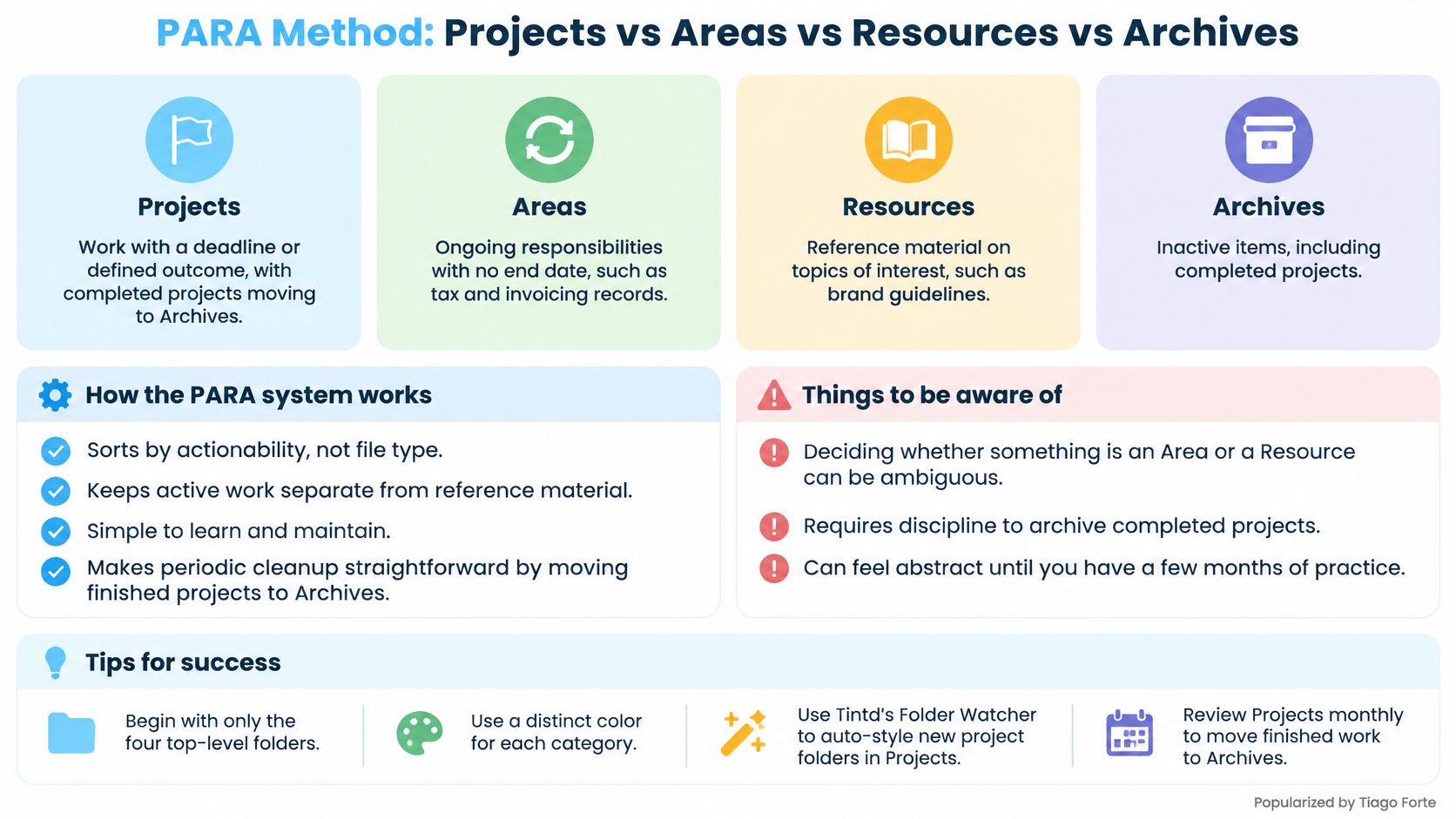
A client engagement with a deadline does not belong next to last year's brand guidelines. PARA keeps those apart by sorting folders on how actionable the contents are, not on file type. Four top-level folders carry the whole system.
Projects hold work with a deadline or a defined outcome. Areas cover ongoing responsibilities that never finish, like finance, hiring, or your own invoicing. Resources store reference material on topics you care about. Archives hold anything inactive but worth keeping.
A designer ends up with each client engagement as a project folder, brand guidelines under Resources, and last year's delivered work in Archives. A freelancer puts tax records and invoice templates under Areas, because neither one has an end date.
Here's the four-way split mapped out:
Why It Beats Filing by Type
Filing by type answers "what kind of file is this?" PARA answers "what am I working on now?" Re-finding shared files is among the least satisfactory parts of file management, and a pile of type folders (Invoices, PDFs, Images) makes that hunt worse. Shallow parents, with subfolders only where a live project needs them, keep the active set small enough to scan.
Color and icon turn that logic into something you can read in Finder before you open a name.
- Start with four folders and nothing else. Subfolders appear when a project earns them, not in advance.
- Color each top-level category once. Select the parents, then give Projects one hue and icon and Areas another in a single action, so the split reads without a word.
- Review Projects monthly. Finished work moves to Archives. The active list stays short enough to scan.
- Let new folders style themselves. A folder watcher on the Projects location detects each new folder and applies a matching color and icon from its name, so consistency does not depend on a manual sweep.
The honest downside: PARA says nothing about naming. Until you write naming rules down, the discipline lives in your head. Two project folders both called "Final" stay confusing no matter which color you give them. Archives also grow slowly if the monthly move never happens, and then the visual layer just makes a stale pile easier to see.
2. Johnny.Decimal System
Johnny.Decimal replaces descriptive folder names with IDs. Areas get ranges of ten (10-19 admin, 20-29 coursework, 30-39 publications), categories inside each area get a number (11, 12), and individual items get a two-part ID like 11.01. Sort by name and the entire system snaps into the order you designed.
A researcher can cite "11.04" in a grant application and know exactly which file that means. A photographer does the same for clients, equipment, and business records: 10-19 for clients, 20-29 for gear, 30-39 for admin. No ambiguity survives a rename.
The Real Benefit Is Referencing
Numbers survive moves, renames, and volume migrations that break name-based paths. Research on scientific file systems names the underlying problem: as collections grow, users stay dependent on remembering where a file was placed, and manual metadata work costs time without paying it back (a study of scientific file systems and manual metadata). Fixed IDs move some of that burden onto the structure itself.
Any folder deeper than three levels is a navigation tax you pay every time you open the window. Numbering makes depth tempting, so cap it deliberately.
The trade-offs are real. You can't rename a folder on a whim, and a collaborator who doesn't know the system finds "21.03" far less useful than "Client Invoices." Pair each number with a short plain-language name (21.03 Invoices) and keep one index file listing every ID.
- Plan the ten areas first. Renumbering after you've built 60 folders is a weekend you won't enjoy.
- Keep the index in plain text. One file, synced, openable on any device.
- Style numbers and icons together. A number plus a matching icon reinforces the same cue twice.
3. Color-Coded Folder Systems
Fifteen projects in one window, and the question is still "what is on my plate?" A video team can answer that without reading names if red folders are in edit, blue folders wait on client review, and green folders are delivered. The tree stays a simple status structure. Color is the layer that makes it scannable in Finder.
Names do not scale the same way. A foundational study of 73 knowledge workers found the average document collection held 5,850 files across 628 folders, with individual folder counts ranging from 11 to 4,694 (a study of personal digital document structures). At that size, distinguishing folders by sight is retrieval.
Three folders, three meanings, no reading required:

Rules That Keep Color Useful
Cap the palette at five or six colors. Past that, shades blur in list view and you are back to reading names.
Use one axis only. Lifecycle (active, review, delivered, archived) or category (client, internal, admin), never both on the same folder. Two meanings on one color and the cue stops working.
Some readers have color vision deficiency, so treat color as an accelerator and pair it with an icon or a number. I'd keep color off any system that has no second cue.
Color the whole set in one action, not folder by folder. Inconsistent reds are how a palette loses its meaning. The other failure is the blank folder that shows up tomorrow. Tintd's Folder Watcher can detect a new folder in a chosen location and give it a color and icon from its name. Turn the watcher off if you would rather set icons by hand. If nobody will maintain the rule, skip color.
One limit sits under all of this. Changing a folder's color is cosmetic and leaves the files inside alone, but those custom icons are stored on that Mac. A second computer needs the same setup, or the names remain and the visual layer does not.
4. Date-Prefixed Chronological Folders
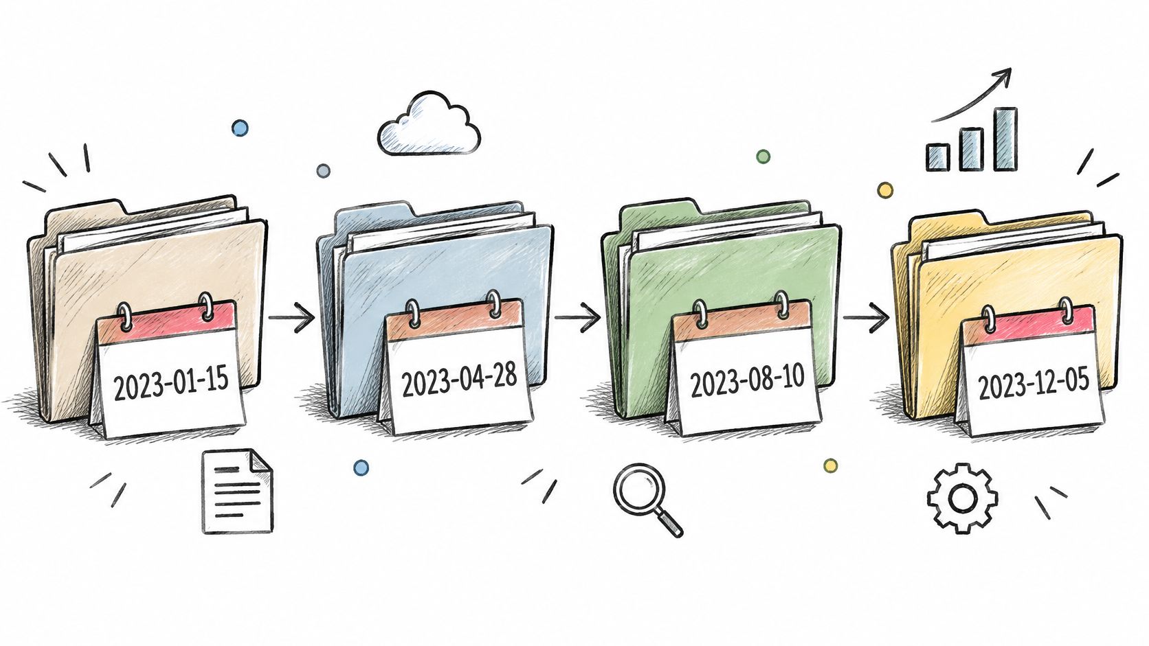
2026-09-14_Smith-Wedding sorts before 2026-10-02_Jones-Portrait, and it keeps sorting that way after you copy it to a client's drive, a backup disk, or a shared team folder. That portability is the case for date prefixes: the sequence lives in the name, not in Finder metadata that vanishes on export.
A consultant stores meeting records as 2026-10-02_Client-Kickoff inside that client's folder. A photographer names shoots by date plus subject. Open the folder a year later and the timeline is already built.
The date is only one piece of a bigger file naming conventions standard. Decide the order once (date, client, subject, version), then never negotiate it again at 11pm.
ISO or Nothing
Use YYYY-MM-DD and nothing else. It sorts correctly as plain text in Finder, in a spreadsheet, and in a terminal. Formats like 14-09-2026 or 09/14/2026 sort by the wrong unit or break the moment a collaborator in another country reads them.
- Add a yearly parent folder. A 2026 folder holding dated subfolders keeps the top-level list short.
- Keep the date short and the subject shorter.
2026-03-11_Q1-Budgetbeats2026-03-11_Meeting with finance about the Q1 budget final v2. - Color by event type, not by date. Dates already handle order; color should carry something the date can't.
Dates are useless for anything you think about by name. Nobody hunts for "the 2026-03-11 folder." Use them for records, shoots, meetings, and deliverables, and leave reference material organized by topic.
5. Client- and Project-Based Hierarchies
Clients / Acme / Website Redesign 2026 / Final. Four levels, every account, no exceptions. When you bill by client and hand off by project, this mirrors how you already think about the work, and it turns invoicing, archiving, and file handoff into single steps.
The overhead it removes is real. Employees across six European markets spent approximately 15 hours per week on five core administrative tasks, including document management, according to Ricoh Europe's 2025 research on admin workload. A template with standard subfolders already inside it cuts a slice of that every time you start an engagement.
An agency that builds one template folder (Briefs, Working, Deliverables, Final, Invoices) and duplicates it per client never has to invent a structure under deadline pressure. Written rules beat improvisation, which is why a documented project folder structure pays for itself on the third client.
The repeating-engagement detail is often overlooked.

- Put the year in project names. Website Redesign 2025 and Website Redesign 2026 sit side by side without anyone confusing the files.
- Style every client folder identically. Batch applying one icon and one color across all client folders takes a minute and makes the account list scannable forever.
- Keep shared assets outside the tree. Logos, fonts, and boilerplate live in one Assets folder, not copied into forty client directories.
6. Icon-Based Visual Tagging
Color says which folder is which. Icons say what's inside. A camera on shoot folders, a checkmark on delivered galleries, a code bracket on repositories: the icon answers the question before you read a name.
Watching the visual layer get applied is the fastest way to understand it:
The time at stake isn't trivial. Workers spent an average of 4.5 hours per week searching for files, emails, or links they'd already seen, about 29 workdays a year, and 28% felt overwhelmed by their digital workspace weekly, per a 2025 survey of 1,005 U.S. employees. Visual cues move that number: the same report cites a longitudinal study of Finder users where icon highlights cut real-world retrieval from 12.2 seconds to 10.6 seconds, a 13% drop.
Build a Legend, Not a Decoration
Write the legend down before you style anything. One icon per content type, one color per lifecycle state, and a rule for what happens when the two conflict. Fifteen random emoji look worse than no icons at all.
- Separate what from where. Icon equals content type (photos, code, contracts). Color equals status. Mixing the two axes is what makes icon systems collapse.
- Raid a large emoji and icon library. A folder-icon app that converts an emoji into an overlay saves searching for PNGs.
- Keep an escape hatch. Any styled folder should revert to the default macOS icon in one click, because a bad batch edit across 300 folders is painful to undo by hand.
- Reuse what already worked. Save the icon and color combo for "Delivered" once, then reapply it instead of rebuilding it.
Icons carry the highest maintenance cost of anything here. Every new folder is a small decision unless something automates the styling for you.
7. Type-Based Folder Organization
Documents, Images, Video, Audio, Installers. It's the structure every desktop operating system shipped with for thirty years, and it still works when you don't know where else a file belongs. Setup time is close to zero and nobody needs training.
Retrieval is where it breaks. A review of personal information management research reports that an earlier study found 19% of documents could not be retrieved and 26% could be retrieved only with difficulty, and a later study still found 13% unretrievable and 21% difficult to retrieve (a 2025 review of personal information management research). The same review argues folder systems should mirror how people look for things, by activity, project, client, or stage of work, rather than by abstract technical category.
Use Types as a Second Level
Type folders earn their place one level down, shortening long lists: Acme / Website Redesign 2026 / Images. At the top level they scatter a single project across five locations and force you to remember a file's format before you can start looking. That's the wrong question to put in front of yourself.
- Give each type folder its own icon. A distinct image icon on Images, a document icon on Documents, so the sub-level reads instantly.
- Merge what you don't use. If the Audio folder has held three files since 2022, fold it into Media.
- Clean Downloads first. A personal Mac's Downloads folder sorted into Documents, Images, and Installers is the classic low-effort win.
- Keep formats out of folder names.
Imagesis enough.Images_JPG_PNG_RAWis filing for the file system rather than for your memory.
Honest verdict: type-based organization needs almost no planning and almost no upkeep, and it gives you very little to think with. Use it as a sub-layer, not a system.
8. Inbox and Staging Folder Workflow
Where does a file go in the ten seconds after it arrives? One folder called Inbox, at the top of your home directory, is the answer. Downloads, screenshots, email attachments, and client drops all land there. Once a week you file the contents into the permanent structure. Capture and filing stay two separate acts, which is why this holds up when filing each item as it arrives does not.
Deciding what to keep is the hard part. A 2025 study of workplace digital hoarding found employees most strongly agreed with "believing files might be useful later" and "losing track of digital files" (a 2025 study of digital hoarding at work). Use controlled retention: a Quarantine folder with a review date in the name, active work kept apart from reference, and the original filename left intact so a file's origin stays visible.
The Weekly Fifteen Minutes
Friday afternoon, fifteen minutes, on the calendar. The slot matters more than the length. Allow three destinations only: a project folder, Quarantine, or the trash. "Decide later" is how the inbox doubles.
Pair the structure with a visual layer so Finder shows the stage of work, not just the name.
- Inbox gets a loud color and a warning-style icon. An unprocessed pile should be impossible to miss.
- Quarantine gets a quieter icon. Same family of styling, different signal, so the holding pen does not look like live work.
- New subfolders should not arrive as plain blue icons. A watcher on the inbox location keeps anything spawned there visually consistent.
Folder actions can route screenshots and downloads by type or date before you open the folder. A handful of Automator folder actions covers most of those obvious cases. The same staging habit helps with streamlining document approval workflows: a file sits in Quarantine until someone has decided, then it moves into the permanent tree.
Skip two Fridays and Inbox becomes a second, worse filing system. You then search two places for one file. The upside is few daily decisions and a full inbox you can see at a glance. The cost is discipline: the weekly pass has to happen, and a fat Quarantine with no review date is hoarding under a cleaner name.
8 Folder Organization Ideas Compared
| Idea | Best for | Maintenance effort | Works well with |
|---|---|---|---|
| PARA Method (Projects, Areas, Resources, Archives) | Separating active work, ongoing responsibilities, reference, and inactive items | Low; review and archive completed projects regularly | Folder colors, project subfolders |
| Johnny.Decimal System | Predictable, numbered structures and unambiguous folder references | Moderate; plan IDs and update them when the structure changes | A single index file, consistent icons |
| Color-Coded Folder Systems | Scanning dense folder lists and recognizing categories at a glance | Moderate; keep the palette small and apply colors consistently | Icons, project-based folders |
| Date-Prefixed Chronological Folders | Records and work where timing matters | Low; use a consistent ISO date format | Yearly parent folders, colors or icons |
| Client- and Project-Based Hierarchies | Freelancers, agencies, and consultants managing multiple client engagements | Moderate; maintain templates and naming conventions | Shared assets folder, batch styling |
| Icon-Based Visual Tagging | Recognizing folder contents or status quickly | Low to moderate; keep icon meanings consistent | Color coding, folder names |
| Type-Based Folder Organization | Finding files by format, such as images, documents, or audio | Low; periodically review and merge rarely used categories | Project or client folders, folder icons |
| Inbox and Staging Folder Workflow | Capturing unsorted files before filing them into a main structure | Moderate; process the inbox on a regular schedule | Any organizational system, distinctive icon or color |
Pick Two, Set Them Up Today
Eight ideas is a reading list, not a plan. Adopting all of them in one weekend produces a folder tree you'll abandon by Thursday, and then you'll conclude folder organization doesn't work when scope was the problem.
Pick one structural system. PARA if you juggle many responsibilities and need a place for everything. Johnny.Decimal if you need stable references that survive renames. Client hierarchies if every job is billed to someone. Date prefixes if your work arrives in events, shoots, or meetings. You only need one at the top of the tree.
Then pick one maintenance habit. A weekly inbox review is the highest-return fifteen minutes in this entire article, because every other system here degrades without it.
Then apply the visual layer, because structure alone is what you already have and it isn't working. Say you're a freelance designer with thirty active clients. Move to Clients / Client / Project, color by status (red in progress, blue in review, green delivered), put a camera icon on photo folders and a document icon on contracts, and keep one Inbox you empty every Friday. That's three of the eight ideas, and it covers nearly all of your retrieval pain.
The test isn't whether the folders look good. It's whether you find a file faster next month, and whether the system costs you less than ten minutes a week to maintain.
Tintd handles that visual layer on macOS: smart icon and color suggestions based on folder names, batch editing across whole folder trees, and a Folder Watcher that styles new folders automatically as they're created. It runs entirely on your Mac with a one-time purchase.
Pair the setup with a backup habit, since a beautifully organized folder you can't restore is worse than a messy one you can. These backup and recovery habits are worth thirty minutes before you restructure anything.
Two or three of these ideas, applied to real folders, will do more for your week than a perfect taxonomy you never finish. Tintd is built for the visual half of that work on macOS: it reads a folder's name and suggests an icon and color, applies one style across dozens of folders and subfolders in a single action, and its Folder Watcher styles new folders the moment they appear, all processed locally on your Mac. Visit Tintd to see the icon library and set up your first color scheme today.