
You open Documents to find a client project, but every folder looks alike. You've already tried changing a few colors, and now you can't remember whether orange means urgent, unfinished, or just something you liked that afternoon.
A useful folder color icon set starts with a legend, not a collection of attractive icons. Decide what each visual cue means, apply it consistently, and keep searchable labels separate from appearance. Then choose whether new folders should be styled by hand or through privacy-conscious automation.
Build a Starter Color Legend and Test It
Starter legend for a folder color and icon set
| Role or status | Suggested color | Icon type | Example folder |
|---|---|---|---|
| Clients | Blue | Briefcase symbol | Client Acme |
| Active projects | Green | Rocket emoji | Website Relaunch |
| Waiting for review | Orange | Clock symbol | Q3 Design Review |
| Personal | Purple | House emoji | Taxes and Receipts |
| Archive | Gray | Box symbol | Completed Projects |
| Urgent | Red | Exclamation symbol | Invoices Due This Week |
Treat this as a starter example, not a universal filing standard. Each role gets one color so you can recognize its meaning before reading the folder name. You can make your own folder icon color or choose one from a palette, but keep the chosen shade consistent across matching folders.
There's a catch: these roles can overlap. Client Acme might contain an active project waiting for review, so don't assign whichever color feels most relevant that morning. Choose the folder's primary purpose, or define separate legends for separate parent folders.
For example, your top-level Documents folders might distinguish Clients from Personal, while a dedicated production folder uses Active, Review, and Archive. Don't mix those interpretations among neighboring folders.
Test the legend against your actual folders
Open Documents and scan the colors you've already used. Can you give every colored folder a role without making an exception? Fix contradictions first, such as a blue personal folder sitting beside blue client folders.
Build your own version with this short sequence:
- List the categories you use. Start with recurring work, such as clients, coursework, personal administration, and completed projects. Leave hypothetical future categories out.
- Assign a distinct color to each category. Compare the colors together rather than choosing them on separate days.
- Pick a recognizable icon for each role. Save the mapping in a note or a folder named Legend, including an example folder for each entry.
- Apply the set inside a single parent folder first. Once the choices feel coherent, extend them to the Projects folder where you create new work.
- Keep the palette constrained. Add a category only when an existing category can't describe the folder, not because another color looks appealing.
For a related approach to maintaining a written visual key, Fluidwave's guide to color-coded notes is useful alongside your folder legend. Keep that note easy to find, especially if someone else uses your Mac.
Why Folder Color Only Works With a Stable Meaning
A subway map works because each color identifies a particular line. Give unrelated lines the same hue without another clear distinction, and passengers can't reliably follow the route.
Finder presents a similar problem because several visual features can look like parts of the same system. Folder tint, Finder tags, and custom icons aren't interchangeable, even when they share a color.
Three layers of folder styling in Finder
| Layer | What readers see | Found by Spotlight search | Best use |
|---|---|---|---|
| Folder tint | Folder color in Finder | No, the appearance itself isn't indexed | Category, such as client or personal |
| Finder tags | Colored label in the sidebar and file lists | Yes, from any location | Status, such as review or archived |
| Custom icon overlay | Symbol, emoji, or image on the folder | No, the artwork itself isn't searchable metadata | Folder role, such as invoices or drafts |
Apple's guide to Finder tags explains that tags can be assigned to files and folders, given colors, displayed in the sidebar, and found through Spotlight regardless of location. Finder can also tint folders based on their tags, which makes the distinction between appearance and metadata especially easy to miss.
This visual comparison separates the layers before you combine them.
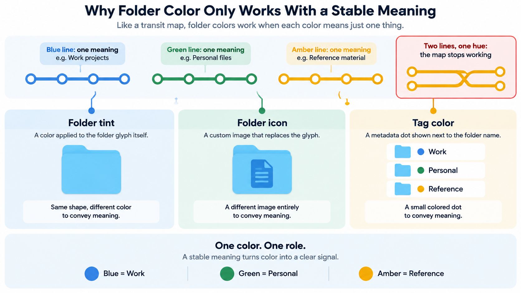
Separate identity from changing status
For a durable setup, use color for category, an icon for folder role, and tags for status. A blue client folder can carry an invoice symbol while receiving a Review tag. When the review finishes, change the tag rather than redesigning the folder's identity.
That's a refinement of the starter legend: status colors can work inside a narrowly defined workflow, but mixing permanent categories and temporary states in the same location creates conflicts. Decide which interpretation applies before styling the folders.
A colored custom icon doesn't automatically create a searchable tag. If you want to retrieve every folder awaiting approval, assign a named tag explicitly rather than expecting Spotlight to understand orange artwork.
Your folder hierarchy still needs sensible names and locations. A broader digital file organization approach helps you decide where a folder belongs; visual styling helps you recognize it once you're there.
Before accepting any distinction in your set, ask: Which layer does this belong in, appearance, role, or searchable status?
How Many Colors and Icons a Set Can Hold
A set can hold only as many colors as you can tell apart at a glance. When every project gets its own shade, the legend becomes a memory test, and the folder that needed the fastest recognition is the one you misread.
Finder includes seven built-in tag colors: red, orange, yellow, green, blue, purple, and gray. That fixed list is a useful reminder that macOS treats color as a small set of meanings. A custom folder palette does not have to copy those hues, but it should stay small enough that neighboring folders never look like near matches. When hues crowd together, recognition slows. Pairing each tint with a readable name or a distinct icon helps, including for users with mild color-vision differences.
Treat the counts below as starting ranges to test on your own screen. The right ceiling depends on icon size, Finder view, display contrast, and how often two categories sit side by side.
Palette size and the system to use
| Categories in the set | Recommended system | Why it works |
|---|---|---|
| 1-4 categories | Color alone for category coding, with readable folder names | A small selection of clearly separated hues stays easy to compare |
| 5-6 categories | Color plus a role icon | The icon supplies a second cue when two tints feel close |
| 7 or more categories | Two levels, color for area and icon for subtype | Avoids requiring a separate hue for every subtype |
Make the set readable without color
Even a small palette should survive bad lighting, small icons, and imperfect color perception. Red and green can be difficult to distinguish for people with color-vision differences, so avoid making that pair carry the difference between urgent work and active work.
Give each category a second signal. Use an exclamation symbol for urgent folders and a rocket for active projects, then keep names that say what the folder contains. Invoices Due This Week communicates more than a red folder called Misc.
A folder should remain identifiable when its color isn't obvious.
Choose icons with different silhouettes. A briefcase, house, and clock separate faster than three document symbols with minor changes. Fine decoration disappears when Finder shrinks icons, so prefer bold shapes that still read at list-view size.
Test at working size
Inspect the set in list view and icon view, using the smallest icon size you normally use. Judge the actual folders against your desktop background and Finder appearance, not enlarged previews in a picker.
Then ask someone unfamiliar with the setup to match folders to your legend. If they confuse categories, simplify before adding shades. For a large collection, divide broad areas into parent folders and reuse meaningful role icons inside them, so each level stays readable and the same visual vocabulary works throughout the set.
How to Apply a Color and Icon in Finder
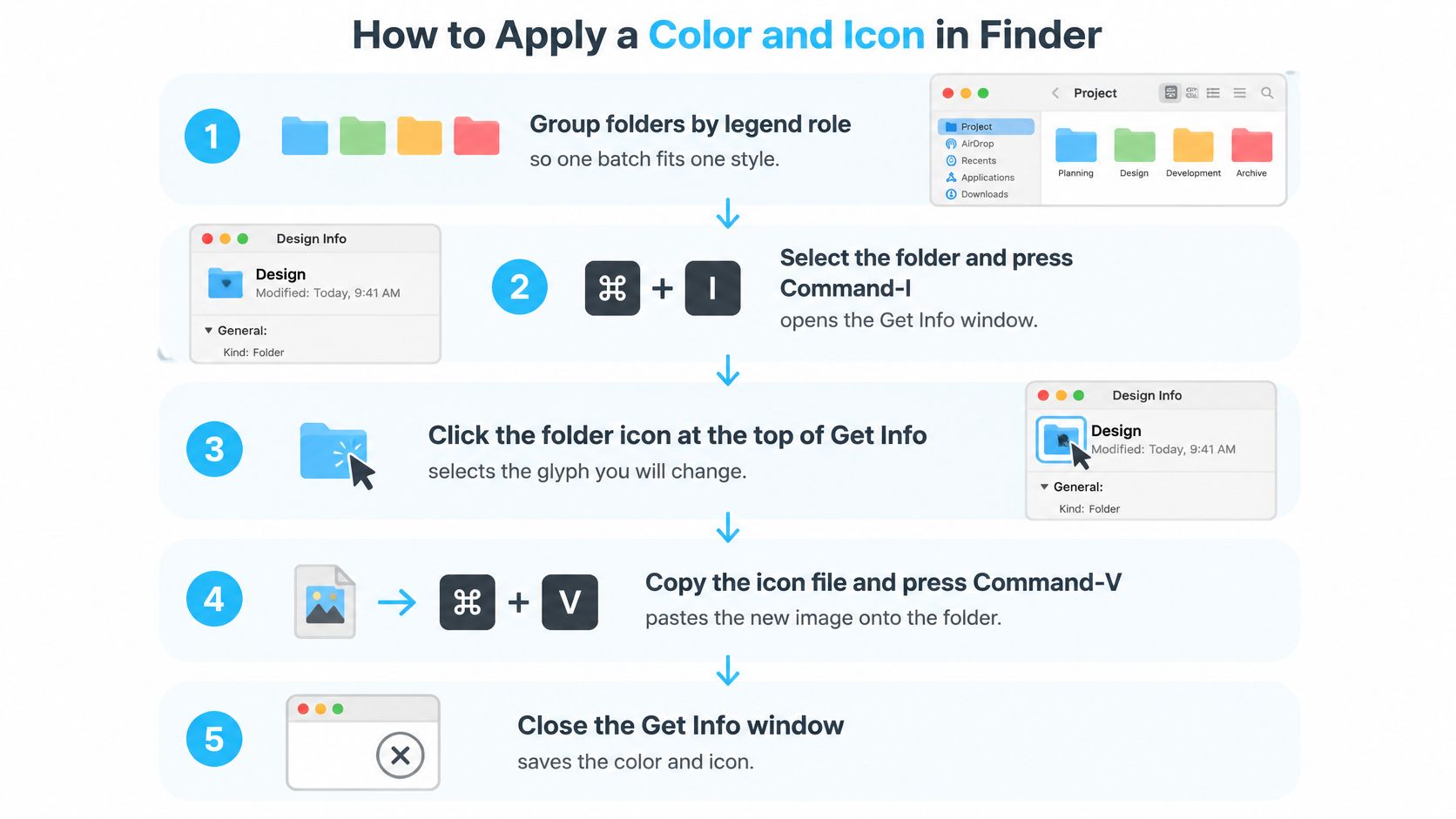
Group folders by legend role before changing anything. A batch should contain folders that deserve the same style, not merely folders that happen to be adjacent in the window.
Apple's folder customization guide documents folder colors, symbols, emoji, and image-derived custom icons. The controls available depend on your macOS interface, so distinguish the built-in customization panel from the Get Info method for pasting a custom image.
This graphic shows the custom-image route through Get Info.
Apply the style deliberately
- Select a folder and press Command-I. This opens Get Info, where you can select the folder's current icon. Start with a test folder so you can verify the result before changing a group.
- Click the small folder icon at the top-left of Get Info. Make sure the icon itself is selected, rather than the larger preview or the folder name.
- Apply your chosen artwork. For a custom image, open it in Preview, select and copy the image, then return to the selected Get Info icon and press Command-V. If Finder offers Customize Folder in its contextual menu, use that panel for its built-in color, symbol, or emoji choices instead.
- Repeat for the rest of the group, or use batch editing. Tintd opens from Finder's right-click menu and lets you give several selected folders a color and icon in a single action, which avoids repeating the same manual edit.
- Inspect before continuing. Close Get Info and check the result in list view and at a small icon size. Confirm that the folder still looks like a folder and that its symbol remains recognizable.
For choosing suitable artwork before you paste it, the guide to custom folder icons provides a useful companion to the application steps.
The video offers another way to follow the folder-customization workflow.
Respect permissions and keep a return path
Protected locations such as Applications, Library, System, and Users generally can't be customized. Work in user-editable locations such as Documents, Desktop, or your project folders, and don't change permissions on system folders just to apply artwork.
Before a batch operation, confirm that you can edit the target folders. If a folder is restricted, leave it unchanged rather than treating a partial batch as a reason to broaden access. Be especially deliberate about any option that includes subfolders.
Custom folder icons are stored locally on each Mac, so set up the customizations separately on another Mac. Keep your legend and source artwork available for that setup rather than assuming another machine will reproduce your working environment.
To return to the default macOS folder, open Get Info, select the small custom icon, and press Delete. If you're replacing a previous custom design rather than the default, save that artwork before overwriting it.
Automating New Folders Without Exposing Their Names
A color legend answers two questions on its own: which tint marks a category, and which icon explains it. Automation adds a third question with different stakes. Choosing a tint changes only what you see; choosing automation changes what the software can see. So before giving a tool access to a working directory, compare what information it can inspect and where it processes that information.
Automation models compared by privacy and connection
| Model | What it can observe | Where processing happens | Needs internet |
|---|---|---|---|
| Manual rules | Folder names you type yourself | Your Mac | No |
| Local automation | Folder names and neighboring folder colors | Your Mac, names stay on the device | No |
| Cloud-assisted classifier | Filenames, possibly extracted text | Provider servers | Yes |
The privacy discussion on Hacker News contrasts local processing with cloud-assisted organization, including the possibility of filenames or extracted text leaving the machine. Sending filenames alone is less invasive than uploading file contents, yet it still hands a third party information you may treat as private.
Say a watched folder is named Confidential Client Acquisition. Under a cloud model that transmits filenames, the classifier receives that sensitive phrase even if it never opens a document. Folder structures can also disclose relationships between clients, projects, and locations.
Define a narrow automation boundary
Manual styling through Finder requires no additional styling software or network transfer. You choose the folder and apply the legend yourself, which makes it a sensible starting point for sensitive collections.
Tintd's Folder Watcher detects each new folder created in chosen locations and automatically gives it a matching color and icon based on its name. Suggestions run locally on your Mac, folder names never leave the device, and no AI service is called. Choose watched locations intentionally rather than pointing the watcher at your entire home folder.
Changing a folder's color or icon is purely cosmetic. It doesn't alter files or subfolders inside it, so evaluate styling separately from tools that rename, move, or classify documents.
For workflows built around watched directories, Automator folder actions provide additional context for deciding where an action should run. The same tradeoff between automation and manual inspection shows up in other tooling, for example in SpecStory, Inc.'s discussion of balancing dashboards and terminals during releases.
Before enabling any tool, establish clear answers:
- Offline operation: Does styling still work when the Mac is disconnected?
- Data boundaries: Exactly what leaves the Mac, including names, paths, and nearby-folder context?
- Control and recovery: Can you pause automation, inspect its changes, and reverse unwanted styling?
Keeping the Set Consistent Over Time
After you've used the setup for a while, review the legend against the folders you open. Retire unused categories instead of keeping them merely because you spent time choosing their icons.
Run the Documents scan again and look for drift. A blue folder that no longer represents client work needs a deliberate correction, not an exception you'll have to remember.
Make maintenance part of filing
- Check new arrivals. Before accepting a style, confirm that it matches the folder's purpose, whether you applied it manually or received an automated suggestion.
- Review changing work. Update status tags when work moves into review or storage, rather than repeatedly redesigning permanent categories.
- Remove obsolete styling. Restore the default folder when a custom identity no longer helps you recognize its contents.
Keep visual maintenance separate from performance troubleshooting. If Finder feels sluggish, adding or removing a color isn't a substitute for diagnosis; MackTechs' explanation of why MacBooks slow down over time addresses that different problem.
Is the setup helping you identify folders without extra thought? Choose a single confusing folder today, assign it a clear place in your legend, and test the result before expanding the set.
Tintd offers custom folder colors, meaningful icon overlays, batch editing, and local automatic styling for new folders. Visit Tintd to apply your legend to a small project folder first, then expand it once the choices are easy to recognize.