
How many times this week have you opened a folder, found the wrong thing, and closed it again? That pause is the cost of a Finder window where every folder is the same pale blue rectangle with a different string under it. Naming is supposed to solve this. Naming rarely does, because names get abbreviated under deadline and two projects end up as "Smith_final" and "Smith_final2."
Folders are a navigation surface, and navigation surfaces work better with visual cues. Apple's own Finder already treats color tags and grouping as legitimate ways to find files, not decoration. Icons and colors do the same job at the folder level. They let you recognize a category before you read it, which is faster than scanning text and much faster than opening three folders to check.
Below are eight casos de uso, each treated as a small design problem. For each one you get the legend (what the colors mean), the state conventions (how styling changes as work moves), and the failure modes (the ways these systems rot). None of them require you to reorganize your files. The styles sit on top of the structure you already have.
Pick the one that matches your mess and copy the system.
1. Organizing Creative Photography and Video Projects
The tree looks tidy until you're 200 sessions deep.

A wedding photographer's archive holds names that differ by a suffix: RAW, Selects, Retouch, Final. Every one is the same blue rectangle. In 2024, 83% of surveyed creative professionals said visual browsing was the most important digital asset management feature, according to Playbook's State of Creative Digital Asset Management report. The folder itself should carry information.
Build the legend before you style anything
Decide four or five meanings, write them down, then apply them.
- Color for the year or season: one hue per shooting year, so 2026 always reads the same shade in the sidebar.
- Icon for material type: a camera for camera originals, a checkmark for exports already delivered, a ring for delivery folders.
- One permanent color for finished work: muted grey, applied the day a project ships.
The failure mode is styling as you go. A color chosen in March, another chosen under deadline in June, and no legend anywhere produces nine shades of blue-green and no way to tell which means what. Style a whole year in one pass from a written legend, then restyle brand-new folders from the Finder context menu as each shoot lands.
2. Managing Development Projects and Technical Resources
A Mac hosting four client repositories, two side projects, an assets export directory, and a docs folder tests memory, not skill.

Developers usually rely on naming discipline, and it breaks the moment the same repo name appears under three different clients. Color fixes the ambiguity faster than renaming does. A controlled information-location experiment found that color-coding schemes using mixed color temperatures, warm and cool hues combined, produced better overall performance than schemes built from visually similar colors, as reported in this study of color-coded information displays. The same experiment found dichromatic schemes beat monochromatic ones on response time, and yellow-inclusive palettes drew faster responses and higher preference.
There's a catch worth designing around. Red-inclusive palettes produced longer response times and lower preference in that study, so flooding a sidebar with red works against you.
- Production gets the rarest color: use red once, on the folder that can hurt you, and nowhere else.
- Test and staging share one green: two greens create a guessing game you'll lose at 2 a.m.
- Documentation and assets stay neutral: not every folder earns a color.
Keep the system shallow
Style only top-level folders. A subfolder five levels deep never appears in a sidebar scan, and decorating it just adds noise you have to undo later. When a folder changes role, restore the default macOS icon rather than inventing a new shade. Put the convention in the team README so it survives the next person who clones the repo. This developer tools for Mac roundup covers the rest of that workflow.
3. Sorting Coursework and Research Materials
Three courses in one semester, each with readings, notes, datasets, and a submission folder, all named in the same tired pattern. A second organizational layer earns its keep here.
Apple's guide to organizing files in the Finder documents what's already built in: folders, sorting, grouping by attributes such as date last opened, kind or size, color tags that stay searchable from the sidebar and Spotlight, and Smart Folders that collect everything matching a rule, like all PDFs edited in the past month, while leaving the originals in place.
Your icons and colors stack on top of those without replacing them.
- Icon carries subject: a book for literature, a microscope for lab work, a chart for statistics.
- Color carries semester: one palette per term, applied to every course folder in it.
- Tags carry what crosses folders: "to-read" and "submitted" work better as tags than as duplicate folders.
A folder tells you where something lives. A tag tells you what it is. Use both and stop arguing about which one wins.
Name folders so a machine and a human both parse them: 2026-1_Biology beats Bio_Spring_final. Consistent prefixes make automatic suggestions far more accurate, and consistent semester colors keep a six-course term readable. The failure mode here is per-course colors. Six courses, six hues, and your legend becomes wallpaper within a month.
4. Client Folder Management for Freelancers
Forty client folders, each with contracts, invoices, deliverables, and correspondence.

Client names stop being the useful signal once you have more than a dozen. Status is the signal. Reporting on digital clutter found that employees spend an average of 4.5 hours per week searching for previously accessed files, equivalent to nearly 29 workdays a year, with 28% saying digital clutter leaves them overwhelmed weekly and 12% reporting delayed submissions, per Economic Times HR's coverage of the digital clutter survey. A client folder that doesn't announce its status adds to that tally every morning.
Three states, three colors, no exceptions
- Active: green, applied to the client folder and its current deliverables.
- Paused or waiting on the client: amber, so you can see whose court the ball is in.
- Closed: grey, applied on the day the final invoice clears.
A briefcase icon marks clients with a signed contract, which makes the difference between "lead" and "client" visible without opening anything. When a retainer ends, restyle the whole tree in one pass rather than editing folder by folder. When you archive, restore the standard macOS icon so the grey doesn't follow you into next year.
The failure mode is encoding two ideas in one color. Status and service type can't both live in the hue, or the sidebar becomes a puzzle. Status wins the color. Service type gets the icon.
5. Personal Document and Home File Organization
The home folder is where naming discipline goes to die. Tax returns, receipts, insurance PDFs, scanned school forms, and a Downloads folder that hasn't been read since spring.
Icons beat names here because personal documents are recognized by shape and context, not by file name. A house icon for home documents, a banknote for money, a heart for health records, a plane for travel. You find the tax folder because it looks like money, not because you remember whether you called it Taxes_2025 or 2025_Tax.
- Start with five to ten folders: home, money, health, travel, family, plus whatever your life contains.
- Use emojis where speed beats precision: a camera emoji per photo year is faster to scan than four digits.
- Clear the Desktop weekly: it's the folder everyone sees and nobody styles.
The rule that keeps this system alive is restraint. Expand from five folders to eight when a real category appears, not when a single document arrives. Review the desktop every Friday and fold new items into the categories you already have. Small personal systems survive because they stay small.
6. Bulk Styling for Teams and Shared Workspaces
Shared workspaces are where individual taste becomes a coordination problem. In a 2024 survey of 423 U.S. and U.K. content and creative professionals, 34% identified a disorganized file structure as a major challenge when accessing relevant digital assets, according to MarketingProfs' chart on digital content challenges.
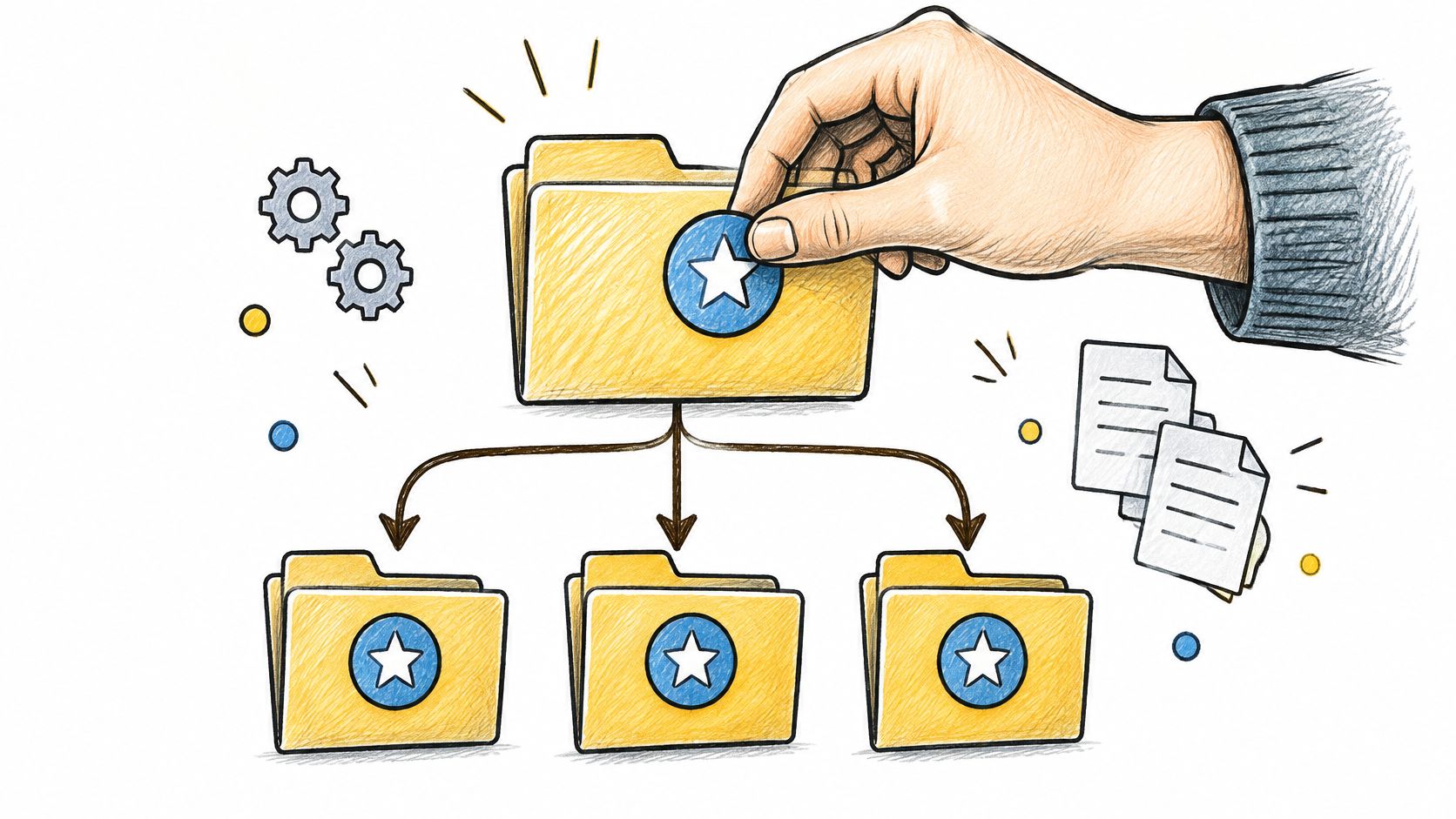
The problem compounds when the same work lives in several places. In September 2024, 57% of organizations surveyed across 14 countries said they relied on two or three digital asset management systems, per Cloudinary's Global DAM Survey conducted with Researchscape International. When files live in two or three systems, the visual convention is the only thing that travels between them intact.
Write the convention down before the sweep
Bulk editing makes it easy to apply a bad decision to ten thousand folders in one click, so sequence matters.
- Draft a one-page legend: client folders, internal projects, archives, active work. Four lines is enough.
- Test on a sample branch: apply the scheme to one project, live with it for a day, then roll it out.
- Bulk-apply across years: an architecture studio styling every project since 2019 in one pass gets consistency that manual work never delivers.
- Put the legend in onboarding: new team members inherit the system or they improvise their own.
7. Auto-Styling New Folders with Directory Watching
The system only works if it survives contact with a busy week. A folder watcher styles new folders as they appear, which is the difference between a convention and a habit.
That convenience has a privacy dimension that often goes overlooked. A watcher reads folder names continuously, and folder names leak project titles, client identities, research topics, and financial details without a single file being opened. Apple's privacy overview describes on-device processing as a way to use personal information without collecting it, and states that its products are designed to process on the device wherever possible and to give users control over what applications can access. Classification of folder names belongs in that category.
- Watch one root folder first: the projects directory, not the whole drive.
- Name with the keywords you'd search for: "invoice", "contract", "raw" give a watcher something to work with.
- Review the output weekly for the first month: correct the misses before the pattern hardens.
Automated styling should be reversible in one click. If you can't undo a sweep, don't run it on the archive you care about.
If you're weighing options, this guide to watch folder software covers how directory monitoring behaves in practice. The failure mode is watching Downloads, where names like "Untitled folder 3" and "scan_0042" produce confident, wrong suggestions. Start where names are deliberate.
8. Visually Unifying Folders Named in Multiple Languages
A German client sends Rechnungen. A French team sends factures. A Spanish vendor sends facturas. Three folders, one category, and a sidebar that treats them as unrelated strangers.
The fix is to style by meaning rather than by string. Assign one invoice icon and one color to all three, and the language stops mattering at a glance. Research on privacy-preserving systems makes a related point about scope: only the information necessary for the task should be collected and processed, as set out in this paper on privacy-preserving system design. Keeping language matching on the device means those folder names never travel to an external service just to be classified.
- Pick the meaning, not the word: invoice, contract, brief, and archive exist in every language you work in.
- Use one color for equivalent categories everywhere: factures, Rechnungen, and facturas share a hue.
- Agree on a minimal convention: even a rough rule like "invoices start with INV" dramatically improves detection across languages.
Ambiguous and abbreviated names are where this system fails. Check the suggestions on folders called "Rg." or "Fact." before you accept a bulk sweep.
For teams that lean on symbols rather than words, this guide to emoji folder icons explains how to keep a multilingual archive readable. The failure mode is treating translation as a reason to diverge. The moment three equivalent folders get three different icons, you've rebuilt the problem you set out to solve.
8 Folder Organization Use Cases at a Glance
| Use Case | Visual System | Key Tintd Feature | Setup Effort | Best For |
|---|---|---|---|---|
| Creative photography and video projects | Colors and icons by project stage | Bulk styling across project subfolders | Medium: define a color legend | Photographers and videographers managing large archives |
| Development projects and technical resources | Icons by folder type; colors by environment | Automatic styling for new folders | Low to medium: set conventions and style key folders | Developers and design teams managing multiple projects |
| Coursework and research materials | Subject icons; colors by semester or research group | Reuse style combinations with history | Low to medium: establish a repeatable scheme | Students and academics organizing courses and research |
| Client folders for freelancers | Icons by client or document type; colors by status | Multilingual folder-name recognition | Medium: maintain status colors over time | Freelancers and small agencies managing multiple clients |
| Personal documents and home files | Thematic icons and soft colors | Import custom images as folder icons | Low: start with a few main folders | Individuals and families organizing personal files |
| Bulk styling for teams and shared workspaces | Consistent icons and colors across folder hierarchies | Bulk editing and quick reversion | Medium: test and document the shared convention | Teams managing large or shared folder structures |
| Auto-styling new folders with directory watching | Name-based icons and colors applied automatically | Detect and style new folders in watched locations | Medium: configure and review a watched folder | Users with growing project or download directories |
| Folders named in multiple languages | Shared icons and colors for equivalent categories | Folder-name recognition across languages | Low to medium: review ambiguous suggestions | International teams and multilingual archives |
Build Your Own Visual System This Week
The temptation is to style everything at once. Resist it. Pick one use case from this list, write a legend of four or five colors, and apply it to a single top-level folder. Then live with it for a week and notice whether you're still opening folders to check what's inside.
Three decisions carry the whole system. What each color means, kept to five or fewer. What each icon type marks, tied to a category rather than a mood. And what happens when a folder changes state, whether that's a finished project, a closed client, or a new semester. Write those down before you touch a folder, and the styling takes an hour. Skip them, and you'll be redoing it in March.
The failure modes repeat across every use case: too many colors, two meanings in one hue, exceptions that outlive their project, and styling applied so deep in the tree that nobody sees it. A good visual system is boring and stable. It survives a busy week because new folders arrive already styled.
Tintd is one option for that on macOS. It runs entirely on-device, so folder names and directory context never leave the Mac, and it handles the parts that get tedious by hand: bulk styling across folders and subfolders, a folder watcher that styles new folders as they're created, and a one-click restore to the default macOS folder icons when you want out. Access is a one-time purchase with no subscription, and the app is licensed for personal, non-commercial use under its terms of service.
Start smaller than feels satisfying. Style one folder, watch it for a week, then let the system spread as you add projects. The compounding happens on its own once the convention is stable.
Tintd assigns custom icons and colors to your Finder folders, with Smart Icon and Smart Color suggestions, bulk editing across whole folder trees, and a folder watcher that styles new folders the moment they appear. Everything runs locally on your Mac, so your project and client names stay where they belong. Visit Tintd and style your first folder this week.