
You open Documents and find a wall of identical blue folders. Client work sits beside tax records, camera exports, course notes, and a project you haven't touched in months. Every folder looks the same, so you read each name until you spot the right one.
A well-chosen emoji gives you another clue. A camera can mark photography, a receipt can identify expenses, and an airplane can distinguish travel documents. Emoji icons work best as a navigation system, not decoration. Keep the folder names descriptive, then use symbols to help you scan neighboring folders without reading every label.
The useful choice isn't always the prettiest illustration. You need a recognizable shape at Finder's actual display size, a meaning that survives mixed-language folder names, and a consistent style across related projects.
Privacy matters, too, especially with client names or personal records. With on-device suggestions, folder names stay on your Mac rather than being sent elsewhere for matching. Start with the application that applies those choices, then compare the artwork libraries that can supply them.
1. Customize Folder Icons on macOS
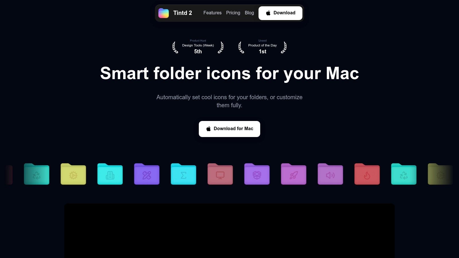
Tintd is the practical pick for applying and maintaining folder overlays, rather than downloading artwork. Its Smart Icon feature matches folder names against more than 11,000 icons and emojis, while manual selection lets you choose an emoji and drag it onto a folder. You can also import custom images.
For a repeatable setup, assign a camera to photography folders, a document to writing, and a laptop to development. Apply the same symbol across related folders with batch editing, then adjust size, placement, and color until the overlay reads clearly against the folder.
Build the convention before automating it
Finder's right-click integration keeps changes close to where you work. Folder Watcher can style new folders in selected locations automatically, but it's better to settle your category choices before enabling that behavior.
- Private suggestions: Icon and color matching runs locally, without cloud or AI calls. Folder names never leave your Mac.
- Mixed-language matching: Recognition supports combinations of 11 languages, useful when project names and category names don't share a language.
- Repeatable styling: History keeps previously created icons available for reuse, while batch controls apply an icon across selected folders.
- Easy reversal: Restore the standard macOS folder icon with one click if a treatment becomes distracting.
Our guide to using emojis as Mac folder icons explains the application workflow. The important distinction is between choosing a symbol and maintaining a convention: automatic suggestions help with the former, but you still decide what each category means.
The trade-off is scope. This is a Mac workflow, and customizations must be set up separately on each Mac. A large catalog also invites unnecessary tweaking, so choose a restrained style before editing your entire Documents folder.
2. OpenMoji
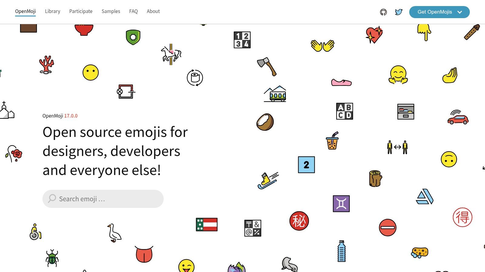
Choose OpenMoji when you want colorful, outlined artwork rather than the default emoji appearance. Its searchable library offers SVG and PNG assets, making it useful for assembling a coherent set of folder overlays.
Say you're organizing a photography project with folders for originals, edits, exports, and paperwork. OpenMoji gives you a common illustration style for the camera, editing-related symbol, outgoing files, and document. That shared treatment is more useful than collecting unrelated images that happen to fit each name.
Watch the outline at small sizes
An outlined illustration can look crisp in a browser preview but busy when reduced. Check whether the subject remains recognizable when you can no longer distinguish its internal details. A simple camera silhouette is a safer choice than artwork whose meaning depends on tiny controls or markings.
SVG is useful when you need to resize or adapt the artwork before exporting a folder-ready image. PNG is simpler when the supplied image already has the appearance you want.
The graphics use an attribution and share-alike license, so commercial distribution and adaptations need attention to the published terms. Don't assume that free downloading means unrestricted reuse.
An icon organizer for Mac workflow also benefits from keeping downloaded assets together. Save the original artwork alongside its license information, and separate source files from the images you've prepared for folder use. OpenMoji is strongest when you want a deliberate visual family and don't mind doing the preparation yourself.
3. Google Noto Emoji
Google Noto Emoji suits users who prefer a maintained asset repository to a download storefront. The Noto Emoji repository provides emoji fonts and image assets, including SVG and PNG options, with public version history.
That distinction matters for developers and designers who want to keep the source artwork alongside other project assets. You can work with individual images without treating the entire font as part of your folder-customization process.
- Choose images for overlays: A standalone image is the relevant asset when preparing a custom Finder icon.
- Choose fonts for text workflows: Installing an emoji font and changing a folder's custom icon are different operations.
- Check the asset license: Read the terms that apply to the format you download, rather than assuming every file has identical requirements.
Shared identity doesn't guarantee shared appearance
Emoji entered the global Unicode standard in 2010, according to Unicode's historical emoji charts. That common foundation explains how a symbol can retain its encoded identity while different platforms draw it differently.
For folder organization, separate meaning from rendering. A camera may remain your photography category even if you switch artwork libraries. However, mixing camera images from different families can make neighboring folders look inconsistent.
Noto is a strong choice for broad, general-purpose subjects and technical asset management. The friction is finding the correct file and preparing it for use. If you only want to change a folder quickly, browsing a repository may feel like unnecessary work.
4. Twemoji
A project's folder icons don't need the same rendering engine as its website. They can still use the same artwork family, which is where Twemoji becomes useful.
The Twemoji repository includes PNG and SVG artwork alongside a JavaScript parser for replacing Unicode emoji in web content. For Finder customization, you want the images. The parser won't help you apply an overlay to a Mac folder.
Keep the artwork, skip the web tooling
Twemoji makes sense when a designer or developer already uses its illustrations in documentation or interface mockups. Reusing that family for local project folders can keep the surrounding workspace visually consistent.
A useful category mapping might distinguish development with a laptop, documentation with a book, and releases with a package. Avoid using a rocket for every active project just because it looks lively. If every folder shares the same symbol, you're back to relying on names alone.
A coherent icon family helps, but distinct category meanings do more work than matching decoration.
The artwork and code have separate licenses. The artwork requires attribution under its published terms, while the parser has its own code license. If folder icons appear in distributed templates, screenshots, or other published material, review the artwork requirements rather than relying on the parser's license.
Best fit: a consistent illustrated set that also belongs in web-related work. Main limitation: the repository's tooling is aimed at web content, so a Mac user still needs a separate application or manual workflow to apply the images.
5. JoyPixels
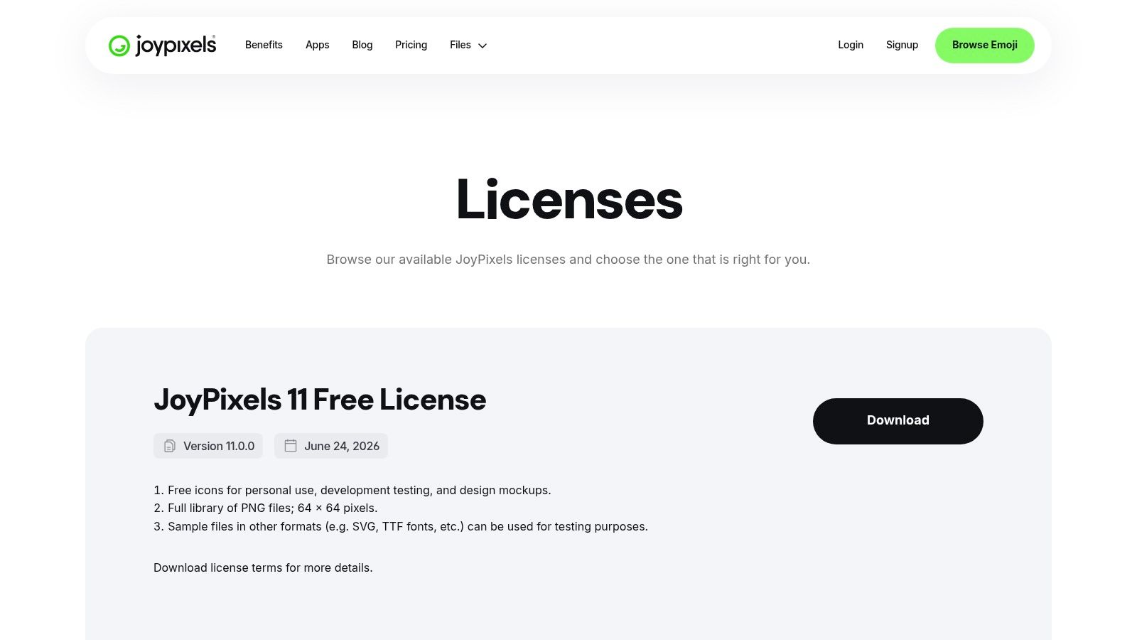
JoyPixels is worth considering when the artwork will serve more than your private Finder setup. Its polished emoji collection comes with free and paid licensing options, and the JoyPixels licensing page distinguishes access by intended use and asset type.
For a personal folder system, focus on static images. Higher-resolution files and vector options can help when preparing artwork, but animated assets don't add anything useful to a static folder overlay. Don't choose a larger package just because it includes formats your workflow won't use.
- Private organization: Check whether the available download and license cover your intended use.
- Published design work: Review the terms for artwork appearing in templates, interfaces, or deliverables.
- Library-wide consistency: Confirm that your chosen access level includes the subjects and formats you need before committing to the style.
Object symbols beat emotional shorthand
A face can be expressive without being a useful category marker. A crying face might mean difficult work, an unfinished assignment, or an inside joke. A receipt is a clearer starting point for expenses.
Cultural and language context deserves attention, too. A Scientific Data study collected emoji-evaluation data from 763 Spanish speakers to categorize emojis across 13 discrete emotions. That scope is a useful reminder not to treat your own emotional reading as universal.
For mixed-language folders, choose the underlying category first, then the image. JoyPixels offers a consistent visual vocabulary, but it can't decide whether your team interprets a symbol the same way. Keep the descriptive folder name.
6. Icons8
Start with Icons8 when the category you need isn't well served by ordinary emoji. The Icons8 catalog combines emoji-style artwork with conventional icon families, so you can search for a precise subject rather than force a loose metaphor.
This helps with technical folders. A laptop could represent almost any computing task, whereas a conventional database or terminal icon may distinguish the work more clearly. For researchers, a recognizable document or laboratory symbol may be more useful than a decorative face.
Choose a family before filling the gaps
The catalog's breadth is both its advantage and its trap. Search results can offer the right subject in an incompatible style: a shaded illustration beside a thin outline beside a solid glyph. Each may work alone, but together they make neighboring folders harder to compare.
- Set the style first: Choose an illustration family, then look for your categories within it.
- Check the silhouette: Avoid subjects that become indistinguishable when details disappear.
- Review download terms: Available formats, sizes, and attribution requirements depend on the asset and plan.
A Mac icon pack approach works better than collecting isolated favorites. Build a small group of related symbols, test them together, and only then expand the system.
Icons8 isn't a dedicated Unicode emoji library, so don't expect every result to correspond to a text emoji. That's not a disadvantage for folder overlays. Clarity matters more than whether a picture has a Unicode equivalent.
The main trade-off is selection discipline. You gain more specific subjects, but you must manage style consistency and check whether the available downloads suit your intended use.
7. Flaticon
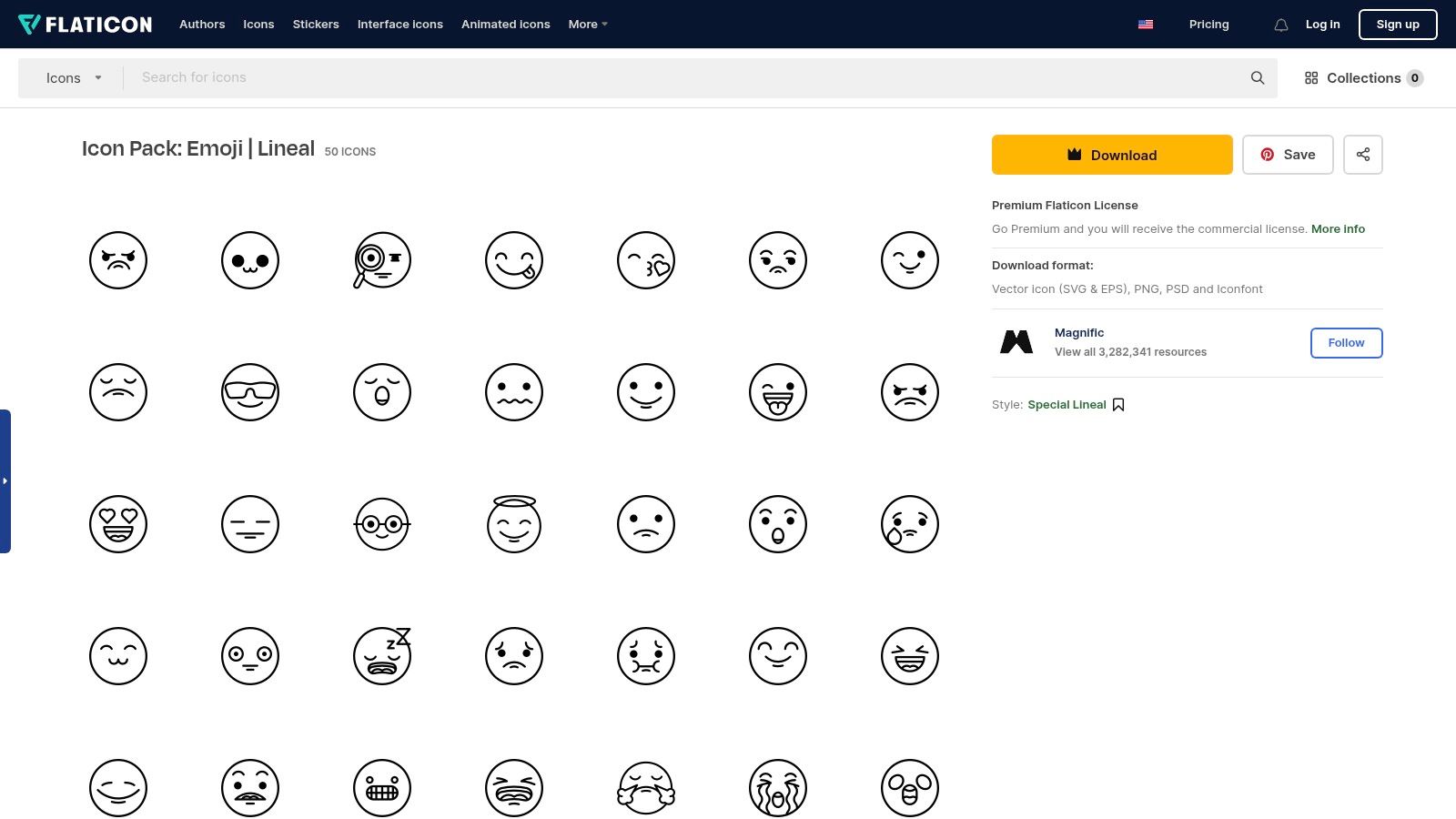
For a compact, themed collection, browse Flaticon's emoji packs rather than searching an entire catalog symbol by symbol. Pack-based browsing makes it easier to compare neighboring icons before downloading them.
This works well for a bounded project. A student might need a related set for reading, notes, assignments, and archived work. A creative professional might prefer a coherent group for audio, photography, video, and final deliverables.
A smaller set can make decisions easier
Choose a pack whose visual style matches how you use Finder. Flat or solid artwork can provide clear shapes, while lineal or soft-fill treatments need closer inspection against the folder background. Pack pages list formats such as SVG and PNG, but confirm availability for your chosen assets.
The limitation appears when your folder system outgrows the pack. An unrelated replacement can break the visual rhythm, so inspect likely future categories before adopting the set. Free downloads may require attribution, while Premium use remains subject to the applicable license.
The Bureau of Internet Accessibility's emoji guidance emphasizes meaningful text alternatives and the limits of relying on appearance alone. Applied to Finder, keep descriptive folder names, don't encode status through color alone, and test navigation with VoiceOver.
A custom image isn't the same thing as a Unicode character in a folder name. Don't assume assistive technology will announce your intended category from the artwork. Flaticon can supply the visual cue, but the folder name should preserve the meaning.
How the seven emoji and icon sources compare for Mac folder overlays
| Item | Pricing model | Best for | Licensing note |
|---|---|---|---|
| Customize Folder Icons on macOS | One-time purchase | Customizing and organizing folders in macOS Finder | No subscription; folder data stays on your Mac |
| OpenMoji | Free | Downloadable emoji and icon artwork for design workflows | CC BY-SA 4.0; attribution and share-alike terms apply |
| Google Noto Emoji | Free | Unicode emoji assets and font-based workflows | Font is SIL OFL 1.1; check the license for specific asset formats |
| Twemoji | Free | Consistent emoji artwork and web use | Artwork is CC BY 4.0; parser library is MIT licensed |
| JoyPixels | Free tier and paid plans | Static or animated emoji assets with varied formats | Free-tier limits apply; commercial use may require a paid license |
| Icons8 | Free tier and paid subscription | Searching a broad catalog of emoji-style and conventional icons | Free downloads have restrictions; paid plans offer broader access |
| Flaticon | Free downloads and Premium | Themed emoji-style icon packs in multiple visual styles | Free downloads may require attribution; Premium terms apply to commercial use |
Build a Folder System You Can Scan at a Glance
Start with the folders you open repeatedly, not your entire home directory. Identify the categories that help you organize things, such as photography, finance, development, reference material, and travel. Assign a clear symbol to each category and keep those choices stable across projects.
The most useful convention is usually literal. A camera means photography, a receipt means expenses, and a book means reference material. Reserve status symbols for a clearly defined purpose rather than mixing category and progress into the same overlay.
Test the system where you work
View the folders at your normal Finder size, including List view if that's where you spend most of your time. Check whether you can distinguish the symbols without leaning closer or enlarging the window. If a design depends on tiny facial features, fine lines, or lettering inside the artwork, choose a simpler alternative.
- Preserve the name: The folder label should explain the contents without the image.
- Keep neighboring styles consistent: Use compatible shapes, placement, and visual weight.
- Handle mixed-language names by meaning: Assign the same category symbol even when folder labels use different languages.
- Separate category from status: Don't let the same check mark mean approved in one location and archived in another.
Change the icon when it improves recognition, not merely because another option looks interesting.
Changing a folder icon is purely cosmetic. It doesn't reorganize or alter the files and subfolders inside, and you can revert to the standard macOS folder icon when needed. That makes a limited trial more sensible than a wholesale redesign.
Choose a project folder you use daily and style its immediate subfolders. Keep the result for normal work, then remove ambiguous symbols and reuse the choices that remain clear. A useful folder system should reduce interpretation, not give you another visual language to memorize.
Tintd lets you apply emoji overlays, adjust their appearance, and keep new folders consistent with automatic styling. Its Lifetime plan is a one-time purchase that gives access to all features, including the full icon library and automatic folder icons. Visit Tintd and try a category-based setup on a project folder before extending it across your Mac.