
Your desktop is full of blue folders, and the client project you need looks exactly like the archive beside it. You want to change its icon, not reorganize your files or spend the afternoon decorating Finder. The useful starting point is a single folder you open daily, with a clear image you'll recognize before reading its name.
Learning how to override a Mac folder icon is mostly about selecting the right control in Get Info. But before you paste anything, check whether that folder can accept the change and whether you need its appearance to survive a move to another Mac.
Folders You Can and Cannot Override
A folder icon override has three practical outcomes: it works locally, the location refuses it, or the appearance doesn't travel reliably. Knowing which outcome to expect saves you from repeatedly pasting into a folder that should stay blue.
Overriding replaces the picture Finder displays. It doesn't rename the folder, move its files, or change its permissions. Apple's folder customization guidance supports colors, symbols, emoji, and custom images for ordinary folders, but excludes protected macOS folders such as Applications, Library, System, and Users.
Where a Mac folder icon override works
| Folder type | Can you override | What to expect |
|---|---|---|
| Ordinary folder in your home folder | Yes | Icon changes on this Mac; files stay untouched |
| Writable folder on an external drive | Usually | Works if the volume accepts Mac icon metadata |
| Applications, Library, System, or Users | No | Protected; the default icon stays |
| Alias | Alias only | Original folder icon does not change |
| Search result or stack | Risky | Confirm you selected the real folder first |
| Read-only or network volume | Often no | Paste fails or the icon does not stick |
| iCloud or other synced folder | Local maybe | Other devices may still show the default icon |
Check the target before changing it
Start with an ordinary project folder inside your home folder, or a folder on a drive you can write to. Go to its actual location in Finder instead of working from a search result, where it's easier to select a similarly named item.
An alias is a useful fallback when you want a distinctive shortcut without changing the original. Just remember that styling the shortcut isn't styling its destination.
For a consistent system across ordinary folders, use these Mac folder icon rules to decide what deserves customization. Send only writable, correctly identified folders through the paste workflow.
How to Override a Folder Icon in Finder
Use a simple target such as Projects or Client Work for your first attempt. Avoid starting with a synced project tree or an external archive, because you want to test the clicks without adding storage complications.
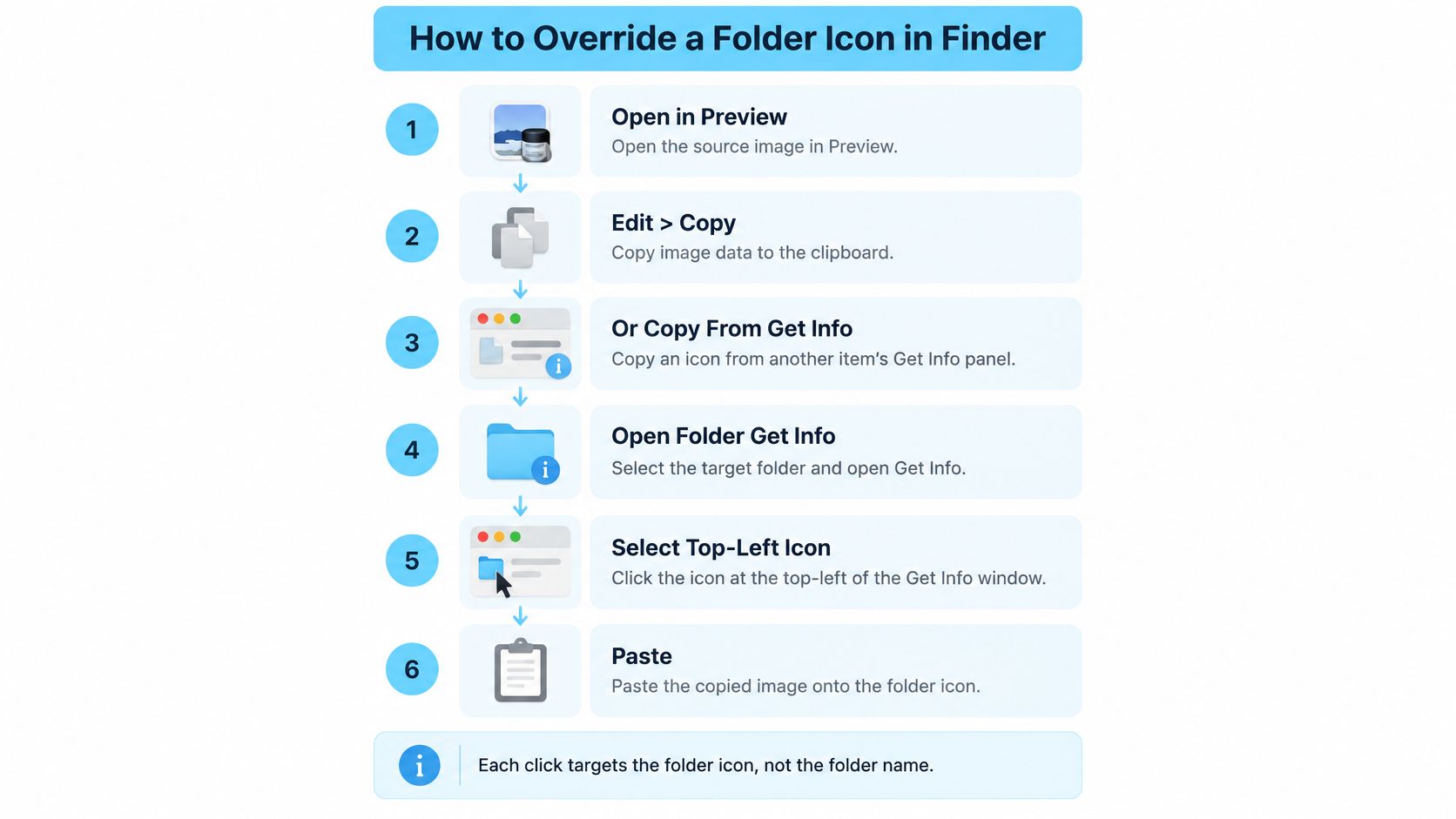
The reliable method is the native Get Info workflow in Apple's instructions for changing file and folder icons. It accepts copied image data, or an icon copied from another item's Get Info panel.
Copy the image, then target the icon
Open your source image in Preview and copy its contents. Use Edit > Select All when necessary, then Edit > Copy. The clipboard needs the image itself. Selecting an image file in Finder and copying its filename or file reference isn't the same operation.
In Finder, select the actual destination folder. Open its parent folder so you can confirm the name and location. Don't use an alias unless the alias is deliberately what you want to customize.
Press Command-I to open Get Info. Keep the destination folder's name visible at the top of the panel so you don't accidentally paste onto another open item.
Click the small icon in the upper-left corner of Get Info. It should highlight. This is the correct selection, not the large picture in the Preview area farther down the panel.
Press Command-V. Finder applies the clipboard image to the selected icon control. If the folder remains unchanged, check the selection before trying a different picture.
Close Get Info and inspect the result in Finder. Check it in the window and, if the folder lives on your desktop, on the desktop too. Switch between list and icon views to judge whether the design is readable.
The visual sequence below shows the source-image and existing-icon routes.
Use the small control, not the large preview
The easy mistake is clicking the large preview because it looks like the obvious place to put a picture. That preview isn't the paste target. Repeatedly pasting there won't fix the selection.
For an existing icon, open the source item's Get Info panel, select its small upper-left icon, and copy it. Then select the equivalent control in the destination's panel and paste. This is useful when you already have a folder style you want to reuse.
Copy from the source icon control and paste onto the destination icon control. Neither folder name needs to be selected.
Choose a square PNG with generous resolution, clean edges, and a subject that fills the canvas without touching every edge. A tiny thumbnail may look acceptable in list view but soften when you enlarge Finder's icons.
An emoji must also reach the clipboard as an image for this workflow. Typing an emoji into the folder name changes the label, not the folder icon. After the first successful paste, try another ordinary folder to confirm you can repeat the small-icon selection deliberately.
How to Put the Default Icon Back
Restoring the default is a removal operation, not another decorating job. You don't need to find a blue folder image online, copy a neighboring folder's appearance, or keep a backup picture of the original.
Learn the restore action before restyling an entire project tree. It makes experimentation less consequential: you can judge the result in your everyday Finder layout and remove it if it's harder to recognize.
Remove only the custom icon
- Select the customized folder in Finder.
- Press Command-I to open Get Info.
- Click the small custom icon at the upper-left until it highlights.
- Choose Edit > Cut, or press Command-X.
The standard folder icon should return immediately. You're removing the custom icon resource, not cutting the folder from its location.
Names, contents, tags, and comments stay in place. The selection matters here just as much as it does when pasting. Keep your attention on the little icon inside Get Info rather than the folder selected behind the panel.
When Cut isn't available
If Cut is greyed out, click the small custom icon again and check for its highlight. Don't compensate by selecting files inside the folder or using a delete command elsewhere in Finder.
If you're nervous, create an empty test folder, customize it, and restore it before touching your working folders. That gives you a clear way to verify what changes and what doesn't.
When several changes need undoing, restore a representative folder first and confirm Finder displays its standard appearance. Then continue through the remaining folders rather than issuing commands across open panels without checking their titles.
A folder that never accepted a custom icon has nothing to remove. Don't interpret an unavailable Cut command on an unchanged folder as a separate repair problem.
Keep restoration selective. If a camera symbol makes Shoots easier to find but a novelty picture obscures Archive, keep the useful symbol and remove the distraction. A good folder system doesn't require every item to look customized.
Icon Tips That Keep Folders Scannable
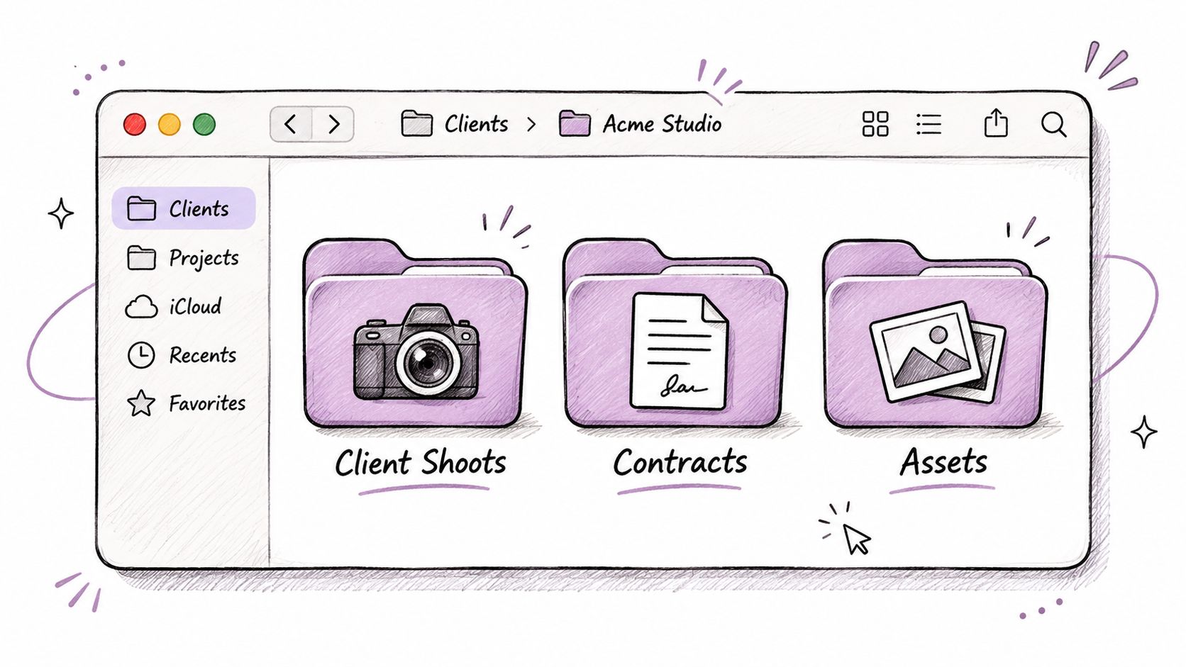
Choose icons for recognition, not decoration. A camera makes sense for client shoots, a document mark for contracts, and a restrained color family can tie related project folders together.
This illustration shows the kind of client-work grouping worth aiming for.
Design for list view first
A detailed photograph can look excellent as a large desktop icon and become an indistinct patch in a Finder list. Prefer a bold silhouette, a simple symbol, or an emoji image on a plain background.
If your purpose is merely to mark a category, color may be enough. Use a more descriptive image only when its shape adds information you can recognize quickly.
- Match the job. Use a recognizable camera for shoots rather than an attractive view that could also mean Travel or References.
- Separate neighboring folders. Don't give unrelated clients the same teal treatment merely because you like teal.
- Keep established palettes. If a client already has a visual identity, stay within it rather than introducing a competing style halfway through the project.
- Preserve clear names. Keep Contracts, Deliverables, and Source Files explicit. An icon is a visual hint, not a substitute for a searchable name.
For lightweight symbols, these emoji folder icon ideas offer a useful starting point. Choose a distinct shape rather than relying entirely on subtle color differences.
The video offers another visual reference for folder customization.
Leave routine destinations familiar
Inbox and Archive often work best with plain, predictable appearances. A joke image can be memorable without being useful, especially when you're filing something quickly.
Use a single coherent image for each folder instead of trying to squeeze a logo, status badge, photograph, and label into the same small space. Put changing status information in the name or your existing organizational system.
If you can't tell neighboring folders apart in list view, simplify the icons. Don't enlarge the whole interface to rescue an overly detailed design.
Fixes When the Custom Icon Fails
Start with the large-preview miss. If paste appears to do nothing, check the small upper-left icon selection before changing permissions, restarting apps, or blaming the image format.
Then diagnose what you see. A paste that never appears, an icon that reverts, and an icon that looks blurry are different problems with different fixes.
Custom folder icon problems and fixes
| What you see | Usual cause | What to do |
|---|---|---|
| Paste does nothing | Large preview selected, or a path copied instead of image data | Select the small upper-left icon in Get Info and copy the image in Preview |
| Icon returns to blue | Read-only volume, protected folder, or sync rewrite | Check permissions; don't force system folders |
| Only the alias changed | The alias was selected | Open the original folder and paste there if it is writable |
| Icon looks blurry | Source image is too small | Export a larger square image from the original artwork, then paste again |
| Looks right here, default elsewhere | Metadata did not travel with the sync or file system | Treat it as local, or reapply on the other Mac |
| Cut is greyed out | Small icon not highlighted | Click the custom icon in Get Info, then Command-X |
Separate a paste failure from a storage limit
For a writable folder, reopen the source in Preview and copy the image contents again. Select the destination's small icon, paste, and switch Finder to list view and back so it redraws the item.
If that succeeds in your home folder but fails on a shared volume, stop treating the clipboard as the likely problem. Check whether you can modify that location and whether it retains Mac-specific metadata.
Don't broadly change permissions just to make an icon stick. In particular, leave Applications, Library, System, and Users alone rather than attempting to bypass their restrictions.
Test the destination, not just the starting Mac
Before sending a styled project folder elsewhere, test a nonessential copy through the actual route you'll use. Inspect the received folder on the destination Mac or shared location, rather than assuming a successful local paste proves portability.
The files may arrive correctly while the custom appearance doesn't. A default icon on the receiving device isn't, by itself, evidence that the folder's contents are missing.
Treat custom icons as local navigation aids unless you've verified the complete transfer route.
For blurry artwork, return to the original image or vector design. Enlarging an already tiny raster image won't recover missing detail. If the design still reads poorly after a cleaner export, replace the design rather than repeatedly pasting the same unsuitable picture.
Choose Manual Paste or a Batch Tool
Manual Get Info editing suits a small, occasional cleanup. You control each destination, inspect each result, and can stop as soon as your daily folders are easier to identify. There's no reason to add another tool just to change a project folder.
Repeatedly restyling client trees is a different workload. Opening panels, finding the little icon, and maintaining a consistent palette become repetitive enough that people skip the cleanup.
Match the method to the repetition
- Choose manual paste when you have a short set of folders and already have the images you want.
- Choose batch editing when related folders need the same treatment, or you repeatedly organize similar project structures.
- Keep the scope narrow when testing a new workflow. Check the resulting folders in Finder before applying it across a larger tree.
The useful distinction in batch editing is applying a deliberate choice across a selection, not customizing everything indiscriminately. A batch should still have a clear purpose, such as identifying active client work.
Tintd is an option for that repeated work: our batch controls let you select several folders and give them a color and icon in one action, choose overlays from more than 11,000 icons, and revert any customized folder to the original macOS Finder icon with one click. Finder contextual-menu integration and history help reuse styles without repeating the entire manual sequence.
Start with folders you open daily, verify the first batch, and expand only where the result helps you find files. Leave protected locations at their defaults and restore designs that add visual noise.
Visit Tintd if you want to apply folder colors and icon overlays across a selection instead of opening Get Info for every folder. Start with your active project folders, check the results in Finder, and use one-click restore for any style that doesn't improve recognition.